misskey

misskey copied to clipboard
Manage accounts, wrong button for disconnection activity
💡 Summary
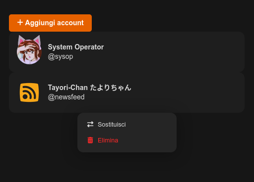
While you're inside /settings/account (Account Manager) you can see a list of connected account to the client. When you choose one of them you can switch or disconnect. No real account deletion happens.
🥰 Expected Behavior
I expected two primary color buttons, one to switch, one to disconnect the selected account.
(red deletion it's an irreversible action, you can do at /settings/delete-account and destroy your profile)
- 🔃 Switch
- ↖️ Disconnect (or Exit)
🤬 Actual Behavior
Actually, icon for switch it's ok. But for the second menu item is wrong either color, translation, and icon.
📝 Steps to Reproduce
- login with first account
- go to account manager, login with second account
- go to account manager, click other account
📌 Environment
Misskey version: v12.119.0 Your OS: Docker Your browser: all