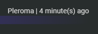
enhance: show software in instance ticker
What
Show the software of an instance in the instance ticker.
Why
fix #8832
Additional info
The API already provides this information so no changes to the backend are necessary.
screenshot
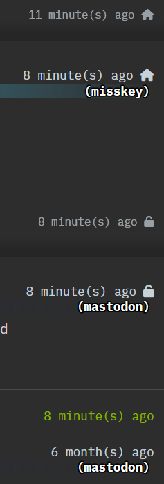
I'm unsure over the design. It was suggested that the text does not look great because it does not have a proper background so maybe it would make sense to remove the gradient for the instance theme colour here.
Does the software name discern between forks? For example, Mastodon doesn't support emoji/custom emoji reactions but Fedibird (Mastodon fork) does
Does the software name discern between forks? For example, Mastodon doesn't support emoji/custom emoji reactions but Fedibird (Mastodon fork) does
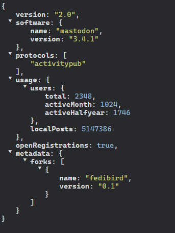
this makes use of software part of the nodeinfo, fedibird doesn't use it to discern itself from upstream mastodon at all
 glitch-soc, however, does
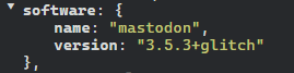 but as you can see, this doesn't show the version string
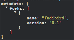
Maybe it could look in metadata[forks]?
So it'd appear as mastodon (fedibird)
this would require backend changes if i understand correctly, and also description of metadata is Free form key value pairs for software specific values. Clients should not rely on any specific key present. as seen here, not exactly sure if this is a great idea
Maybe it could just be if in metadata, show the fork name if forks is present.
As Jeder321 said previously, the NodeInfo specification says:
metadata (object) Free form key value pairs for software specific values. Clients should not rely on any specific key present. -- https://nodeinfo.diaspora.software/schema.html
The last sentence rules out what you want to do in my understanding. So I agree with Jeder321 that this does not sound like a good idea.
It was also shown that e.g. for the glitch fork the software is shown in the version string. Although that might be also useful in cases I think showing the full version string will decrease the usefulness because it will be so much potentially hard to read text, especially on mobile devices.
ソフトウェアのアイコンが表示されると見栄えが良くなるかも?
I feel like that's already (partially) handled by the instance favicon, it'd be weird to see the same icon twice for a lot of posts.
とりあえずオプションにしてほしい
I agree. Having this as an opt-in setting would be nice.
Showing icons for software would also mean we have to keep a list of known software and their icons, which sounds like it could be a lot of work because anyone could come up with a new AP server software at any time. And maybe they do not even have an icon.
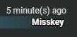
ソフトウェア名をそのまま表示するのはダサい
what do you mean?
It is tacky to display the software name as it is like the screenshot.
ダサい (tacky to) https://japaslang.com/?keyword=%E3%83%80%E3%82%B5%E3%81%84
yeah it looks weird, but tbh i can't really imagine how to show it better without hiding it which would be undesirable
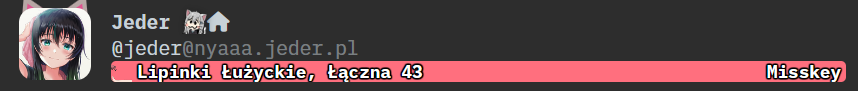
 maybe something like this would look better?
maybe something like this would look better?
Works well on desktop, but can be cramped on mobile and deck.
hm, removing parentheses and capitalising first letter seems to be enough? looks better than current one imo
 but for me "tacky" doesn't say much about what's wrong with it lol, so i have no clue what i am doing
As I suggested above, removing the background gradient is also an option. For example:
If the software name were to be displayed in that position, it would look more natural if the gradient is left in place and the text color is the same color as the user name, etc.
As I suggested above, removing the background gradient is also an option.
If we were to do this, the banner color should be at 50%-ish opacity, as a full bar like that on every post can be jarring, especially if they're bright colors.
New design change looks like this:

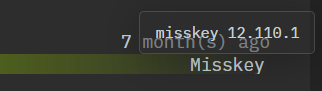
If you hover over the software name you will see a tooltip with the software name and also version. This should allow e.g. glitch to be discerned. I thought that the version number can be quite ugly and long so I did not want to include it in the label that is always shown.
Cool tooltip! ツールチップをインスタンス名のホバーで表示できるようにして、右側のソフトウェア名消しても良いかも 見た目が従来と同じだと「とりあえずオプション」にする必要もなくなる
I think having it displayed immediately is a nice feature because you do not have to explicitly check.
I can see how it may be problematic on smaller UI layouts. But on touch devices where hovering is often not possible, this information would not be available at all.