TrackClonotypes stackplot bugs
Dear Dr. Shugay,
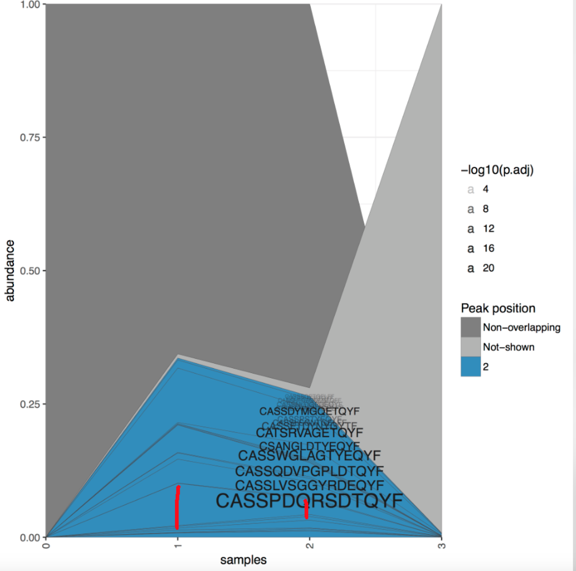
Found another bug in TrackClonotypes calculations. In Clonotype tracking stackplot, the "color" and "Clonotype CDR3 amino acid sequence" position is based on the "PEAK" data from "tracking.strict.table.collapsed.txt" file. We found some obvious mistakes in the plots show as below. The red lines distance shows the maximum abundance (the peak) is different from the results, which "0" should be the peak in first figure and "1" should be the peak in the 2nd figure.

Then we took a close look at the "tracking.strict.table.collapsed.txt" file, found there are many mistakes in many files in the "peak" column.
For example,

 Yellow highlights indicate the true maximum abundance (the peak) , the red highlights indicate if the results is right or wrong compared with the results from the pipeline.
Those 2 screenshots indicate the peak values in the "tracking.strict.table.collapsed.txt" file are obviously wrong.
Is this a bug of the pipeline or our understanding is wrong?
Thanks!
Looks like the peak is determined based on reads count not frequency, will change this.
It's 2020-08, I'm using vdjtools v1.2.1, looks like peak position is still determined not on frequency ?
I also encountered with this problem and I confirmed that, as already mentioned above, the peak was determined based on reads counts(the number shown in "count" column of each sample file) rather than frequency. The quick work around is to write a code that fixes the peak position in TrackClonotypes.tracking.strict.table.collapsed.txt by looking at frequency information of each sample(the last few columns) and then rerun tracking_stackplot.r by yourself.
I actually realized that determining (and coloring) the peak by simple frequency rule didn't generate a visually informative plot. I come up with an idea that I set the peak position only if the frequency is higher than some multiple(ex. double or triple) of the frequency of the previous timepoint. In this way, the stackplot is more nicely colored to emphasize which clonotype is significantly enriched as the timepoint proceeds.