vscode
 vscode copied to clipboard
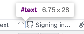
Status bar items do not preserve whitespace between codicons
Extracted from https://github.com/microsoft/vscode/issues/145722
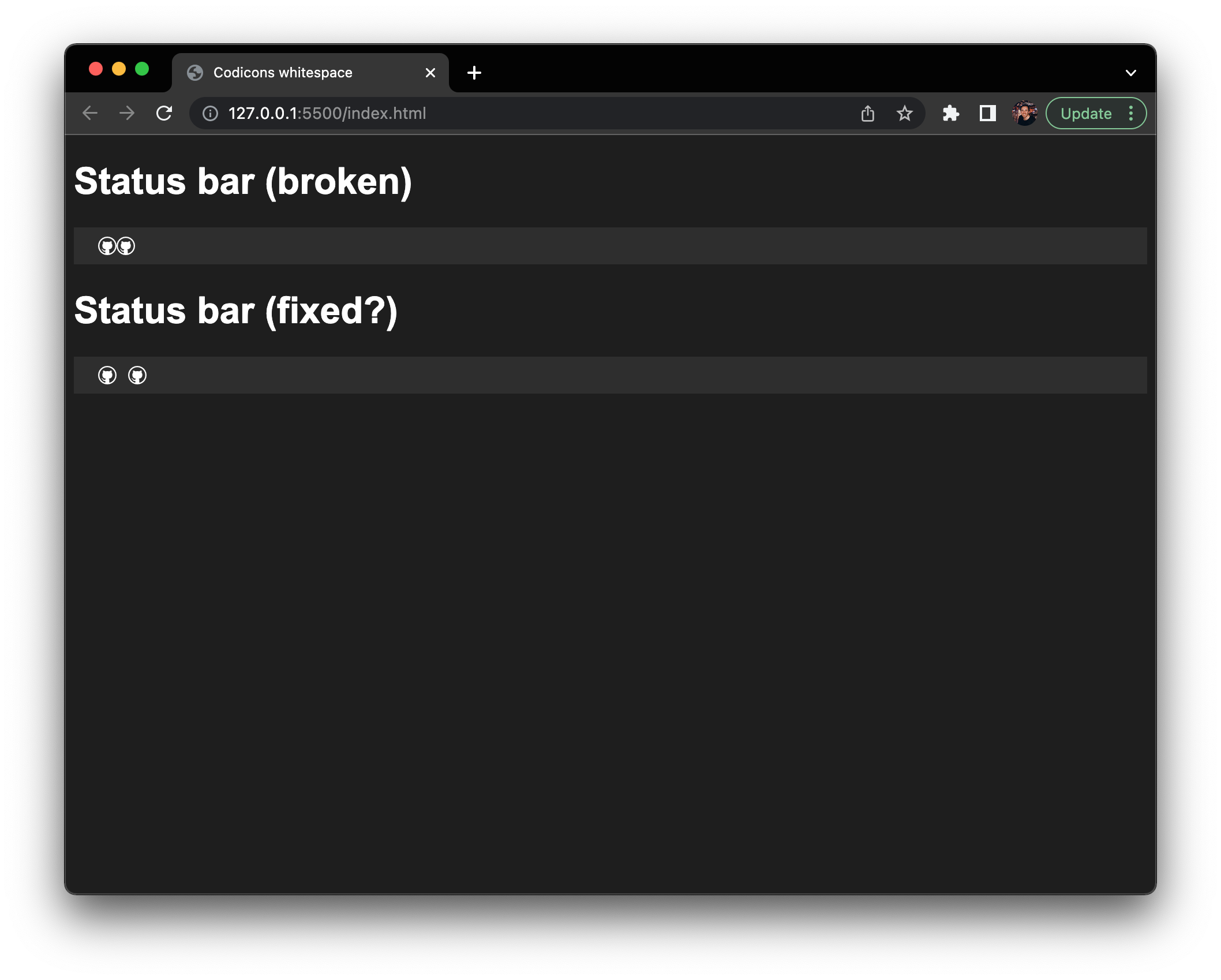
If you bring up a status bar entry with 2 codicons next to each other only separated by whitespace, the 2 icons are still rendered as if there was no white space:

HTML is:
<a tabindex="-1" role="button" aria-label="label" class="disabled"><span class="codicon codicon-mark-github"></span> <span class="codicon codicon-mark-github"></span></a>
Code:
const statusService = accessor.get(IStatusbarService);

statusService.addEntry({
	name: 'name',
	ariaLabel: 'label',
	text: '$(mark-github) $(mark-github)',
}, 'my.id', StatusbarAlignment.LEFT);
I traced this down to the fact that the parent anchor tag of a status item uses display: flex and this seems to collapse whitespace elements, as outlined in e.g. https://www.mattstobbs.com/flexbox-removing-trailing-whitespace/
However, we already set white-space: pre as suggested:
https://github.com/microsoft/vscode/blob/0140fba8bb128d7481a4bcd380de774ab1210c5d/src/vs/workbench/browser/parts/statusbar/media/statusbarpart.css#L118
Opening up for help for a CSS wizard to look at. Ideally all whitespaces between 2 codicons are preserved for styling purposes.
//cc @daviddossett @misolori @joaomoreno
Ah so, this originates from your change @misolori
https://github.com/microsoft/vscode/commit/ef84173ea6e64ee8f7126bbf3f5dc2c51eff798b#diff-b4dccdf238cc73547c4eefcfbac679210115fd5e0dc2fc9902844d6116b0e915
Maybe you have an idea. It used to be display: inline-block;
The whole status bar might require a larger refactoring to use gap instead of margin-left or margin-right on each element: https://developer.mozilla.org/en-US/docs/Web/CSS/gap#flex_layout
Before boiling the ocean, an alternative is to wrap whitespaces into span itself to preserve them. I.e. here:
https://github.com/microsoft/vscode/blob/fcbf1eb903ad019fbd003d754067d0728d79d498/src/vs/workbench/browser/parts/statusbar/statusbarItem.ts#L285
and here
https://github.com/microsoft/vscode/blob/fcbf1eb903ad019fbd003d754067d0728d79d498/src/vs/workbench/browser/parts/statusbar/statusbarItem.ts#L290
Something along the lines of:
renderLabelWithIcons(text ?? '').map(value => {
	if (value instanceof HTMLSpanElement) {
		return value;
	}

	if (value.trim().length === 0) {
		const spacer = $(`span`);
		spacer.textContent = value;

		return spacer;
	}

	return value;
})
It's a bit ugly though and a pure CSS solution that only impacts white space would still be nice. Maybe we can go back to inline-block.
Status bar containers are flex. We always want status bar items to have spacing between them. So using gap is the only logical option. It's far from boiling an ocean. Plus, that solution is independent of whether status bar elements themselves are flex.
The current solution of making up space by using :first-child and margin or padding is outdated and prone to errors, as we can now clearly see. I would not add yet another hack to that.
I think you are confusing things. There is a display: flex for status bar items on the parent container of the items to position them and yes maybe we can use gap there to drop a few CSS rules that are hard to understand, and we can have a separate issue for that. But we also started to use display: flex within a status bar item, which imho is not needed because a status bar item itself does not use flex layout at all.
I believe the only reason for having added display: flex is to align the codicon icons well when used inside a status bar item.
If you bring up a status bar entry with 2 codicons next to each other only separated by whitespace, the 2 icons are still rendered as if there was no white space:
Oh these are two icons in a single status bar entry, I thought it was two entries. Why not simply using gap in that flex element then?
gap seems to stretch every status bar item then:

This is really very specific to the fact that there is whitespace between the span, everything else is proper. I think gap will cause other regressions.
Is there any way that we can transform a space (when next to other $(icon) elements) into a  ? That seems to help preserve that spacing:
@misolori I had tried adding that explicitly e.g. $(bell) $(bell) without any luck. But maybe I was holding it wrong..
Yeah I think that would work at the place where we build the HTML elements, but I wouldn't suggest to force extension devs to use it.
I wasing trying to add this via a PR.
.monaco-workbench .part.statusbar>.items-container>.statusbar-item span.codicon::before { content: " "; white-space: pre; }
wanted to add more specificity to preserve the whitespace before this particular span.
@bpasero (@daviddossett @joaomoreno @misolori) I think I have a solution to this!
I believe the issue is that because span tags are inline elements by default any potential spacing you add to them will just be collapsed in a flex container. By setting the span as inline-block you should be able to add margin, padding, etc. without issue.
a > span {
  display: inline-block;
  margin-right: 10px;
}
I also made a super small reproduction in vanilla HTML/CSS to validate this works if you're curious, but assuming I've understood the issue correctly and all looks good I'd be happy to make a PR for this!
Oh shoot, looking back more closely I just realized the hope is to respect the literal whitespace characters between spans versus having spacing between icons in general.
The solution I have above could potentially be used if there's a decision that these icons should always have space between them, but would technically break the scenario where someone does not include spaces in the text field:
text: '$(mark-github)$(mark-github)', // <-- this would still render a 10px margin between icons despite no space in text
@hawkticehurst I think the solution for this issue is to first select all the sibling span element with the General sibling combinator. Look for more info here https://developer.mozilla.org/en-US/docs/Web/CSS/General_sibling_combinator
Then add margin-inline-start: a value; plus writing-mode: horizontal-tb; properties to the selection.
https://developer.mozilla.org/en-US/docs/Web/CSS/margin-inline-start
@hawkticehurst because every item in the status bar is a span it would apply to almost every item. But riffing on that snippet, you could try something like:
.monaco-workbench .part.statusbar>.items-container>.statusbar-item a > span + span {
  display: inline-block;
  margin-right: 10px;
}
though that would only solve for when there are two and not three icons next to each other (which seems more rare)
In every trial I wanted to do this issue, a new aspect unfolded. This is not ideal as it adds to the workload rather than providing a straightforward solution.
First, to address the misalignment of icons and the text, I could come up with these solutions:
The icons do not have the same font-size as the text and this is because of the last line of code in the statubar.css:
https://github.com/microsoft/vscode/blob/d17726fe4beae5abe87ba9e9429cd298be8b53c4/src/vs/workbench/browser/parts/statusbar/media/statusbarpart.css#L146
- Here the codicon icons wrapped in the spans are selected. This excludes the text included in the a tags. A suggestion for this is to change the selection in this way:
.monaco-workbench .part.statusbar > .items-container > .statusbar-item  a {
	text-align: center;
	font-size: 16px;
}
- And to reposition the icons using transform: translate(2px, 1px); property only for the icons. This can re-position them and align them with the text:
.monaco-workbench .part.statusbar > .items-container > .statusbar-item  span.codicon {
	transform: translate(2px, 1px);
	color: inherit;
}
To also align the text also, I suggest changing the line height on this selection: https://github.com/microsoft/vscode/blob/d17726fe4beae5abe87ba9e9429cd298be8b53c4/src/vs/workbench/browser/parts/statusbar/media/statusbarpart.css#L10
Note: Changing its value only pushes items with the text in the div with the class=”status-bar-item left” to the upward direction or to the downward not the other items.
Something else to add: some icons maybe were wrong picks for the test as they may need custom sizing to align properly.
As for the space between codicons icons, there is a specific scenario. The left section of the status bar has three separate sections. These sections are:
- First-visible-item : We have a div with the class=”first-visible-item” this one is a solid subsection without the flexibility of many icon changes.
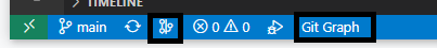
- Middle (meaning without a specific class) : We have a div with the class=”left” For this is for git branches, loading, and other synchronizations.
- Last-visible-item: We have a div with the class=”last-visible-item” right after this one, here I can see there are warning icons and error icons.
My assumption was that all the extension icons would be added to the middle section of the left part of the status bar. However, the real examples I see on my desktop vscode app prove the other cases:
In this subsection, as an example, the gitlens extension adds two icons one before the warning icons and error icons in the last-visible-item div and one after.
 Correction: these are two different extensions but my point here remains the same ( extensions add icons to different subsections of the status bar)
the other point is that, Also, a div has the display:inline-block property . An example of this is line 43: https://github.com/microsoft/vscode/blob/d17726fe4beae5abe87ba9e9429cd298be8b53c4/src/vs/workbench/browser/parts/statusbar/media/statusbarpart.css#L43
If changing the display property won't affect the items because of the nature of the statue bar, maybe display:inline-block can be used for other sections as well. Then the application of margin left and right can be easily done.
As a suggestion, maybe Instead of sectioning the main status bar div we can change the selectors like this:
- span:first-of-type()
- span:nth-of-type()
- span:last-of-type()
and exclude any item that is not needed with :not() selector.
We closed this issue because we don't plan to address it in the foreseeable future. If you disagree and feel that this issue is crucial: we are happy to listen and to reconsider.
If you wonder what we are up to, please see our roadmap and issue reporting guidelines.
Thanks for your understanding, and happy coding!