New emulation bar for screencast - please tell us what design you'd prefer
We're currently working on improving the findability of emulation features in the Microsoft Edge developer tools. Did you know that you can emulate different vision deficiences, dark and light schemes, forced colours and print layout amongst other things?
If you don't, then the problem is that they are hard to find and hidden in the Rendering menu.

To improve this, we are working on a new emulation bar inside the screencast of the Edge DevTools for Visual Studio Code as a testing ground to change it in the main browser.
We now need to know what you'd prefer to see:
CSS features emulation
A prioritised set of emulation features:
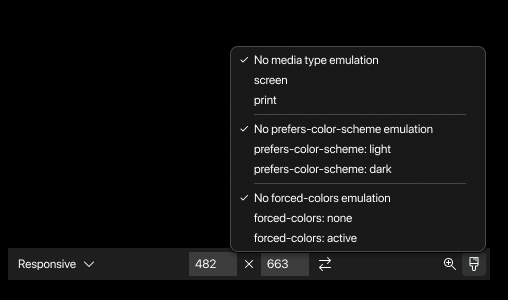
All options as a flat list:

A nested list:

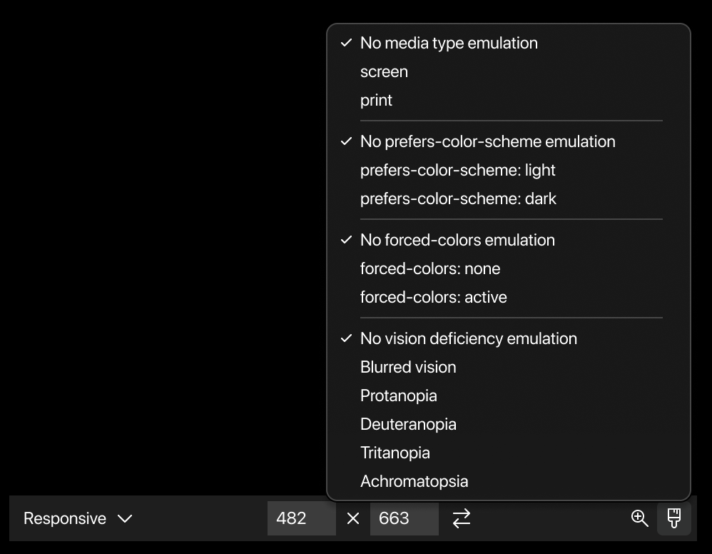
Vision deficiences
Furthermore, we'd like to know if you prefer the vision deficiencies emulation as part of this menu:
Or as a separate button/menu:

You can fill out this quick survey or comment here.
Thanks so much!
Ideally something between flat and nested list: compact like the nested, but with the ability to see which option is currently set (possibly only for the ones that are not on “no”).
Could be the nested list, with the active option written in small/gray next to the option name. And with the list unfolding to the right, not the left.
Could be the nested list, with the active option written in small/gray next to the option name. And with the list unfolding to the right, not the left.
Thanks for the suggestion. I think this is a good idea 👍