Add preference to customize vertical line spacing
the space between lines is way too large.
here's a comparison of the same block of text in terminal (top-left) and windows 10 command prompt (both bottom and right). the font is 'Lucida Console' in both programs.
the block on the bottom shows that the fonts are the same size (the width is the same).
the block on the right shows that the Terminal rendering is nearly 40% larger (blue arrow) than the Command Prompt rendering. That's 40% less text i can read without scrolling.
at the very least there needs to be an option to change the leading (that scales properly), although i'd recommend making it look like Command Prompt by default.

I think the top left line spacing is very readable, and preferable.
As long as the box and block drawing characters line up properly without gaps, then that is good.
Now if you are saying there should be an option to adjust the line spacing - again as long as box drawing characters line up properly - then sure add line spacing as an option.
Thanks for the suggestion! I could have sworn there was already an issue for this, but it looks like it was only ever mentioned as a part of #1790 (and other threads), but never tracked individually. This is now the thread for configurable line height / spacing. Thanks!
Just wanted to hop in here and mention that while the config/preference would be nice, @Spongman might be seeing the effect of #455 (specifically #2779) happening here, if they're running with any "Display Scaling" in Windows.
nope, no display scaling going on.
just too much line spacing. you can see it in all the screenshots, too. so it's not just me.
Ah, ok. Fair.
I just figured it might have something to do with that. But yea, I agree that there's too much line spacing, regardless of display scaling settings.
It is exciting to see MS create a new terminal. Great work, I appreciate it.
+1 for the option to reduce spacing. Not a fan of reading double spaced lines and prefer smaller font too. Much more data can be presented in the given space.
Linux and Mac don't have such wide spacing and large fonts by default.
Linux and Mac don't have such wide spacing and large fonts by default.
btw: you can use CTRL+<Mouse Wheel> to change the font size.
Another side-effect of the default spacing is that, even in the intended Cascadia font box-drawing characters do not, er... tessellate the plane.
Edit: perhaps a better example:
Compare with the legacy conhost, in Courier New:
Why it is not the same as in the classic cmd?? I cannot switch to the new terminal because of this ( I really rely on a number of visible lines on a screen in a few main cases.
I prefer taller, actually I want more taller. An option for line height (line spacing) is really good.
@zadjii-msft is an option to configure the "lineHeight" still something we'd be interested in including? If so, I'd be interested in having a go at implementing this :)
@zadjii-msft is an option to configure the "lineHeight" still something we'd be interested in including? If so, I'd be interested in having a go at implementing this :)
Does Windows Terminal draw it's own Box Drawing characters, I know it was proposed #5897 #455
If so, many of these will need to be adjusted to retain seamless lines and borders. But Full Block heights, should probably stay aligned to the text lines.
@jonhue absolutely, go ahead. @miniksa is the rendering guru - he might have some thoughts of things you should keep in mind, so I'll tag him in ☺️
@zadjii-msft is an option to configure the "lineHeight" still something we'd be interested in including? If so, I'd be interested in having a go at implementing this :)
@jonhue absolutely, go ahead. @miniksa is the rendering guru - he might have some thoughts of things you should keep in mind, so I'll tag him in ☺️
For all of this.... most of my notes on how/why line spacing is the way that it is lies in giant comments inside the DxEngine::_GetProposedFont method. Specific callouts include aligning the baseline to rest on a full pixel, ensuring that the cells continue to be a perfect integer pixel height, watching out for High DPI scaling, and looking around at anything referring to DWRITE_LINE_SPACING structures. I believe it's all set up in the base DxEngine class and the CustomTextLayout class pulls that information out and uses it for laying out the glyphs.
@zadjii-msft is an option to configure the "lineHeight" still something we'd be interested in including? If so, I'd be interested in having a go at implementing this :)
Does Windows Terminal draw it's own Box Drawing characters, I know it was proposed #5897 #455
If so, many of these will need to be adjusted to retain seamless lines and borders. But Full Block heights, should probably stay aligned to the text lines.
No, but it does scale the glyphs to fit perfectly inside a cell so there isn't gapping when the font is authored with a mismatch between the deprecated-windows-only line spacings and the line spacings the rest of the world uses (recent notes from Dustin in #7596). That's done in CustomTextLayout::s_CalculateBoxEffect. Might have to look in there too.
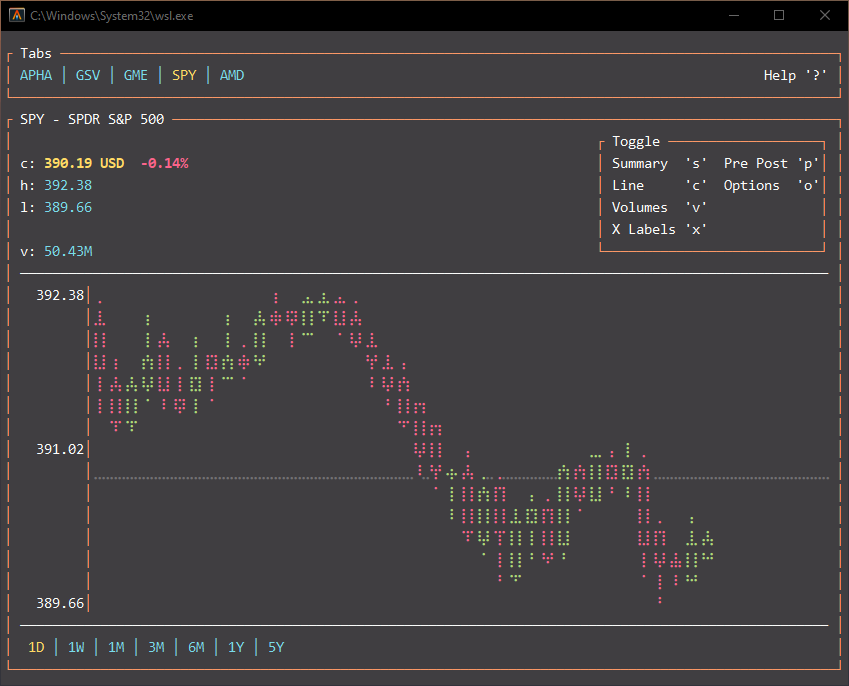
+1 This is a huge problem with TUI applications, especially ones that leverage things like braille characters to render graphs.
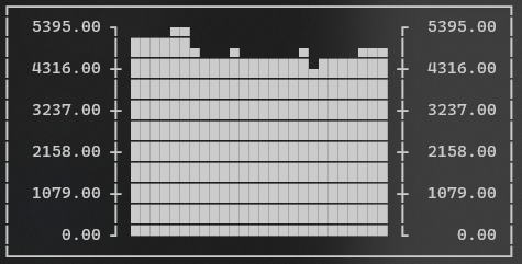
Here's an example of Consolas 11pt in Windows Terminal vs Alacritty that shows the issue very well. I'm assuming this is do to line spacing...
| Windows Terminal | Alacritty |
|---|---|
 |
 |
 |
 |
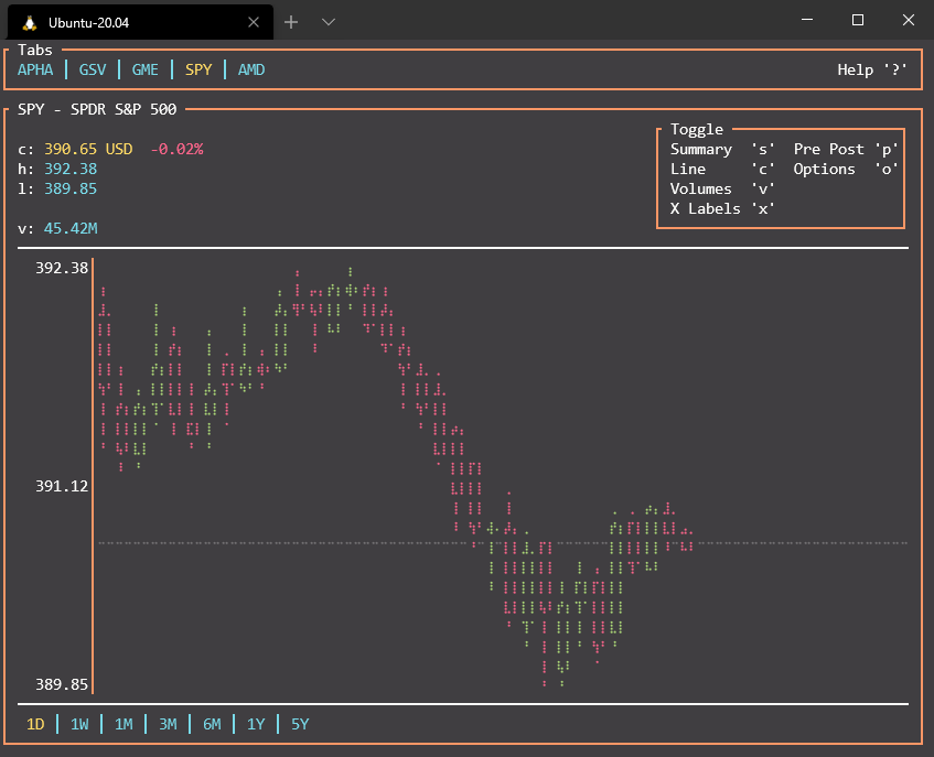
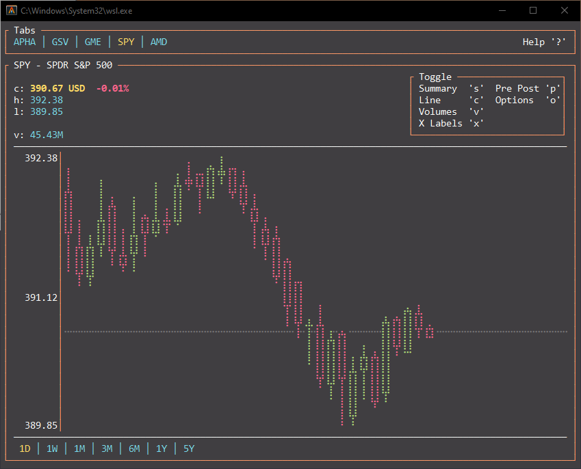
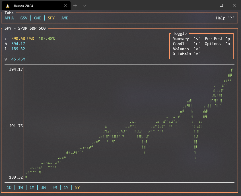
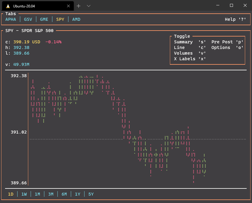
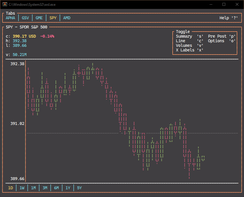
@tarkah woah, what is that application? That's the prettiest looking commandline stock tracker I've ever seen 👀 /cc @miniksa because this is like, both of his favorite things
(If this were due to the line spacing, I would expect the actual lines to be spaced differently. This just looks like an issue with the size of the braille characters.)
@zadjii-msft Thanks! It's a TUI app I made in Rust https://github.com/tarkah/tickrs
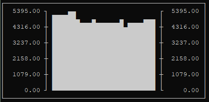
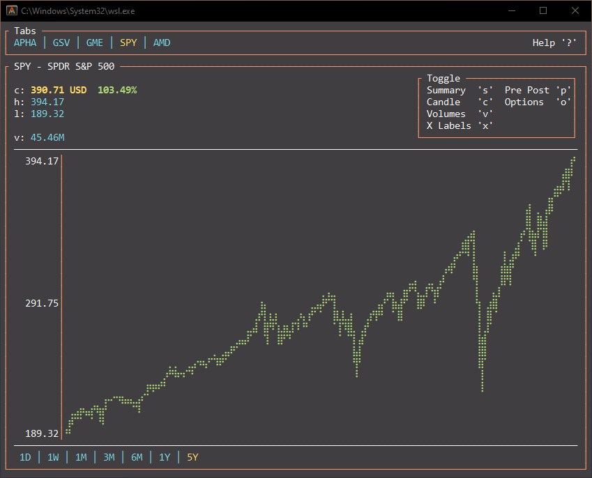
@DHowett Good point, the windows terminal frame is 36 lines tall vs the alacritty is 38 lines tall, but it's hard to know if that's primarily due to the window decoration or any line spacing.
| Windows Terminal | Alacritty |
|---|---|
 |
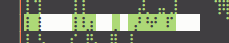 |
The spacing between the braille characters seems much tighter in Windows Terminal vs Alacritty, so maybe this is a different issue.
Weird question- how does it look if you use Cascadia Mono? I wonder if Consolas doesn't actually have those characters and Terminal is squashing them to fit when they come from a fallback font while Alacritty is not? Are are guilty of squashing "big" characters, afterall...
No real difference.
| Consolas | Cascadia Mono PL |
|---|---|
 |
 |
Interestingly, Cascadia Mono renders worse than Consolas in Alacritty...
| Consolas | Cascadia Mono PL |
|---|---|
 |
 |
Alacritty has a line spacing offset option:
  # Offset is the extra space around each character. `offset.y` can be thought of
  # as modifying the line spacing, and `offset.x` as modifying the letter spacing.
  offset:
    x: 0
    y: -1
I need to set it to -1 to get perfect rendering of the braille characters. I can make it look closer to windows terminal by increasing it, but then notice how it affects other characters like the borders. I'm thinking you're right about how they're getting "squished" in windows terminal.
| -1 offset | 5 offset |
|---|---|
 |
 |
the thing i don't quite understand is this: Command Prompt uses ttf fonts, and renders box-drawing characters just fine. why is it that Terminal has this issue where box-drawing characters are taller than normal and there's an extra vertical space in between lines?
@spongman the old Windows Console Host (thing that CMD/powershell run inside) uses legacy font measurements that have been deprecated for about 20 years. Unfortunately, typography has moved on since it was authored. Terminal uses the "correct" (this is debatable, but they are correct insofar as they are the values specified by the font designer!) design metrics.
that's lovely to hear. so, can we get an option to use the old, broken, whatever font metrics? because the new ones suck.
No. You're going to get configurable line spacing, like you asked for in https://github.com/microsoft/terminal/issues/3498#issue-520343001.
so, what's the difference between what you say "correct" design metrics, fudged to fix box-drawing, and then fudged again to allow for configurable line-height, and whatever it was that conhost does?
The problem we're having here is biasing toward a perfect pixel cell grid, where each piece of the grid has an integer number of pixels in both the X and Y dimensions.
The primary reason for this is performance: if we can redraw only on an exact pixel boundary as characters change, then we can save ourselves from having to redraw the neighbors or the entire screen.
Does that come with compromises? Yes.
One of those compromises is that we calculate the perfect pixel width in the X dimension and then add line spacing in the Y dimension to round it out to a whole, non-fractional pixel.
One additional reason for some of the spacing has to do with something we were told by multiple typography experts inside and outside the company: the baseline of characters should sit perfectly on a pixel boundary for the crispest representation. Does someone disagree with this? Probably. Can you find another expert to disagree? Also probably. Do we try to rely on the knowledge of our peers and colleagues when we don't know what's up? Yes.
Is this different from what Conhost did? Yes. Why? Conhost used GDI. We use DirectX. Why don't we use GDI for Terminal? Because it's old and significantly less configurable and doesn't run on the GPU. Performance and configurability are key goals of ours. We also like using supported and forward-looking tech to build new code when possible. DirectWrite/DirectX fits that bucket.
So how did GDI get up into getting this to all work on perfect pixel box grids with the same font? To be honest, I'm not sure. Perhaps they decided to bias in a different direction like on character width. Perhaps because it's old code, it was simply a rounding or truncating-to-integers error that I haven't been able to replicate in the float-based DirectWrite world yet.
Will we do better in the future? Yes.
If we find a more suitable default or expert, will we change our rendering to accommodate? Yes.
When we have time and cycles, will we let people adjust the knobs on this too so they can choose the perfect rendering fidelity for themselves, even if it sacrifices some of the performance? Yes. Why is this taking so long? Because I'm probably the right person on the team to do it and my general productivity, mood, and physical/mental health are all still suffering significantly with the pandemic. Please be patient with us/me.
Because this is the internet, will someone try to prove me wrong and show me the correct union of correctness and performance for DirectWrite? I sure hope so, but it's a solid maybe.
In the mean time, @tarkah, your finance graph thing is super cool. I might keep it up in a tab to MSFT and VTI. :P I nerfed the line spacing quickly/temporarily to reduce the impact of our calculations on the drawing and it still didn't look right in my dev build. And I tried applying the box scaling effect to it and it still looked wrong. Not quite sure why, but I have other things on the agenda today so that's all I can do for now.
@miniksa That's exactly why I created it, to keep a tab on things in the far corner of the screen :)
Thanks for taking a quick look into it. Appreciate all you and the team have done to make this awesome terminal for Windows!