microsoft-ui-xaml
 microsoft-ui-xaml copied to clipboard
 microsoft
Grouped selection support
Proposal: Grouped selection support
Summary
Support for Fluent styling for grouped selection between choices. This type of control could be used in combination with others to display different views of the same or similar data, such as in map interfaces to switch between driving/walking/biking options. This lets a user pick from multiple choices, similar to Segmented Control in iOS.
Rationale
- provide a standardized horizontal selection UX
- in combination with FlipView or other controls, provide support for scenarios that were previously using Pivot
Scope
| Capability | Priority |
|---|---|
| Horizontal selection of multiple options | Must |
| Support horizontal orientation | Must |
| Support vertical orientation | Should |
| Support styling for a Pivot-like header | Could |
| Support styling for a group of buttons | Could |
| Multiple choice | Could |
| Every segment shall adapt to content width | Could |
| Limit the width of an item | Could |
| Respond to swipe on the control surface | Could |
| Overflow items into a dropdown menu | Could |
| Carousel items when resized | Could |
| Provide an area for content in the control itself | Won't |
| Take in data and display it differently based on selection | Won't |
Important Notes
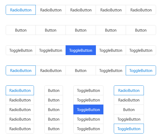
@mdtauk created this mockup:
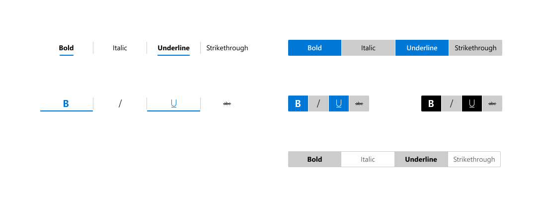
Mockups
Open Questions
- In what scenarios would a user need to (and be able to tell from the control's design) that they can select multiple items?
- Should each 'segment' adapt to content width, or all segments be limited to some default or developer-defined width?
- How should resizing be handled: in a dropdown menu (like NavView) or carouseling (like Pivot)?
- Could this be a restyle of RadioButtons? Likely not if we want to support multiple selection, swipe, carouseling, or other more complicated functionality

The pivot is more like a tab view. This control would be a multi-toggle button. It wouldn't necessarily be used to switch views.
The pivot is more like a tab view. This control would be a multi-toggle button. It wouldn't necessarily be used to switch views.
Are there any other examples of a segmented control being multi-select?
I see macOS supports it, and it is like a list of filters applied to a view. (iOS does not seem to support it)


The Segmented control is not really a concept in Windows UI, either Xaml or Win32. If you can find existing windows apps that would benefit from this kind of control, it would be helpful to judge how necessary this suggestion would be to the community.
If it were to be implemented, the Pivot control could be given a multi-select behaviour, and the Pivot could be moved from a view switcher, to allow for a filtering situation (which is part of what it was originally envisaged to be)


Its not about filtering.
I see this regularly in applications with complex UI, especially if they are visual editing tools. I've even seen it in Microsoft products like the Expression Blend/Design tools, though the edges aren't always rounded. Blender had this kind of visual grouping of controls for a very long time.
Its basically about grouping checkboxes and radiobuttons together visually, like you used to do on a classic Windows toolbar with seperators, except that it is a more modern style. Note that they don't have to be restricted to horizontal stack, vertical makes just as much sense (and are also used in practice).
I also used it a few times myself in WPF, using existing checkbox/radiobutton controls and adjusting their frames to visualize that they belong together. Obviously its very tedious to achieve manually, especially when UI is dynamic and its not fixed which control is the last in the list and needs its edges rounded.
I understand the visual style is something to argue about, but what I think is missing is an easy way to group checkbox / radio buttons together so they can be restyled as one unit. You can do it but its a lot of work. What you want is something as easy as restyling a listbox, except that you can't use a listbox because it changes selection with focus. You could think about it as a restyled listbox-like control with single/multi selection where you have to explicitly confirm that you change selection.
Its not about filtering.
Well the control is used for filtering as well as applying multiple attributes to a selection, and any number of other uses.
I see this regularly in applications with complex UI, especially if they are visual editing tools. I've even seen it in Microsoft products like the Expression Blend/Design tools, though the edges aren't always rounded. Blender had this kind of visual grouping of controls for a very long time.
I encounter it a lot too, but it is still useful to gather any uses that Microsoft have had for such a control UX - to convince the WinUI team of the need for this kind of control. My linking it to the Pivot, was attempting to make it easier to sell.
Its basically about grouping checkboxes and radiobuttons together visually, like you used to do on a classic Windows toolbar with seperators, except that it is a more modern style. Note that they don't have to be restricted to horizontal stack, vertical makes just as much sense (and are also used in practice).
The control would need to work as Icons, Text, and combinations of the two - and would need to visually align to the Fluent design. The RadioButtons control came about out of a need, and this control would be a similar group, with a shared item template, and support both single select and multi-select behaviour.
I also used it a few times myself in WPF, using existing checkbox/radiobutton controls and adjusting their frames to visualize that they belong together. Obviously its very tedious to achieve manually, especially when UI is dynamic and its not fixed which control is the last in the list and needs its edges rounded.
I understand the visual style is something to argue about, but what I think is missing is an easy way to group checkbox / radio buttons together so they can be restyled as one unit. You can do it but its a lot of work. What you want is something as easy as restyling a listbox, except that you can't use a listbox because it changes selection with focus. You could think about it as a restyled listbox-like control with single/multi selection where you have to explicitly confirm that you change selection.
The list of Musts on the original issue, could be finessed to the point where visually it can be made to fit the Fluent design language. I would imagine this control would use an ItemRepeater, as most of these ListView based controls are moving to use it.
I would like to see this control exist, but it would need to visually align to the design language - and be flexible enough to cover most scenarios.
I see where you are going. From a quick check all examples I find in the fluent design language are using separators and not framing to group buttons that belong together. (Context menus like you've shown, Ribbons use grouping but with seperators, etc.) Since there's no common frame they are not running into the problem of not having a control for this kind of grouping.

What would the accessibility story look like here? would it report as a collection of items, would it report out selection states?
@kikisaints This looks pretty similar to radio buttons, but maybe with multi select. @chigy has some ideas.
Trying to draw parallels to existing controls behavior:
- I would expect the control to have an accesibility name so it can report the same grouping that is implied visually. How do Ribbon groups report themselves to accesibility?
- Individual items in a group can either behave as single select (radio buttons) or multi select (checkboxes) depending on control configuration. I don't know how radio buttons usually report themselves to be differentiable to checkboxes, but in single select mode it should behave similarly here.
This control would appear to be an amalgamation of various alternative UX approaches, except contained within a single control.
When considering how behaviours should be handled, we can look to these and see how they are handled there. If this control were to be added, it should cover most of these scenarios below.
-
AppBar / CommandBar with Toggle buttons (multi-select)

-
RadioButtons (single select)

-
The Pivot (detached from the pivot view switching for single select)

-
ToggleMenuFlyout (for multi-select)

btw if anyone is here thinking of pivots (this proposal is not about navigation), please vote for #940
Pivots are the most lightweight visually for this purpose. Perhaps they need to be separated from their view changing?
Pivot becomes just the selection of headings, and a PivotView uses the Pivot with PivotItemViews containing content?
I found a good example of where this is needed. In a color picker it is necessary to switch between RGB/HSV color representation. In the in-box ColorPicker this is done with a ComboBox. However, in the ColorPickerButton that ComboBox would need to be in a flyout. A ComboBox within a flyout is bad UI-design and it also has UWP bugs (#1467).
To fix this I thought to switch to RadioButton. However, then I ran accross more UWP bugs that don't allow this to work (#1299 and #2081). So finally, I had to switch to ToggleButton. ToggleButton actually visually look the best -- the only problem is it's not really the intended use case.

I also realize: RadioButtons are good for vertically stacked elements only. Horizontally stacked elements really could use this segmented control.
Could you turn those scrollbar thumbs into circles? They kind of look weird as capsules
Segmented control seems like a good choice there, at least until ComboBoxes work within flyouts.
I would suggest you figure out the design of it, as it looks weird as two separated buttons. Pivot would work there, but only without the view area
Could you turn those scrollbar thumbs into circles? They kind of look weird as capsules
We should probably discuss that over on the toolkit. I asked for some opinions over there on that but didn't get any feedback. I'm trying not to make it look too much like iOS although circles entirely within the track did cross my mind. This is more of a blend with the Windows style right now.
I would suggest you figure out the design of it, as it looks weird as two separated buttons. Pivot would work there, but only without the view area
Design wasn't done at all and I just made it functional. I do plan to make it look more like a segmented control which is why I had the thought to post the example here.
Segmented control seems like a good choice there, at least until ComboBoxes work within flyouts.
The problem with ComboBoxes is, as you've said in the past, they shouldn't really go inside a flyout. Nested flyouts aren't ideal. Additionally, a ComboBox doesn't show all information -- it only shows what is selected. In this use case that is also not ideal.
Edit: Here is what I'm going with for now. The segmented control might be good to add to the community toolkit first as well. I might take a look at that myself.

Could you turn those scrollbar thumbs into circles? They kind of look weird as capsules
We should probably discuss that over on the toolkit. I asked for some opinions over there on that but didn't get any feedback. I'm trying not to make it look too much like iOS although circles entirely within the track did cross my mind. This is more of a blend with the Windows style right now.
Some ideas for the pivot/segmented control
 (Fluent UI)

 (Fluent UI iOS)
 (Fast Design - default look)
 (Bootstrap Button Group)
Thinking about it, ButtonGroup seems like a good solution, in the same way you have the RadioButtons control
Creates a list of Buttons or ToggleButtons, connected together, with just strings, icons or strings with icons.
 (Solid by Buzzfeed)
@mdtauk Good examples. I do think it's important that this 'ButtonGroup' or 'SegmentedControl' is differentiated from a TabView or Pivot. A TabView/Pivot is fundamentally for switching between views. This 'ButtonGroup' is for switching between settings. Conceptually they are two different things and used in different cases.
It also came to my attention that HandyControls already has an example of this control for WPF.
https://github.com/HandyOrg/HandyControl#buttongroup
Is this being worked on? I think the library would great benefit from a control like this but it's been months without any update.
I was able to get something close using XAML Studio:

Few open issues on RadioButtons which if resolved would make this a lot easier. Certainly seems like a good route to go to provide an alternate style for this vs. a whole new control?
Test Gist here for those interested: https://gist.github.com/michael-hawker/06bda503efa14fbb2a84896643c21959
@michael-hawker Cool design, its great this can be done with a restyling of radio buttons. However, what about the case where multiple segments are selected? This is the reason other WPF libraries (handy controls) have both a radio-buttons version and a toggle-buttons one.
@robloo great point! I forgot about the multi-select scenario. I was just focused on the single-select scenario first, as @sonnemaf tweet was what got me thinking 🙂: https://twitter.com/fonssonnemans/status/1334606237820985345
Other frameworks have called it a Button Group. So ideally such a control would use ToggleButtons for a multi-select scenario - but RadioButtons for single-select.
There would need to be support for Text, Icons, or Text and Icon - if it were to be a flexible control.
I believe a SelectionMode { Single, Multiple } property would solve this issue, but then the base control would (theoretically) be a List.
ButtonGroup.Item ButtonGroup.Item.IsSelected ButtonGroup.SelectionMode - SelectionMode.Single | SelectionMode.Multiple ButtonGroup.Item.Style / Template - Selected, Unselected, PointerOver, Pressed, Disabled etc ButtonGroup.Container (probably a StackPanel) ButtonGroup.Orientation maybe
@mdtauk Great API! Like the naming too as it uses existing conventions and works for both radio and toggle button concepts.
Taking this proposal over from @kikisaints , thank you to everyone for your comments so far! I've updated the proposal, including the mock-up that @mdtauk shared. I'd particularly appreciate your thoughts on the following open questions:
- In what scenarios would a user need to (and be able to tell from the control's design) that they can select multiple items?
- Should each 'segment' adapt to content width, or all segments be limited to some default or developer-defined width?
- How should overflow items be handled, in a dropdown menu (like NavView) or carouseling (like Pivot)?