fluentui
 fluentui copied to clipboard
 microsoft
Adds TextInput as a new web component
TextInput
An implementation of a text input as a form-connected web-component.
Design Spec
Link to Text Input Design Spec in Figma
Engineering Spec
Fluent WC3 Text Input extends from the FAST Text Field and is intended to be as close to the Fluent UI React 9 Input implementation as possible. However, due to the nature of web components there will not be 100% parity between the two.
Class: TextInput
Component Name
<fluent-text-input>
Variables
| Name | Description | Type |
|---|---|---|
TextInputSize |
Size variations for text input | { small: "small", medium: "medium", large: "large" } |
TextInputAppearance |
Appearance variations for text input | { outline: "outline", underline: "underline", filledLighter: "filled-lighter", filledDarker: "filled-darker" } |
TextInputType |
Text input types | { email: "email", password: "password", tel: "tel", text: "text", url: "url" } |
Fields
| Name | Type | Default | Description |
|---|---|---|---|
appearance |
TextInputAppearance |
outline |
Sets appearance of text input. |
autofocus |
boolean |
false |
Indicates element should get focus after the page finishes loading.. |
disabled |
boolean |
false |
Disables text input |
list |
string |
Allows associating a datalist to an element by id |
|
maxlength |
number |
The maximum number of characters a user can enter | |
minlength |
number |
The minimum number of characters a user can enter | |
name |
string |
The name of the control | |
pattern |
string |
A regular expression the text input's contents must match in order to be valid | |
placeholder |
string |
An exemplar value to display in the text input field whenever it is empty | |
readonly |
boolean |
false |
The text input should be submitted with the form but should not be editable |
required |
boolean |
false |
Sets the text input as required |
size |
InputSize |
medium |
Sets the size of the text input |
spellcheck |
boolean |
false |
Controls whether or not to enable spell checking for the text input, or if the default spell checking configuration should be used |
type |
TextInputType |
TextInputType.text |
Sets the size of the text input |
current-value |
Stores the current value of an input element. link: current-value RFC |
Methods
| Name | Privacy | Description |
|---|---|---|
select |
public | Selects all the text in the text field |
validate |
public | {@inheritDoc (FormAssociated:interface).validate} |
Events
| Name | Type | Description | Inherited From |
|---|---|---|---|
change |
Fires a custom change event |
Attributes
| Name | Field |
|---|---|
appearance |
appearance |
autofocus |
autofocus |
list |
list |
maxlength |
maxlength |
minlength |
minlength |
pattern |
pattern |
placeholder |
placeholder |
readonly |
readonly |
size |
size |
spellcheck |
spellcheck |
type |
type |
Slots
| Name | Description |
|---|---|
start |
used to place content at the start of the text input within the input border |
end |
used to place content at the end of the text input within the input border |
| The default slot for text input content |
Additional Styling Variations
For performance considerations, we have avoided the addition of explicit attributes for appearance variations that modify only one CSS property. Instead, opting to provide guidance for users to apply their own CSS to achieve these appearance variations.
Block v.s Inline
The Fluent UI TextInput component offers two appearance variations for the display property - block (default) and inline. To achieve the inline variation, users should apply their own custom CSS.
/* all instances */

fluent-text-input {
  display: inline-flex;
  align-items: center;
}

/* class instances */

fluent-text-input.inline {
  display: inline-flex;
  align-items: center;
}
Accessibility
WAI-ARIA Roles, States, and Properties
This component supports ARIA attributes that inherit from the ARIA Global States and Properties.
Preparation
Fluent Web Component v3 v.s Fluent React 9
Component and Slot Mapping
| Fluent UI React 9 | Fluent Web Components 3 |
|---|---|
<Input> |
<fluent-text-input> |
contentBefore |
start |
contentAfter |
end |
Asset size changes
Size Auditor did not detect a change in bundle size for any component!
Baseline commit: 94f4ec8598a9e34e3ab799f4f5899d5b8dddb645 (build)
![size-auditor[bot] avatar](https://avatars.githubusercontent.com/in/13711?v=4 "Published by a pub.dev verified publisher")
This pull request is automatically built and testable in CodeSandbox.
To see build info of the built libraries, click here or the icon next to each commit SHA.
Latest deployment of this branch, based on commit e01a615faa35b9678d1fe32742a6651264dcaaef:
| Sandbox | Source |
|---|---|
| @fluentui/react 8 starter | Configuration |
| @fluentui/react-components 9 starter | Configuration |
![codesandbox-ci[bot] avatar](https://avatars.githubusercontent.com/in/38409?v=4 "Published by a pub.dev verified publisher")
Design review
| # | Issue | Category | Screenshot |
|---|---|---|---|
| 1 | Pressed state causes a vertical shift in the input contents. The selected indicator should overlap the bottom edge of the input border | Sizing | 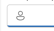 |
| 2 | Edges of the bottom borders seem to curve up slightly (both pressed and rest) but should run straight across | Appearance |  |
| 3 | Icon sizes are a bit off. Should be 16x16, 20x20, 24x24 for S, M, L sizes respectively | Sizing |  |
| 4 | Underline styling shouldn't show a border on pressed state | Appearance | 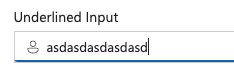 |
| 5 | Large input padding should be 12px instead of 10px | Sizing |  |
| 6 | Font size is rendering too small on medium | Sizing | 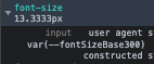 |
| 7 | Filled appearance variants should have a shadow and no shadow version | Appearance | |
| 8 | Filled appearance variants should not display a whole border on pressed/focus | Appearance | 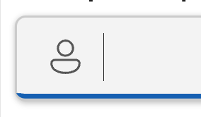 |
| 9 | Inline input alignment is slightly off, causing the text baseline to be misaligned | Styling | 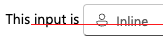 |