fast
 fast copied to clipboard
 microsoft
Remove prescriptive nature of the Select when rendering the listbox
🙋 Feature Request
Remove Prescriptive Nature of the Select when rendering the listbox
As a developer using the FAST Select component, I would like to have more flexibility in customizing the rendering of the component when the multiple attribute is present. Currently, the FAST Select component forces the listbox to render without the 'dropdown' appearance when the multiple attribute is set. It would be ideal if the Select component was less prescriptive in terms of rendering the listbox allowing developers to easily customize the appearance of the FASTSelect according to their needs. Further adding placeholder functionality and multiple selected option rendering in control.
Display Multiple Selected Options in Control
Additionally, I would like to request a feature for the FAST Select component when the multiple attribute is present. Currently, when multiple items are selected in a multi-select dropdown, there is no indication of the selected items in the control text (the visible part of the dropdown when it's closed). This can be confusing for users as they cannot see their selected items without opening the dropdown.
The proposed feature should allow developers to configure the display of selected items in the control text. For example, the selected items can be displayed as a comma-separated list (e.g., "Option 1, Option 2, Option4").
This feature would improve the user experience by providing a clear and customizable representation of the selected items in the control text, making it easier for users to understand their selection without having to open the select each time.
Placeholder Content
I would like to request a feature for the FAST Select component to support placeholder text when in multiple select mode and rendered as a "dropdown". Currently, the FAST Select component does not provide a built-in way to display a placeholder when no items are selected specifically in multiple select mode. This feature would improve the user experience by providing a clear indication of the expected input or prompt the user to make a selection when multiple items can be chosen.
The proposed feature should allow developers to define a placeholder property for the FAST Select component when the multiple attribute is set. When no items are selected in multiple select mode, the placeholder text should be displayed in the control text (the visible part of the dropdown when it's closed). The placeholder text should have a distinct appearance (e.g., lighter text color) to differentiate it from the actual selected value(s).
To implement this feature, the FAST Select component should be updated to include a new placeholder property. The component should also include logic to display the placeholder text in the control text when no items are selected and the placeholder property is set, specifically for the multiple select mode.
🤔 Expected Behavior
Refactor rendering logic: Update the rendering logic of the FAST Select component to not force the listbox to render without the 'dropdown' appearance when the multiple attribute is present.
😯 Current Behavior
The current behavior of the FAST Select component is that when the multiple attribute is present, it forces the listbox to render without the 'dropdown' appearance. This means that the listbox is displayed as a plain list of items without any dropdown control or styles associated with it.
In this scenario, developers have limited control over the appearance of the FAST Select component when the multiple attribute is used. The component's rendering logic is prescriptive, and it doesn't offer the flexibility to easily customize the appearance of the listbox with custom CSS while maintaining the core functionality of the component.
As a result, developers looking to use the FAST Select component with the multiple attribute might find it challenging to achieve the desired visual representation of the component, especially if they want the listbox to maintain the 'dropdown' appearance.
🔦 Context
The Fluent v9 Select component allows for multiple option selection while maintaining the "dropdown" visual appearance. The prescriptive nature of the FASTSelect does not allow this.
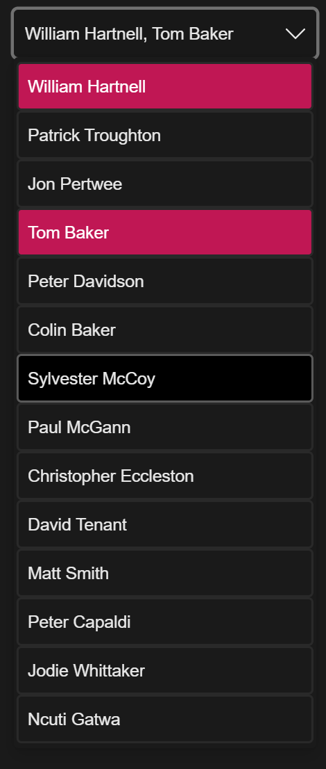
Example
Proposed Select with multiple attribute
Questions
Do we want to remove the prescriptive nature of both the multiple and size attributes?
- The Select by default would always render as a "dropdown".
- The size attribute could still be used to inform the size of the Listbox.
- We would need to provide an easy way for devs to hide the control and display the listbox ( CSS? ).
Did you mean to close this issue? It seems like a reasonable feature request…
Did you mean to close this issue? It seems like a reasonable feature request…
Hey, no I just meant to edit it a bit. It should be good to go now.
@brianchristopherbrady - I love these changes and we have a need for them as we're currently working on providing this option as well. Any updates on your PR status?
Unfortunately @microsoft/fast-foundation is being deprecated, refer to #6955. I see this was mentioned in a PR, we will be addressing open PRs and merging what we can before we snap an archive branch to preserve the latest state of Foundation, however to bring us up to date I am closing out issues.