Azure Storage picker is slow and UX could be improved
Version
4.3.3.57327
Describe the bug
Azure Storage explorer picker does not let me a. pick my tenant b. pick my subscription c. pick my storage account. The more important you are as a customer the more likely you are to have multiple accounts to pick.
- Enumerating all resources is NOT acceptable
- Showing me a giant blob of storage accounts is NOT acceptable
To Reproduce
Steps to reproduce the behavior:
- Add Storage accounts as ME
- WAIT FOR EVER
- Scroll through a list of 1000s of storage accounts.
- Delete the software, quit your juob and go start a coconut shack on the beach, cause life isn't worth it.
Expected behavior
- drop down with tenant. Let me pick. Make the selection sticky.
- Drop down with subscriptions. They should alphabetically sorted. Let me pick. Make the selection sticky.
- Drop down with Resource Groups. They should be alphabetically sorted. Let me pick. Make the selection sticky.
- Drop down with Resources. They should be alphabetically sorted. let me pick.
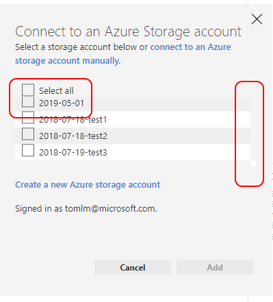
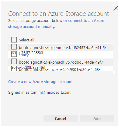
Screenshots
[bug]
@tomlm -
This was a placeholder widget until a more robust solution could be implemented. Azure storage accounts for a substantial user also takes 600+ api calls to retrieve which is the reason for the long delay. I brought this concern up very early on in the design and it was determined that we either needed to pull this feature altogether or leave it as-is until we could dedicate more design cycles for a permanent solution that addresses this.
All other service dialogs suffer from similar issues.
Merging in other 2 related issues that fall under the same category of Azure Storage Picker UX improvements: (#1491, #1492)
Layout needs improvement
- Layout doesn't have consistent spacing
- Scroll bar / word wrap / ellipsis truncation is missing for long entries