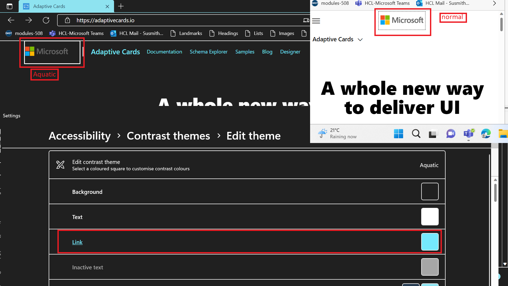
[Adaptive Cards]: "Microsoft" Link is not adopting the Aquatic theme of high contrast.
Target Platforms
Other
SDK Version
1.5
Application Name
Adaptive Cards
Problem Description
Test Environment: OS: Version 22H2 (OS Build 25197.1000) Edge Dev: version 107.0.1379.1 (Official build) dev (64-bit) Screen Reader: Narrator Application URL: [[https://adaptivecards.io/](https://adaptivecards.io/explorer/)
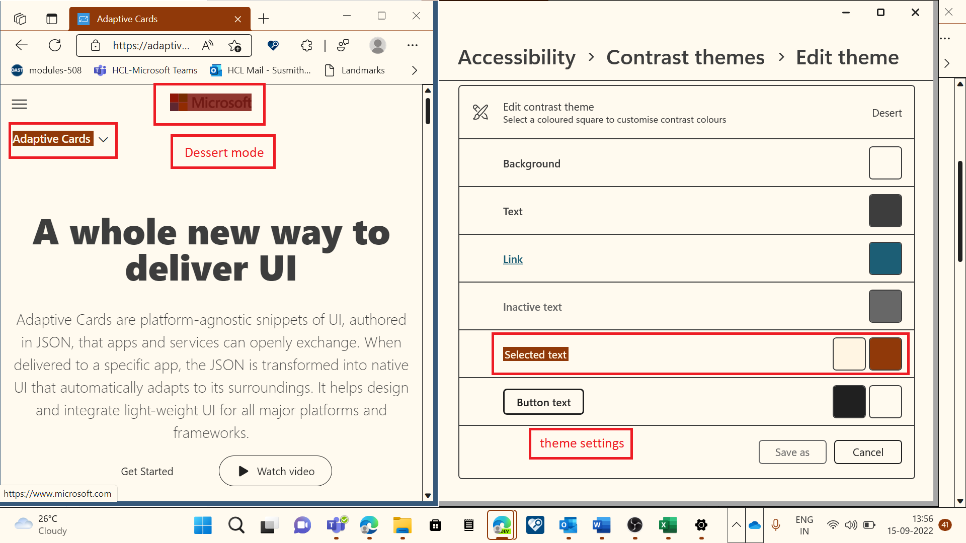
Pre-Requisites: Settings >Accessibility> Contrast themes> Aquatic themes.
Repro Steps:
-
Open above URL with V- credential.
-
Navigate to 'Microsoft' link using tab key in the "Navigation Landmark".
-
Observe the issue here.
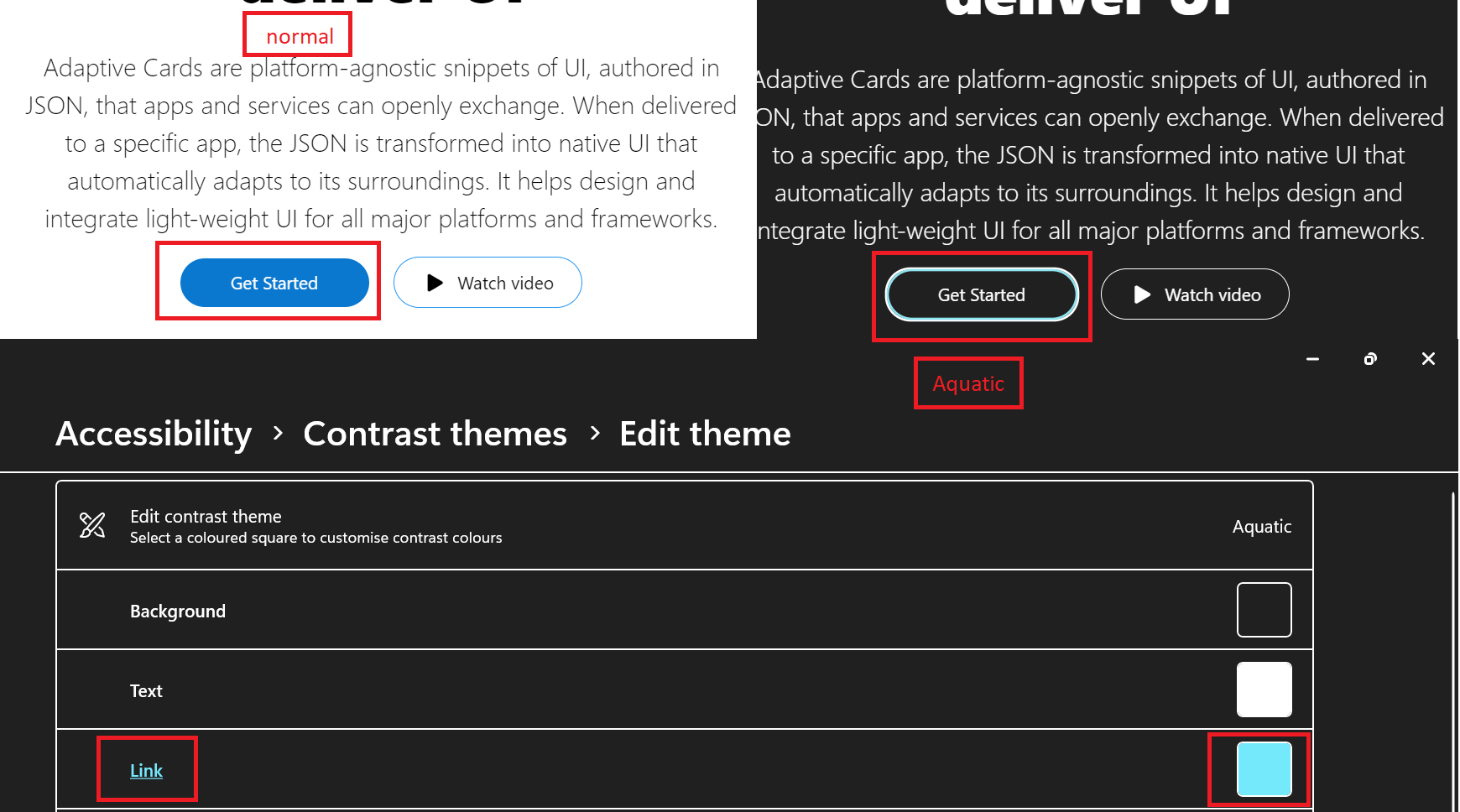
Actual Result: "Microsoft" Link is not clearly visible to the user in the aquatic/Dessert mode settings.
Expected Result: Microsoft Link should adopt the Aquatic/Dessert theme settings so that it will be clearly visible to the user.
Observation: Similar issue on "Get started" link and "Adaptive Card" link. 4.Adaptive Card text is not adopting the Aquatic settings 4.get started link in aquatic Same issue exists throughout the application wherever the similar controls present in the adaptive cards.
User Experience: Visual disable user and the normal user will get impacted as its very difficult to identify the link on the page as its not that clearly visible and not adopting the theme settings.
MAS Reference link: No Disruption of Accessibility Features - Liquid (microsoft.com)
"Have feedback to share on Bugs ? Please help fill Trusted Tester Bug Feedback (office.com) “.
Screenshots

Card JSON
NA
Sample Code Language
NA
Sample Code
NA