Incorrect emblem shape with some icon sizes
For example, with 52px icon size it looks like oval:

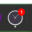
but with 48px it looks like normal (circle):

also 64px looks wrong:

Well, fact is that the emblem is not meant to be a circle, but to be a rounded rectangle that grows depending on the text inside it.
We could probably start it as rounded, but I wouldn't it consider a priority.
I think the problem is that the form is very different on different icon sizes and in some cases looks "skinny" and in other cases round. I would like them to look proportional with any icon size.
I tried displaying the emblem CSS, and it seems to look right in the browser. Is it possible that the font or GNOME somehow distorts this? https://github.com/micheleg/dash-to-dock/blob/89427a8ac0f685b8e0923a2574a344904e2aae8a/_stylesheet.scss#L381-L389
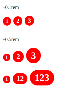
In comparison, 53px and 52px are different in shape, 53px is more rounded than 52px, although the difference is only 1px, and this is noticeable at certain size ranges.

And if you scale them to the same size, it becomes obvious that they are disproportionate, although it should have been since we are using em units: