Explore the vertical centering of radio buttons & checkboxes to their labels
Summary
Currently, in <ic-radio-option> & <ic-checkbox>, the radio & checkbox icons are vertically aligned to the centre of the label. Where are multiple radio options / checkboxes and one label wraps onto multiple lines whilst others are on a single line, there's a visual difference. This visual difference is even more obvious when radio options are displayed horizontally.

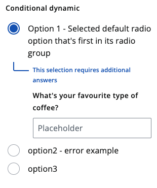
If all radio button & checkbox icons were to be aligned to the top of the label, this would present an issue visually in the conditional variants.
💰 Use value
Visually, these two components would look better. This work could also reduce mental load on our customers as it could mean that radio buttons & checkboxes are always in the same location regardless of its label's length.