 mi6
mi6
Update select guidance to include reasoning for using native select on mobile / tablet devices
Summary
The select component is rendered as a native <select> on mobile or tablet devices. This means that some of the functionality that exists on the custom select is not available on these devices. Anyone using the select may not be aware of this so the guidance needs updating to inform people about this and the reasoning why it has been implemented this way.
💬 Description
Suggested updates:
- Inform readers that the select is rendered as a native
<select>on mobile and tablet devices - Explain that this means that some functionality is not available on these devices. This includes the following:
- A clear button - instead, the placeholder option (default = 'Select an option') is always enabled so it can be reselected (when the 'show-clear-button' prop is not applied, this option is disabled so cannot be reselected)
- Descriptions on options
- Recommended options (on the custom menu, these are displayed at the top with a line to separate them from the others)
- All filtering functionality usually available via enabling the 'searchable' prop
- Explain the reasoning behind this, e.g. maybe something along the lines of:
- A native select provides better usability for mobile and tablet users as the menu displays as a modal or a large menu which always provide a sufficient touch target size for each option than when using the custom menu and makes it easier to navigate through the options.
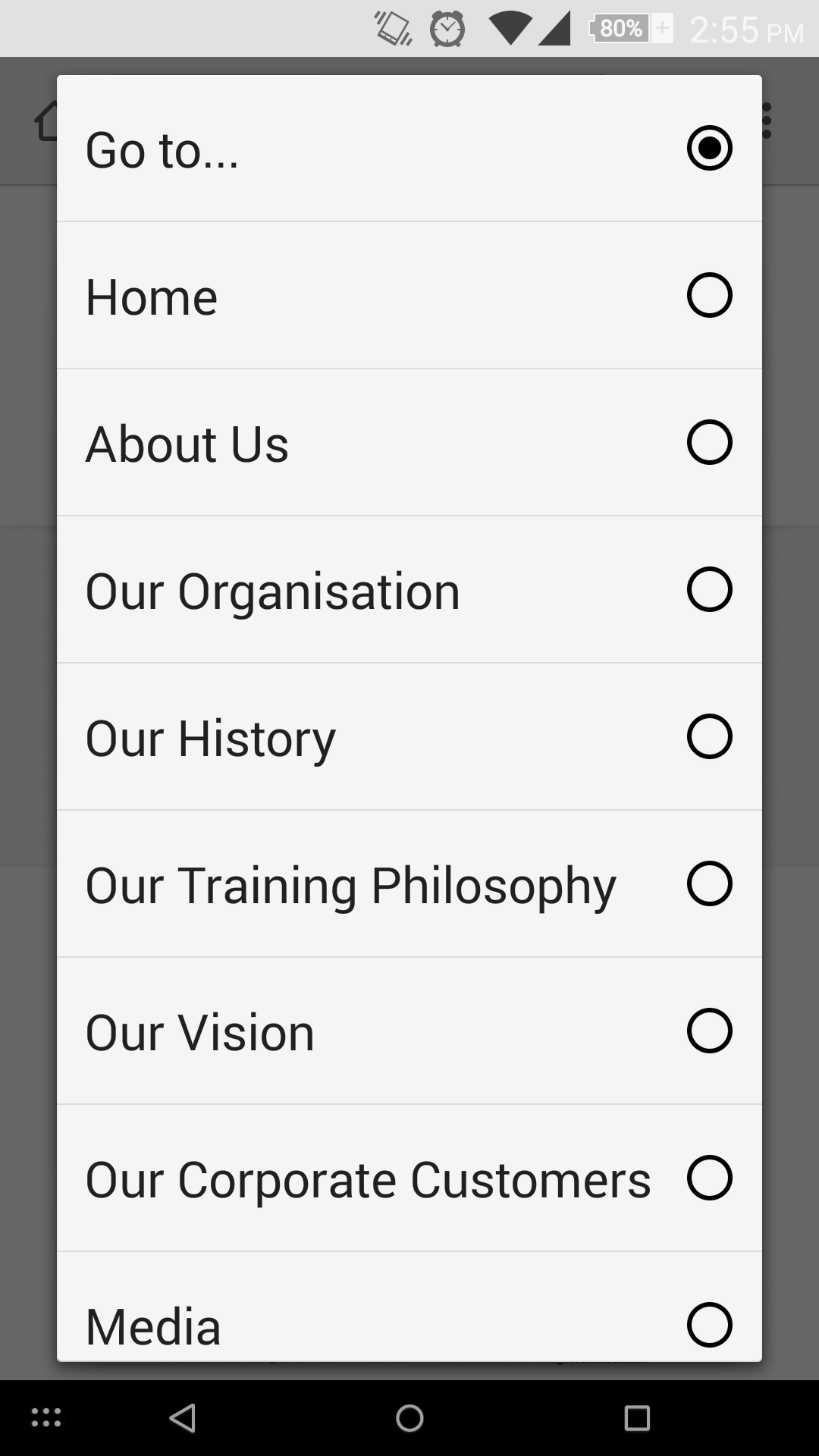
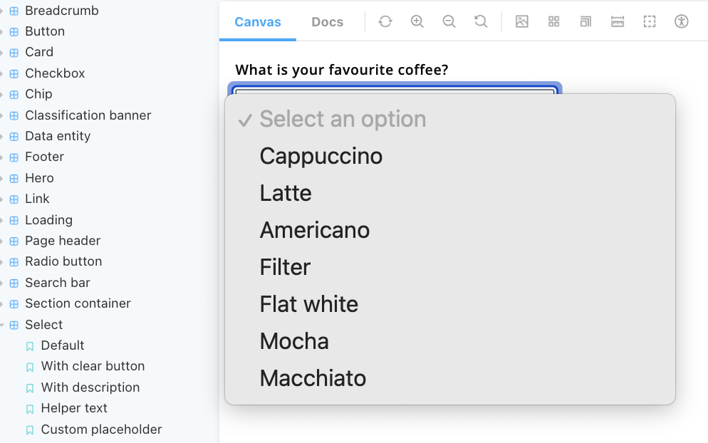
(For clarity, a native select might look a bit like the below image on a mobile screen. After a quick test on a tablet device, for devices with a large screen, it appears as a menu next to where the select is on the screen, a bit like the image underneath - this is why I said "modal or large menu".)
Perhaps this could be added in a new 'Mobile and tablet devices' section on the 'Guidance' tab for the select component? (Open to discussion).
Ensure that the guidance matches the writing / content style of other guidance.
💰 Use value
This will raise awareness about how the select will appear to mobile and tablet users and the fact that some functionality won't be available. It will also provide the necessary information to those who are interested in the reasoning behind why the select has been implemented like this.