vscode-git-graph
 vscode-git-graph copied to clipboard
Adding branch colors on all commits
First of all,thanks for all the things you done. This is really a useful extension on vscode.I used to use GitKraken on my repo but i think i don't need to use any other git GUI anymore. 👍
Describe the improvement that you'd like
When my project have more than one branch,i think it's quite difficult to check the commit by looking the node left side and find out which branch it belongs to.
I think maybe we can puts the colors of branch on every commit, like GitKraken.
So we can easily distinguish when reading all commits.
Additional context (optional) Add any other context or screenshots about the improvement here.
Thanks for the feedback on the extension!
The feedback I have gotten from the vast majority of Git Graph users is that they find the current UI more than adequate to identify which branch each commit is on, no one else has found the current approach "quite difficult".
Implementing this feature itself would be relatively easy, and could be enabled by an extension setting. The challenge is to come up with a useful way of colouring the commits that suits the Git Graph UI (which is quite different from GitKraken). I'm just not sure how much benefit it adds based on all the prior feedback I've received (indicating it isn't necessary).
Note to others reading this: I'd be more than happy to add this feature if I get an indication that a decent portion of users would like it. If you'd value this, please like the first comment on this thread so I can gauge user interest.
Actually "quite difficult" is too exaggerated, this is just my personal opinion 😅 In contrast to other issues, it's not very important I know. But still hope you can add this feature in a proper way and maybe make this as an option to let user decide to open it or not.
Still thanks for your reply.
I overlooked this and just opened another almost identical issue. To streamline discussion, let me just paste my main points over here:
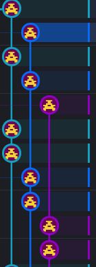
It is hard to parse which branch a commit is on – the visual cue (the small circle in the graph) is not very prominent and also far away from the commit message. This often requires the user to zig-zag their visual focus between the commit message and the graph.
It would be good if the color of the branch extended closer to the commit message, so that it is clearer which commits are on the same branch. [...] The Gitkraken interface is very elegant about extending the color all the way to the commit message, which makes it very easy to understand.
So in short, I'm putting in my vote for this feature.
based on all the prior feedback I've received (indicating it isn't necessary)
As a last comment: Don't forget that much of the feedback you get from current users will be coming from people who were already sort of fine with the state of things, so there's a selection bias at work. "Not necessary" also isn't the same as "sufficient and intuitive", and long-term users also tend to get worse and worse at judging it. Gitkraken really put in a lot of work to make their UI extremely smooth and understandable for new users (and other people who many open-source enthusiasts would consider dummies). It's definitely worth taking note and learning from their example.
Also having an option to fix colors on certain branches would make it easier to spot them quite quickly. e.g., red for main, orange for staging, etc...
Also having an option to fix colors on certain branches would make it easier to spot them quite quickly. e.g., red for main, orange for staging, etc...
See #809