metacpan-web
 metacpan-web copied to clipboard
Update the layout for https://metacpan.org/
Attached are some potential updates to the layout of https://metacpan.org/.
The branch dhogan8/update-layout is still a WIP pending feedback, but here is a list of some potential changes so far:
- Update header and remove icons
- Create a simple footer and remove sponsors
- Move the search to the nav menu except for the homepage
- Update the sidebar and change the screen size it toggles Note: I haven't tested this layout on all pages yet.
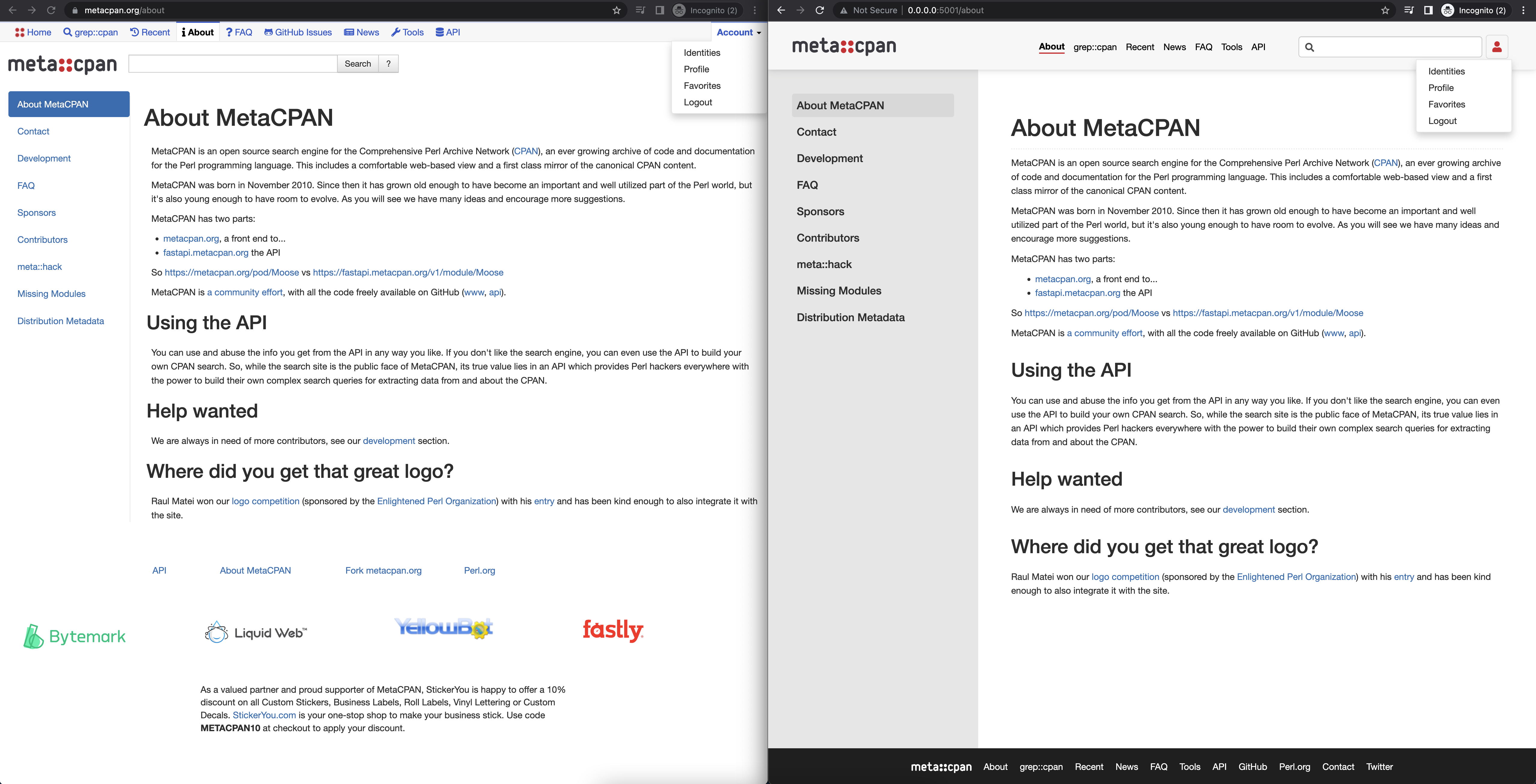
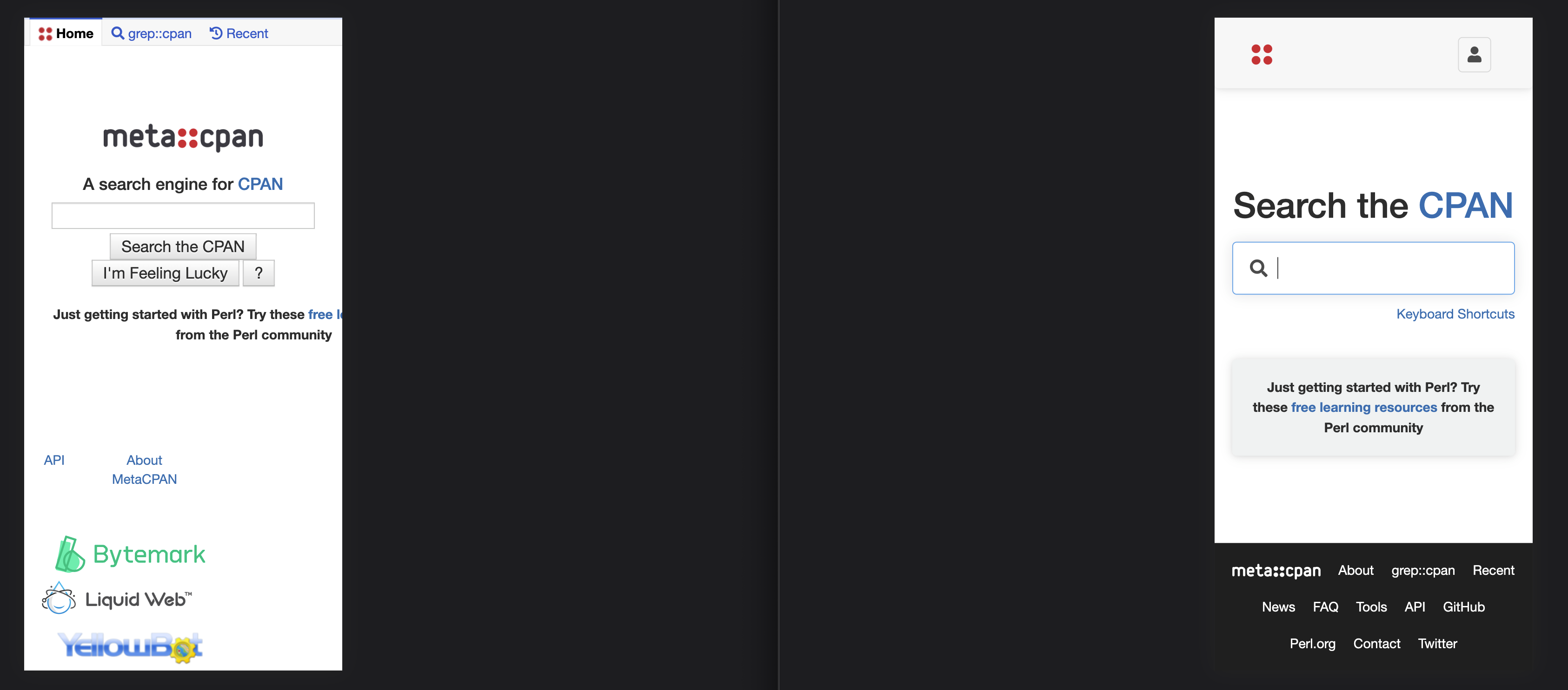
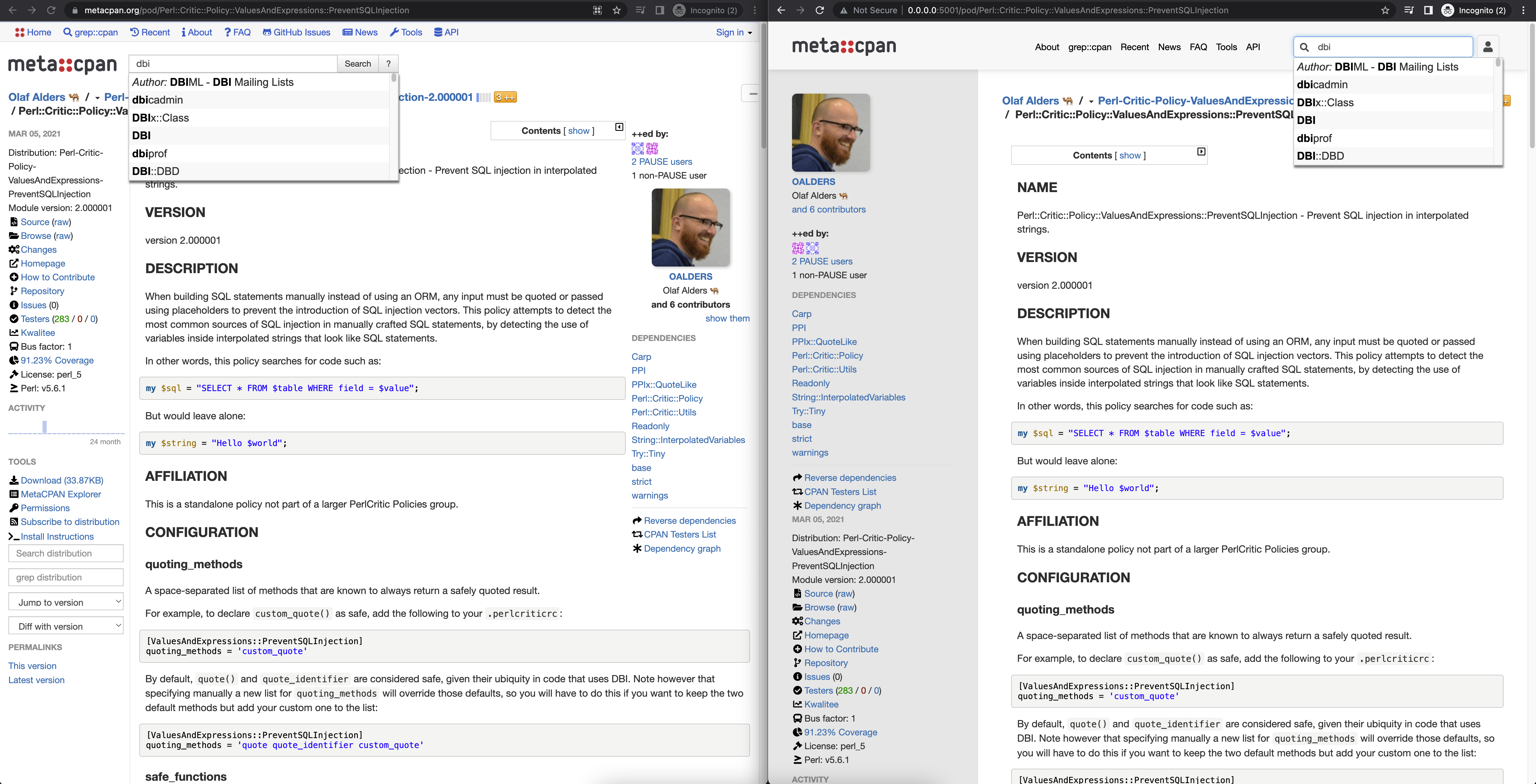
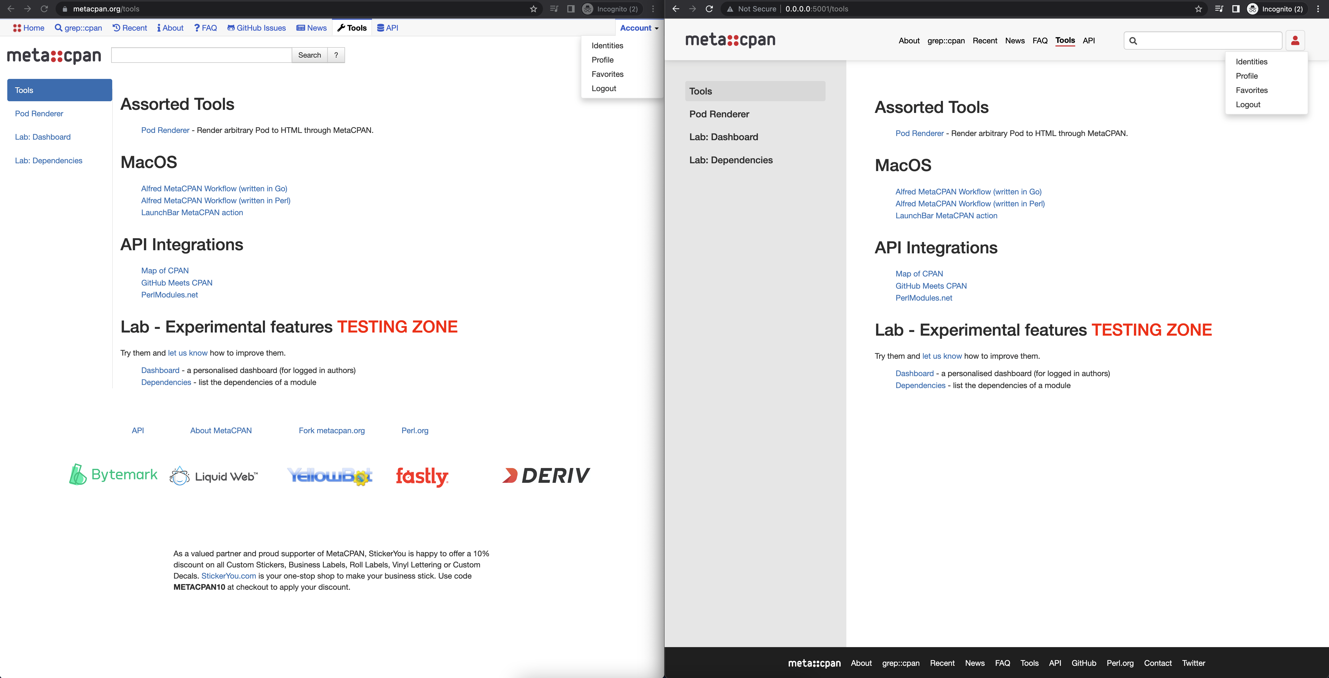
I really like moving the search box to the top menu. Also the login on the top right seems much more compact and cleaner. This is going to look great on smaller devices.
As far as tweaks go, we will need to preserve the sponsor logos in the footer and probably the StickerYou text as well.
I like the general reorganization. Simplifying the header and moving items to the footer, and fixing some of the responsive design elements. Removing the dual sidebar thing.
We won't be able to remove the sponsor logos, so they will still need to be included in some form. Fixing them to work properly with the responsive design would be helpful.
Some of the files modified are vendor files, like bootstrap, which we won't want to modify. Hopefully it's reasonable to make the needed changes without touching those. I've wanted to switch to using SCSS and upgrading bootstrap for a while - that may help or hinder this.
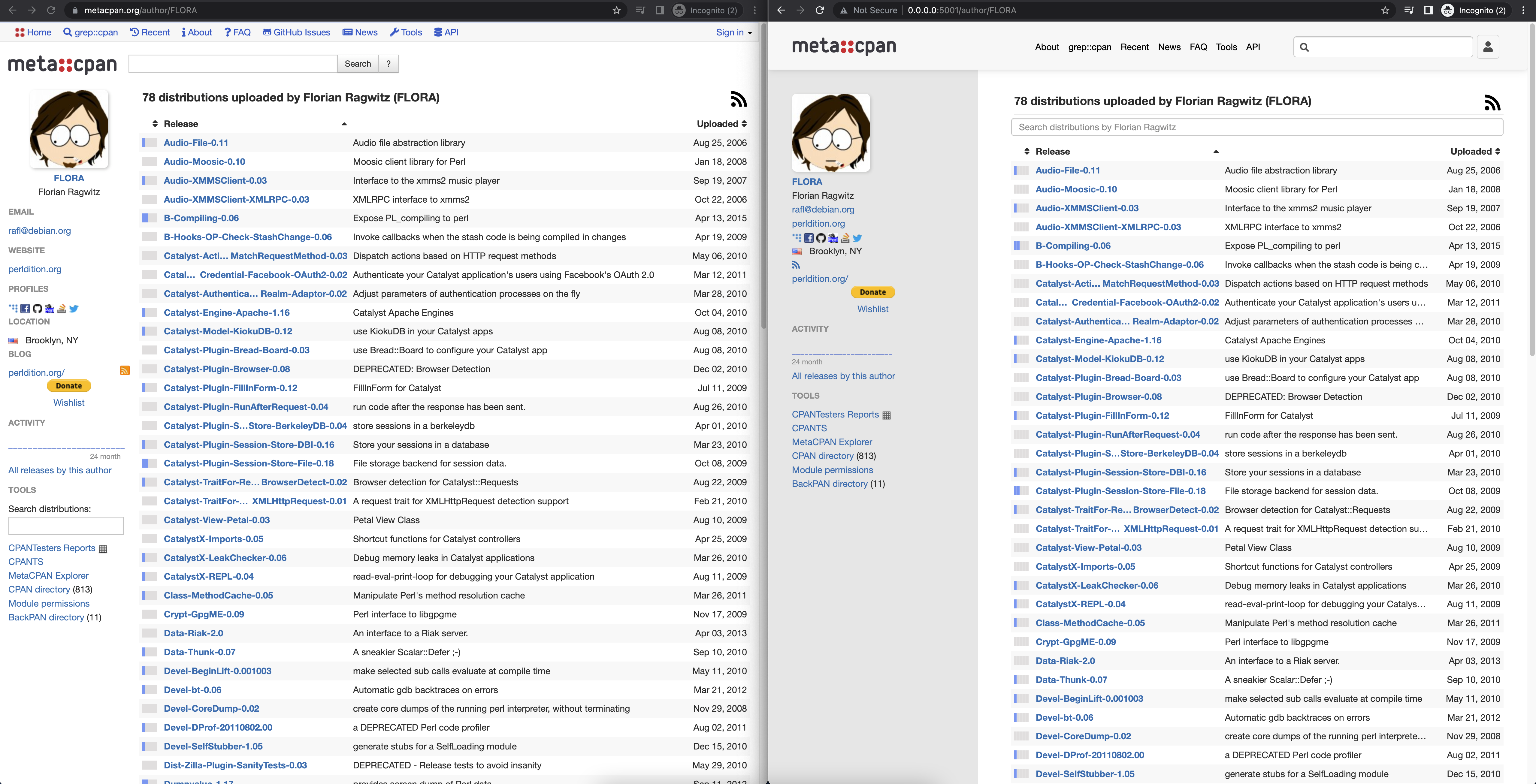
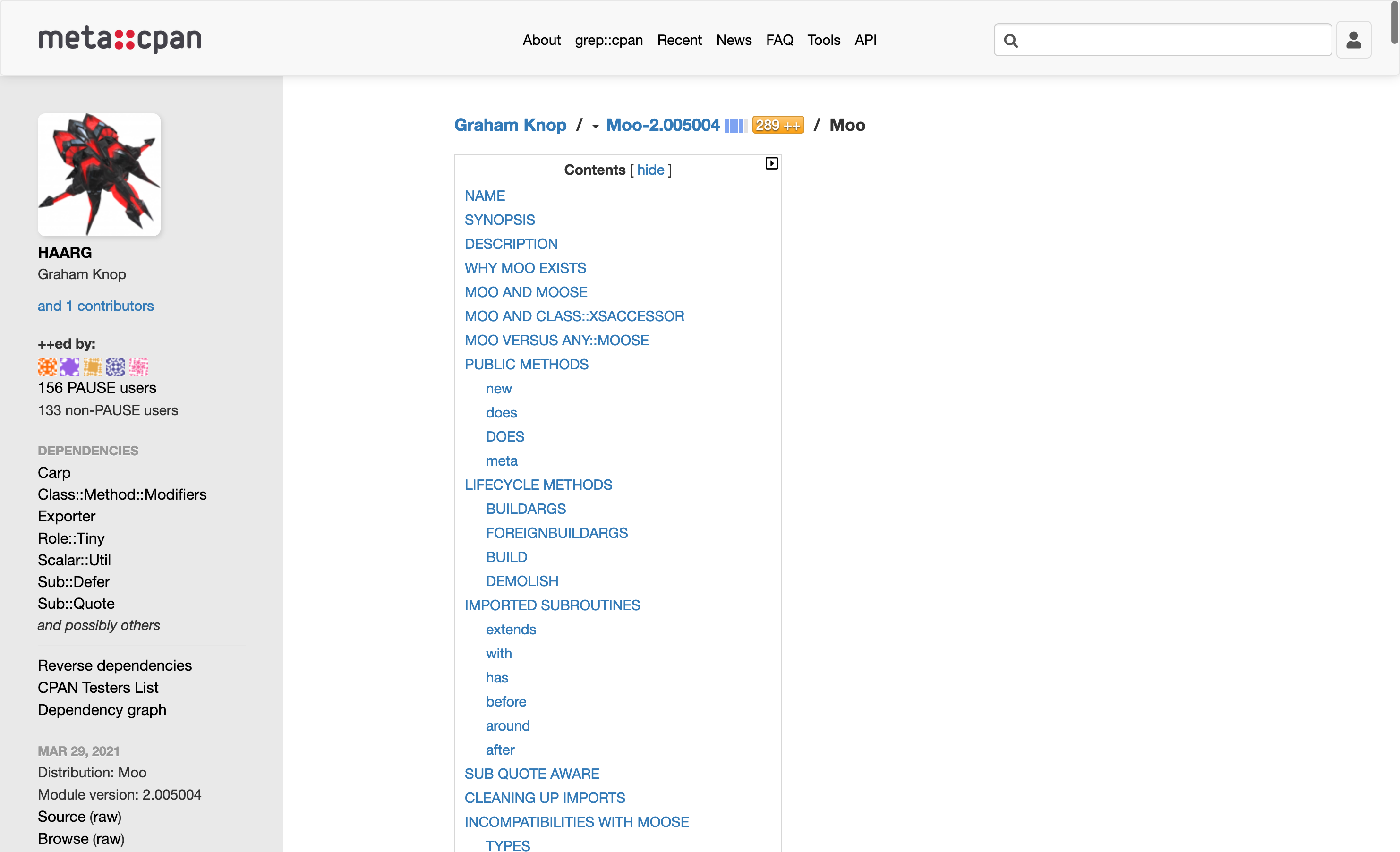
Combining the sidebars is obviously still rather rough. I think we can remove some of the elements like contributors and plussers and link to external pages for them instead. Reordering the other elements could help as well. It is still a lot to have in one list though. There are a few categories of items. Informational, internal navigation, and external navigation. Some of those could possibly go elsewhere that wasn't a sidebar. Maybe some could be removed and placed only on the distribution page, rather than every module page.
The sidebar also seems to have a lot of empty space. Maybe that's OK, and I wouldn't notice if I wasn't so used to the current design. Maybe it would make sense to increase the font size slightly. There aren't many parts of the sidebar that can end up excessively wide. One is the distribution name, but I'm not sure it belongs there to begin with.
I'll try to try the branch out and give some more feedback later. Thanks a lot for working on this. Various parts of the UI have been rather rough for a while, and this feels like a good start at resolving them.
Thanks for the feedback!
Regarding the StickerYou and sponsors in the footer, here is a different potential layout. I'm not sure if the wording of the StickerYou needed to be exactly the same or could be stripped down a little bit.
I went ahead and moved the changes previously made to the Bootstrap less files into the into the root/static/less/ files.
I agree the sidebar needs quite a bit of work. Some thoughts:
- I made the sidebar a bit wider than what it previously was because I set a max-width on the content for easier readability. As a result, this lead to more white space and the potential for a slightly wider sidebar. I think the extra space is okay because it allows some of the list items to breathe a bit more, which also allows for easier readability.
- Increasing the font-size a bit indeed makes sense.
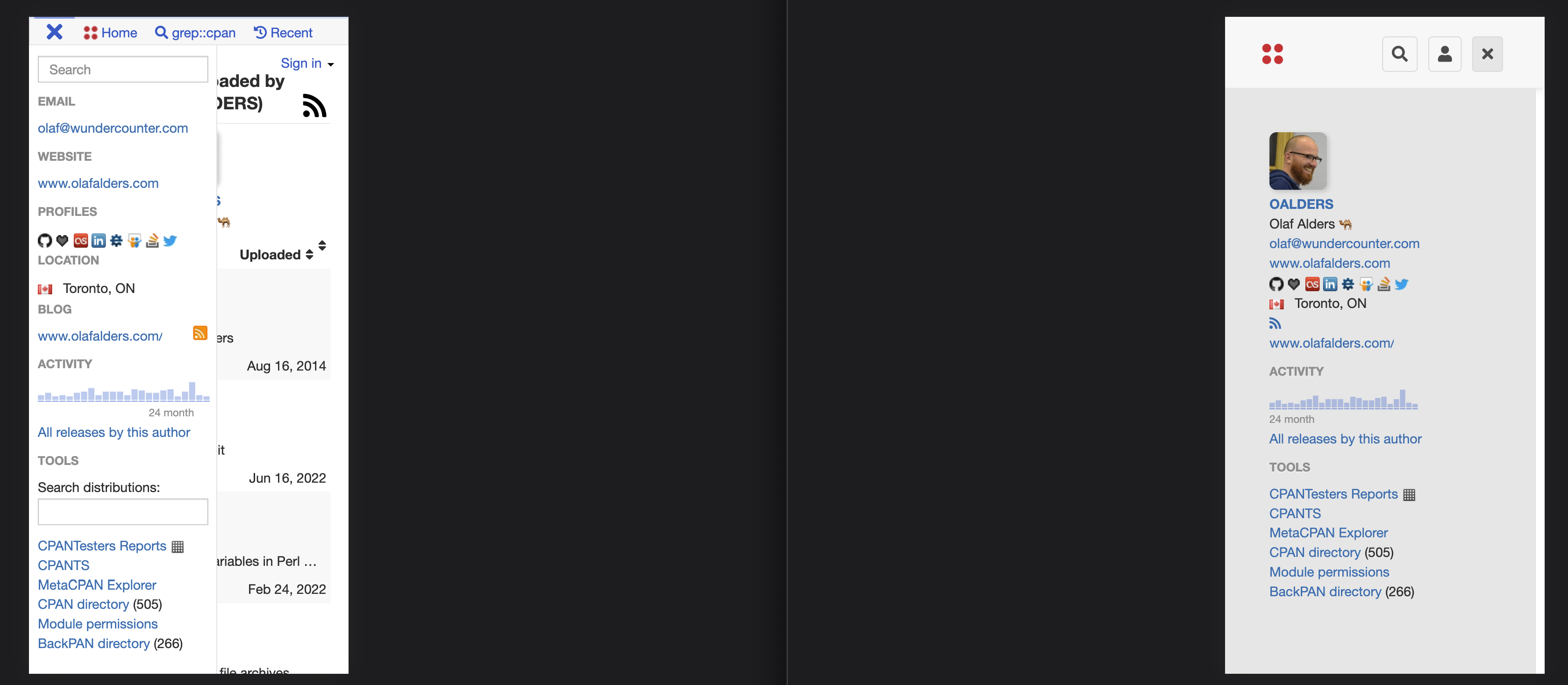
- I removed most of the icons next to the list items since it was a bit busy and some of the icons seemed a bit forced rather than being helpful for describing the actual list item.
- I'm not too sure which items should absolutely be placed in the sidebar for the author, distribution, pod, etc. pages, but I think the more we can pull out, the cleaner things will look. This will also allow users to find the most useful information that they may be looking for.
I do agree it makes sense to move to Bootstrap 5 and SCSS in the near future. Bootstrap 5 is much more responsive and easier to work with. I'm not sure if there is a preference for continuing with using Bootstrap 3 and less for now to set a good framework for those upgrades or if you wanted to make those upgrades prior to the redesign.
Just wanted to say that I love what I'm seeing. Looks really good, loving it!
Here are some updated screenshots from the last batch:
- Removed some headers for the author page. Add in icons for email, location, website, etc.
- Removed some icons in the sidebar on the dist pages
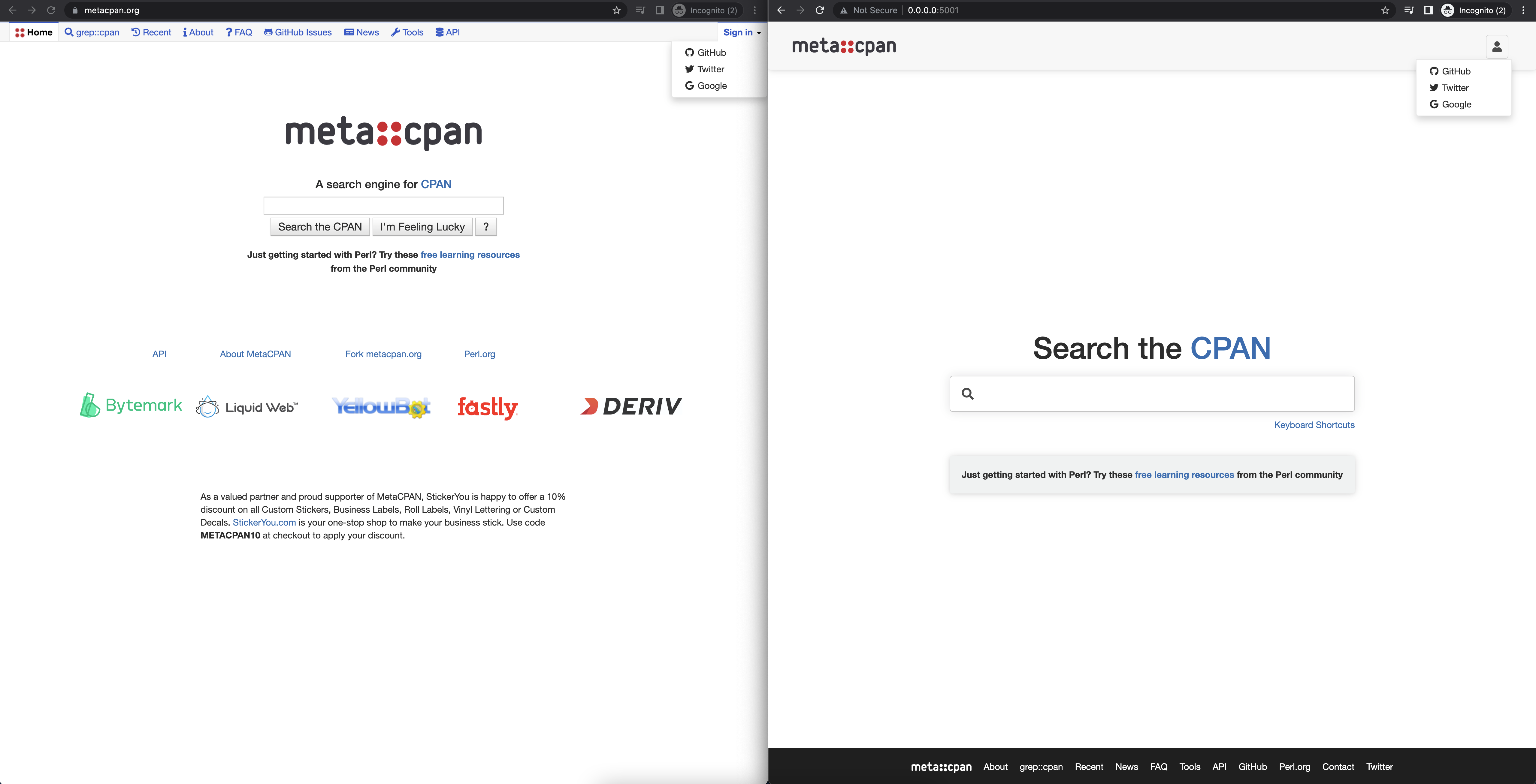
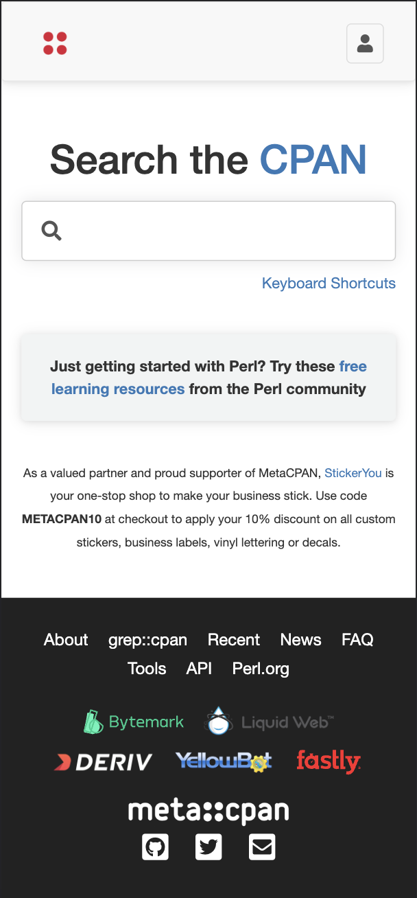
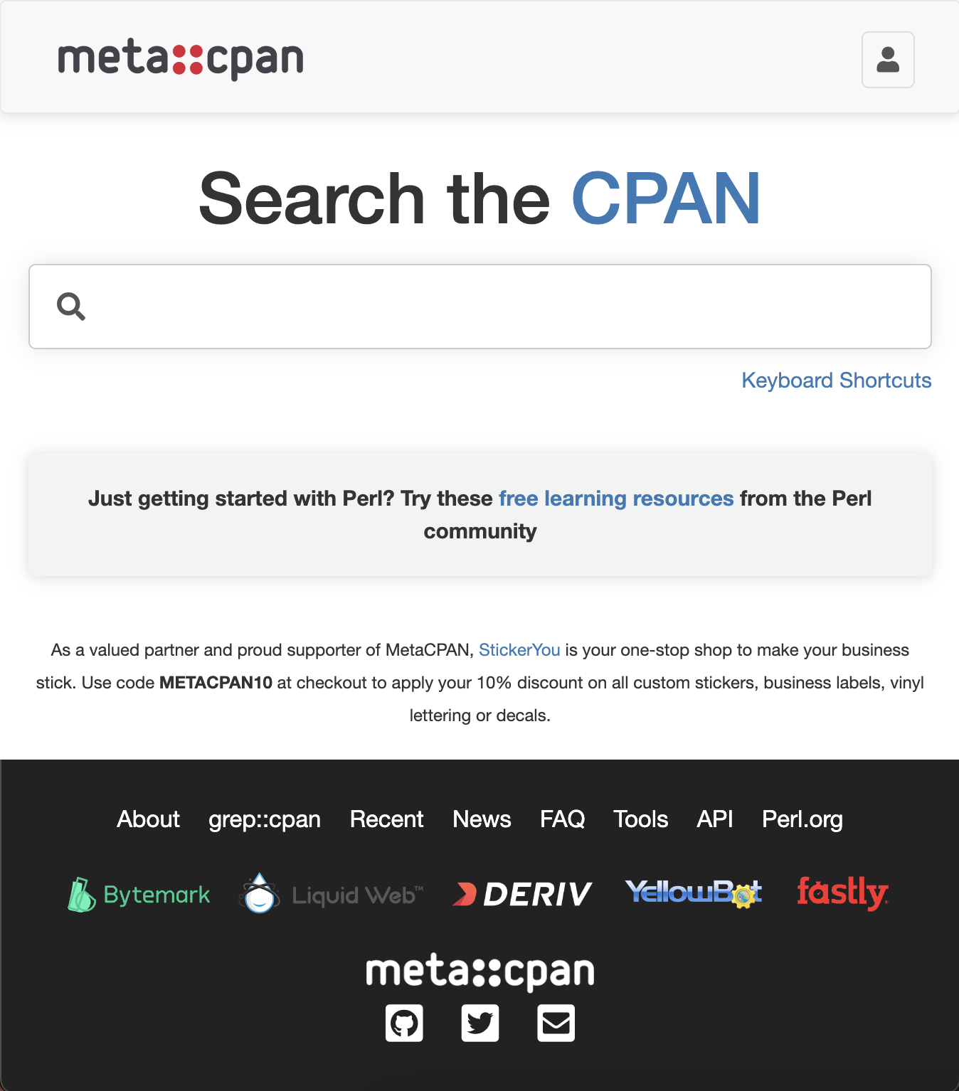
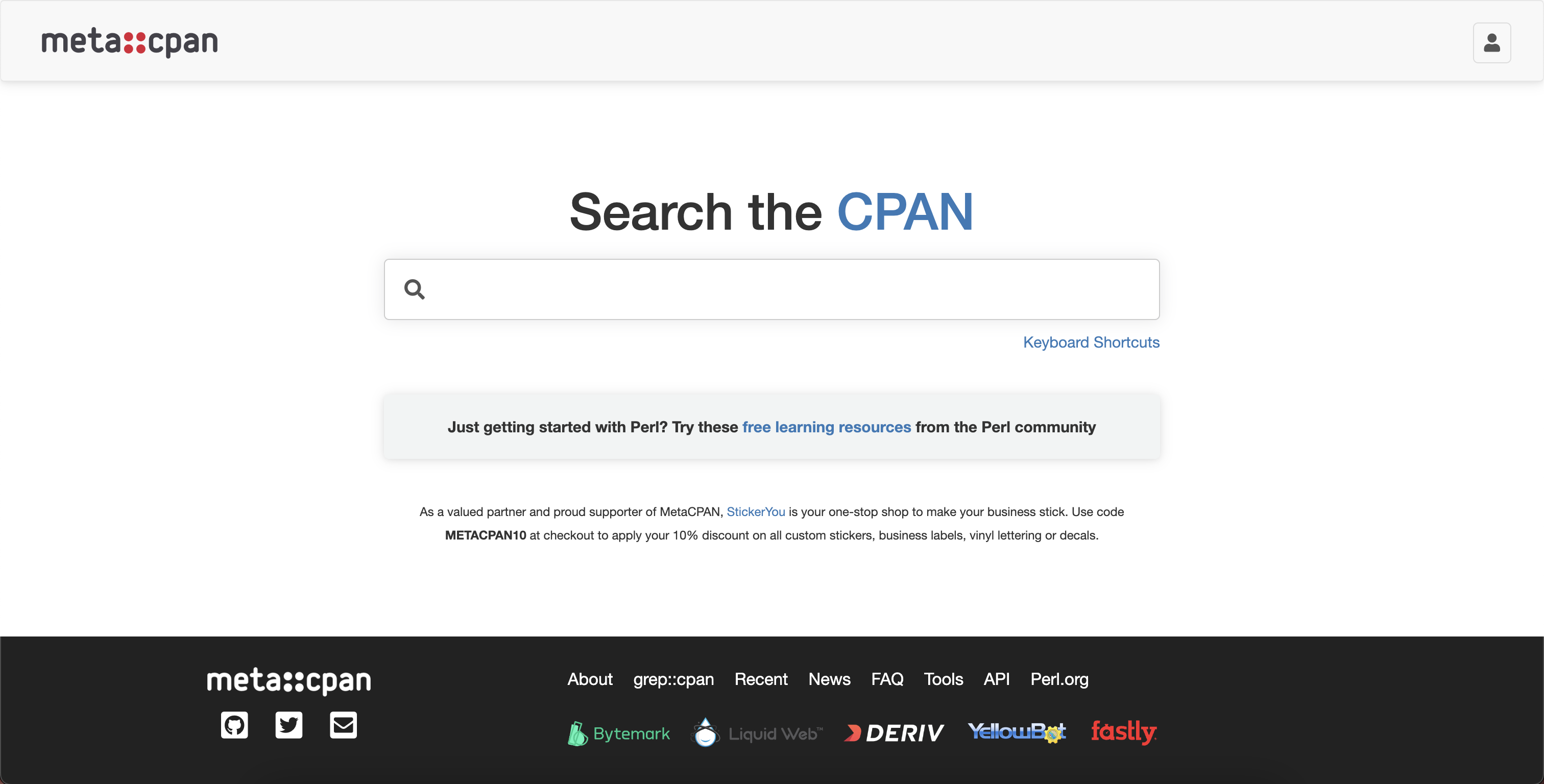
- Removed StickerYou text from the homepage
- Removed the contact icon from the footer
- Change font color of the sidebar items to black
This looks great! Especially the author and front page. I do notice that the Liquid Web logo is a bit hard to read. There are other versions here, if you need different assets to work with: https://www.liquidweb.com/about-us/press-room/photos-and-logos/
I do miss the icons a bit, because I tend to look for them when searching for a link (like permissions), but I think maybe we just need some other way of organizing them. Also, I'd like to hear what folks have to say about it.
This looks great and cannot wait to see it live.
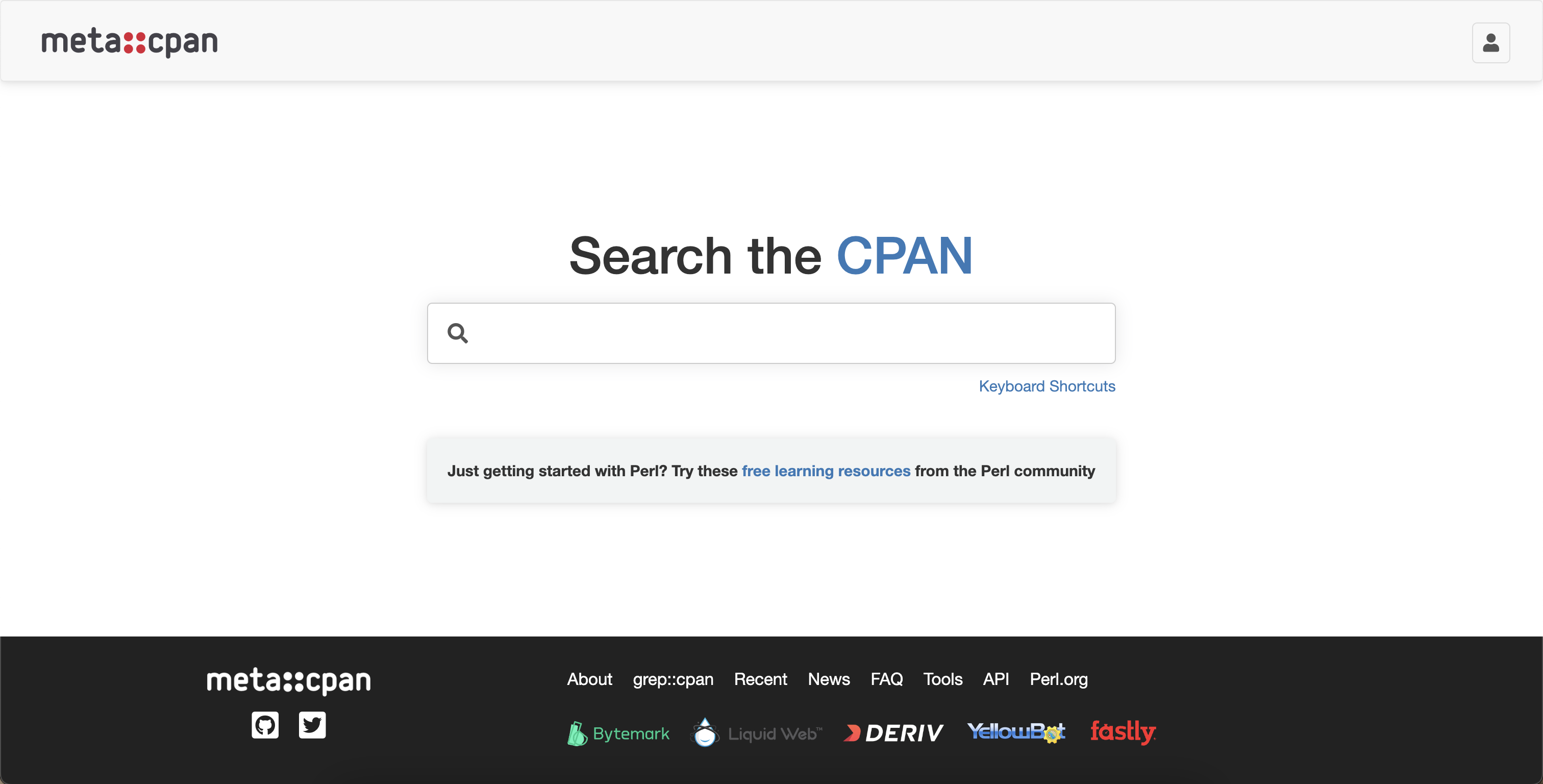
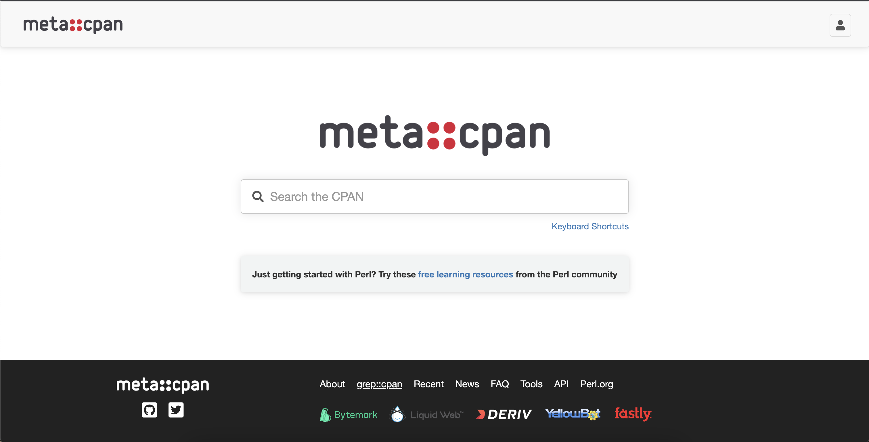
Kind of sad to see the logo removed from the HomePage and replaced by some text.
Should not the Search the CPAN be used as a text placeholder in the search input text?
Kind of sad to see the logo removed from the HomePage and replaced by some text.
Should not the Search the CPAN be used as a text placeholder in the search input text?
This would be worth looking at -- replacing the text with the logo and then moving "Search the CPAN" to placeholder text.
Re: LiquidWeb - I agree that it is a little tough to see. I'm not sure if any of those options would be any better given the footer color itself is also a dark gray. It would be nice if we could get the text to be white like they have in their own footer, but I'm not sure if this is possible. Otherwise, we might have to make the footer white or a light gray.
Re: Icons - I can wait to hear back for more feedback.
Re: Logo / Search - Sure, I can put the logo back in if it is preferred. I initially removed it because when I looked at other sites, logos were mostly reserved for the header (e.g. top left) and usually engaging text or CTA about searching went above the search field. I will indeed move the "Search the CPAN" to the placeholder.
Otherwise, we might have to make the footer white or a light gray
Right. I don't think we need to worry about that for now. I'm happy to deploy it with the current colour and see if it needs more tweaks down the line.
General dark mode option/support would be nice. Switching between a dark dev environment and blindingly bright metacpan makes me squint!
I'm using Firefox 104 on MacOS, and I'm seeing some issues with this currently:
- Search box is highlighted on every page load. This is rather noticeable because the search box eats my normal keyboard combination for navigating back. So every new page prevents me from going back without extra effort. This is two bugs, but only one is related to the new design.
- News page sidebar contains header links. This is confusing because if you click any of the options on the sidebar, all of the other options disappear. Feels like there has to be something better we could do here.
- Pod Renderer (/pod2html) and Contributors (/about/contributors) need a top margin.
- Home page is rendering wrong.
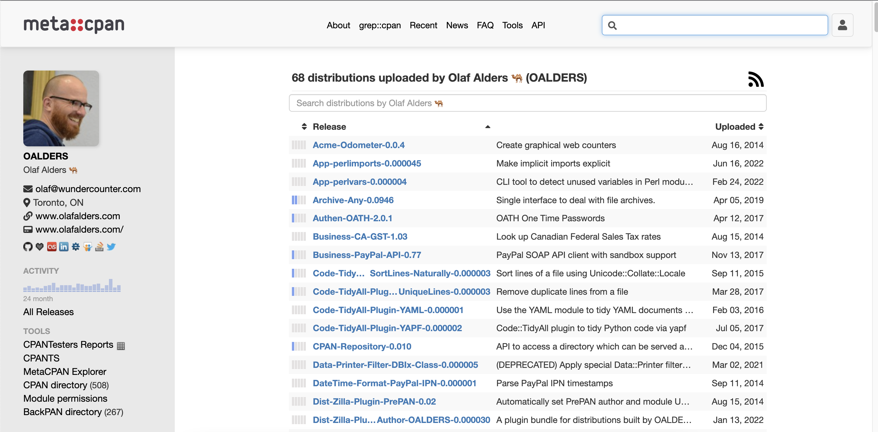
- Sidebar still needs some work. The things that used to be at the top of the left sidebar are probably the most important, but they are now pushed far down. I think starting with the author is fine, but the old top sidebar entries should probably be next. Contributors can be moved down and probably just converted to a link, dependencies can be converted to a link, "[Questions? Chat with us!" should be rephrased now that it isn't a banner. "Reverse dependencies"/"CPAN Testers List"/"Dependency graph" should be move lower or maybe merged with other sections.
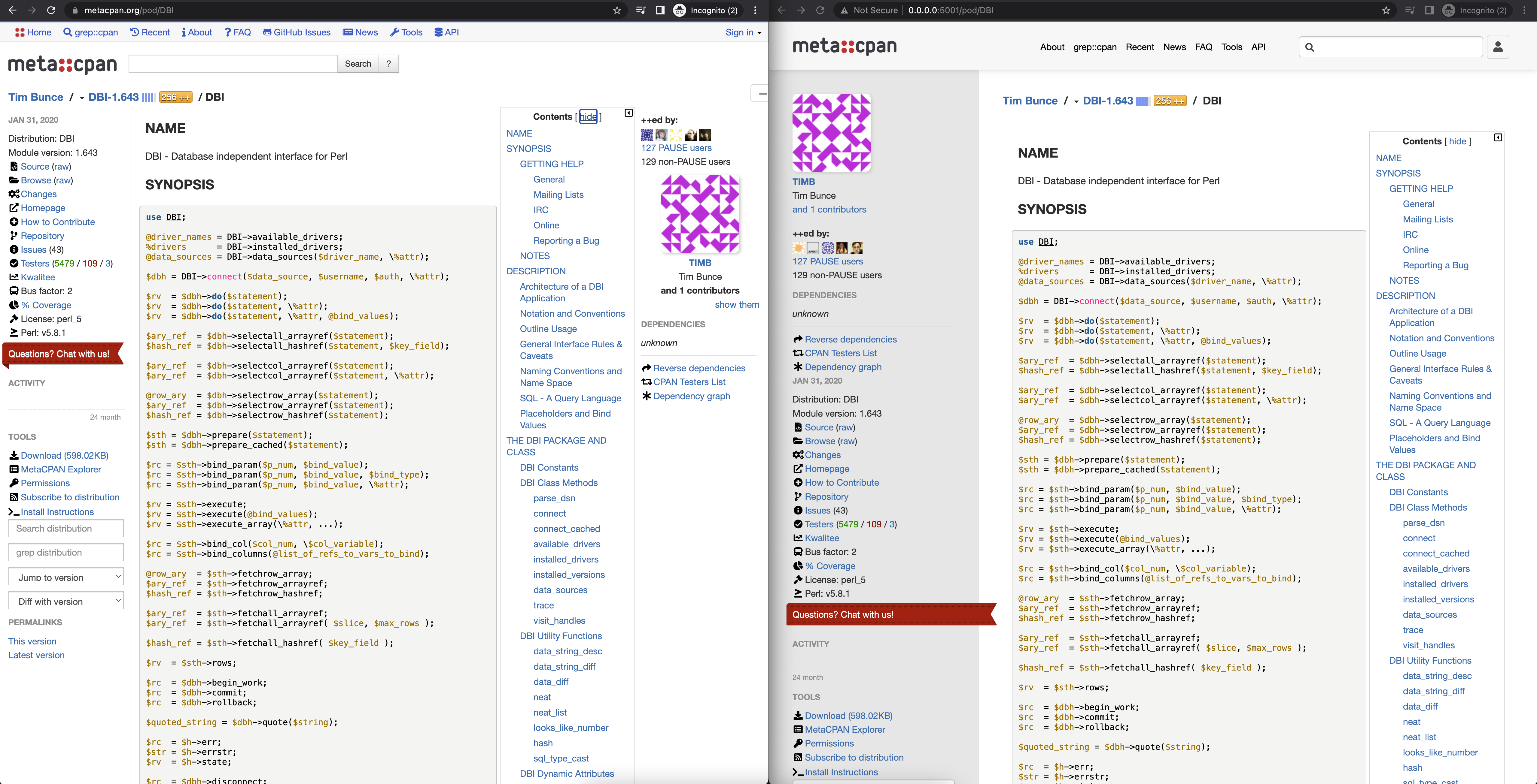
- Contents on a default page load feels awkward. Maybe it should always be pushed to a right sidebar? I'm not sure.
- The layout for the source view is too restricted. I'm not a huge fan of the max-width on the Pod content, but it's definitely wrong on the source view. Source is not wrapped, so the view should always be as wide as possible.
More when I get time.
Thanks for your feedback! I addressed a lot of this and will put it in a new commit on the PR https://github.com/metacpan/metacpan-web/pull/2710.
- Search box is highlighted on every page load.
Fixed: Removed the autofocus JS.
- News page sidebar contains header links.
Sorry, I'm not sure I understand this. Can you take a screenshot of the issue, please?
- Pod Renderer (/pod2html) and Contributors (/about/contributors) need a top margin.
Fixed: Added a margin, which is in line with other pages (40px).
- Home page is rendering wrong.
This is an issue on the staging site only. Olaf mentioned the issue here https://github.com/metacpan/metacpan-web/pull/2710#issuecomment-1211008364. Some of the JS isn't getting loaded. The local build renders properly though.
- Sidebar still needs some work.
This is still a WIP. It would be helpful to have an ordered of items from top to bottom that you'd like to see. In general, I do see other areas of improvement and plan to do further updates in a separate PR. For example, I think we can potentially get rid of the author pic on any page that isn't the /author/[authorname] page. This might save some sidebar space
- Contents on a default page load feels awkward. Maybe it should always be pushed to a right sidebar?
Fixed: Made it a fixed right sidebar, that you can still toggle the show and hide. But I removed the functionality to move it to the middle and to the right.
- The layout for the source view is too restricted. I'm not a huge fan of the max-width on the Pod content, but it's definitely wrong on the source view. Source is not wrapped, so the view should always be as wide as possible.
Fixed: I changed the max-width on the content class from 900px to 1200px, which is pretty wide.
Hello @dhogan8
I'm really loving the redesign! 👍🏼
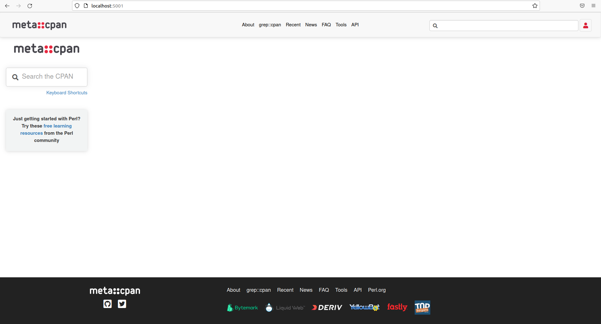
Just to inform, I tested locally and I have this strange "non centered" homepage.
See screenshot:
Apart from this, keep the good work!! Congratulation! 👏🏼
@thibaultduponchelle Thanks for the feedback! Can you confirm whether all of the javascript assets are being loaded in your local environment? Here is the file that is responsible for adding a class on the <body> tag if it detects you are on the homepage. And then here is the CSS that styles the homepage so that you shouldn't be seeing that non-centered homepage.
@dhogan8 Ok it works with 0.0.0.0:5001 instead of localhost:5001 😃
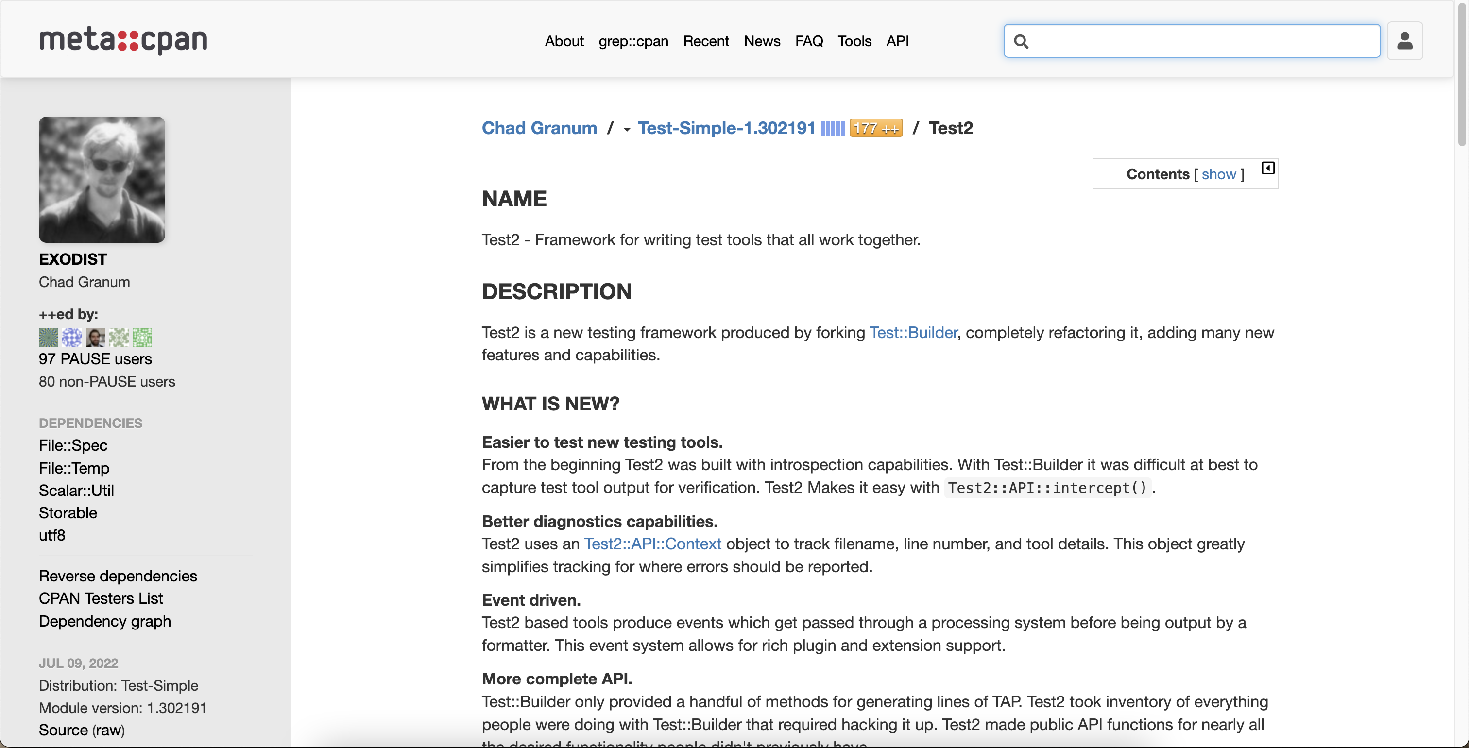
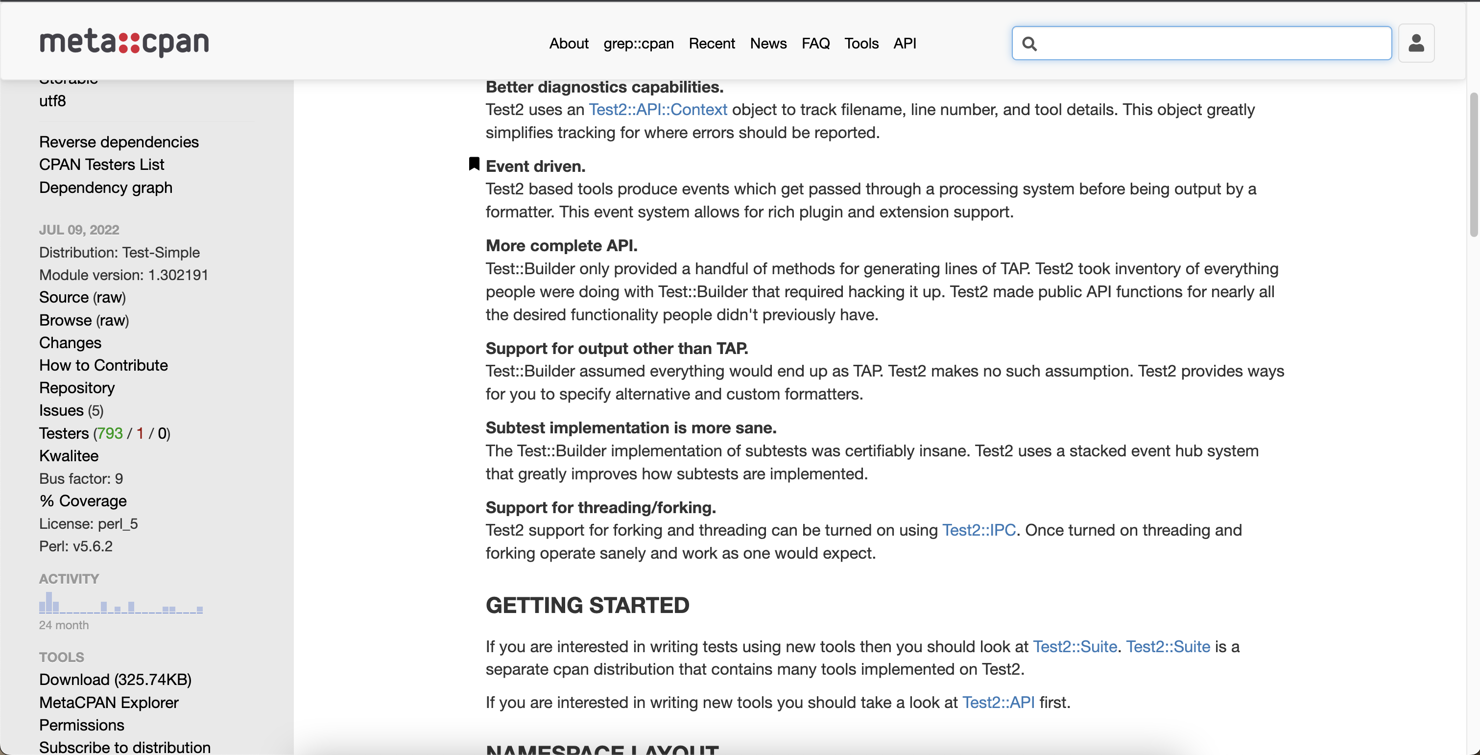
Minor but I would prefer to have the "matrix" aligned with text:
At 100% on my desktop, the space seems a bit "big" to my eyes:
But hey, all in all @dhogan8 it's gorgeous!!!
Thanks for catching that. I changed the CSS of that icon from vertical-align: bottom to vertical-align: text-bottom.
In general, I do understand that I personally don’t use this site as much (yet) so most of the changes I implemented don’t affect me getting used to a new style. I mostly tried to implement some common UI/UX principles. I’m not sure of the best way to improve the overall design of the site while also minimizing a new learning curve with the updated design.
The reason there is such a large gap is due to a couple reasons:
- On most pages, the page content has a
max-width: 1200px. The wider the max-width, the less readable content becomes. The optimal character length for readability is about 75 characters. With a max-width of 1200px, the site’s character length sits at about 130 characters. As a result, there will be more white / empty space depending on a user’s screen size. - The content on the page is centered rather than left-aligned. Centering the page content prevents a user from tilting their head too much when reading (especially when on a larger desktop). I think it is fairly common to have content be centered.
If it helps, here are some other examples of where I grabbed inspiration from:
- https://developer.zendesk.com/documentation/developer-tools/getting-started/getting-a-trial-or-sponsored-account-for-development/
- https://developers.google.com/chat/how-tos/apps-script
- https://developer.mozilla.org/en-US/docs/Web/CSS/Cascade
- https://dev.maxmind.com/minfraud/evaluate-a-transaction?lang=en
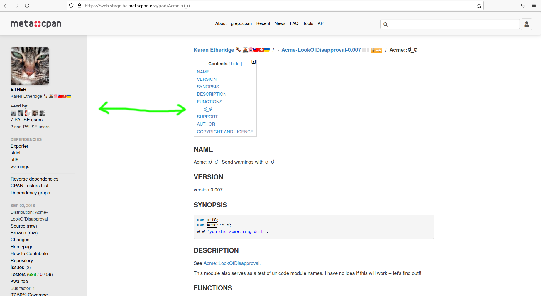
This may be a larger change, but I find that the contents links box widget to be unintuitive and not all that helpful as I scroll down. Indeed, having the bus factor & testers numbers at my reference at all times is of far less use to me than navigational aids internal to the modules documentation.
On that basis my suggestion is that the page-internal links to the various headings be arranged in a similar way to the well known "readthedocs", so that navigation is prioritized over metadata.
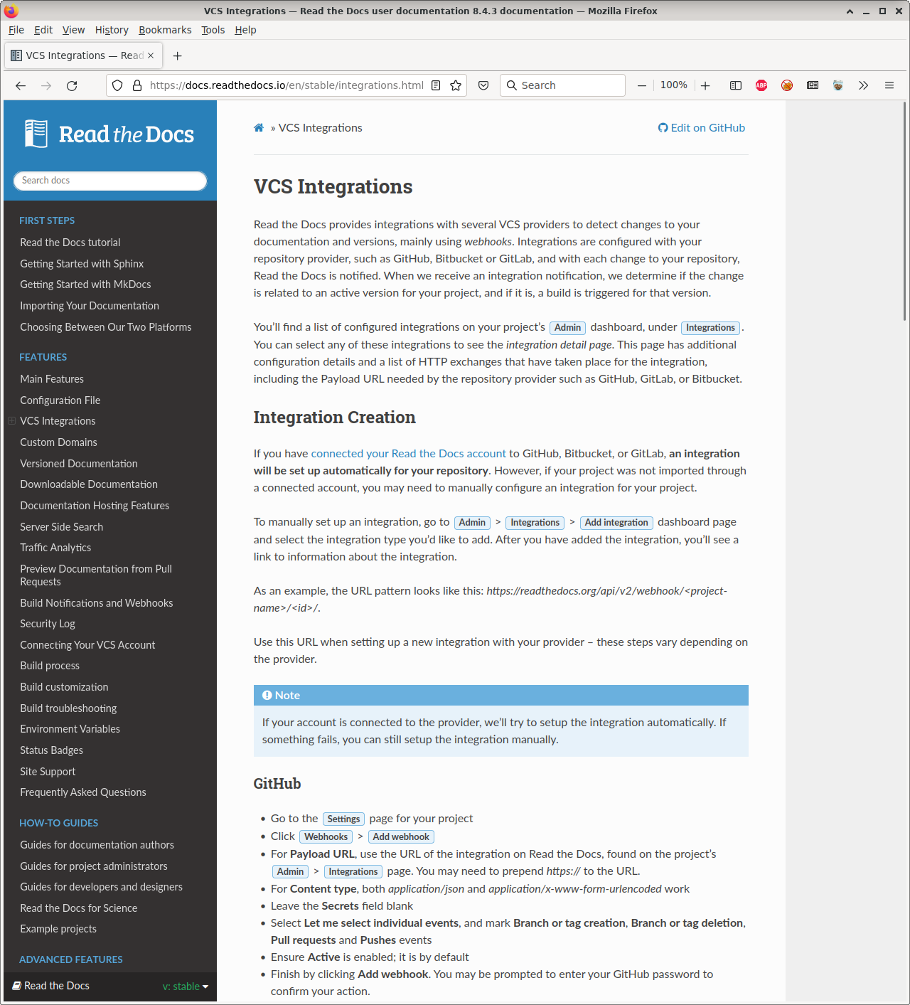 ^ Links https://docs.readthedocs.io/en/stable/integrations.html
This is simply my opinion and I dont believe that metacpan is instrumented with heatmaps to show what people are clicking on or struggling to find. That would be a nice feature to add.
@djzort As a temporary quick fix, would it be helpful if the Contents box were fixed on the right side of the page so that when you scroll down the page it still stays in view? One downside to this would be that it would shorten the width of the content.
As another data point, I would say 90% of my use of metacpan relates to looking at the sidebar data and links, and other metadata, rather than the documentation content itself.
As another data point, I would say 90% of my use of metacpan relates to looking at the sidebar data and links, and other metadata, rather than the documentation content itself.
I was thinking about this. We have two different (and overlapping) audiences. The CPAN developers probably lean heavily on the sidebar and CPAN consumers are probably more interested in the docs. The problem is that the development of the site is basically being driven by the CPAN authors. Non-PAUSE users are still second class citizens here.
I use the sidebar a lot and I like having that info easily available, but I can see how that may not be as helpful for a lot of other users.
I do think it would be a better UX for people who are interested in the content to have a fixed TOC on the right side of the page. It seems like it would make it easier to jump around the content. I was worried about previously implementing this because I thought there was a concern about constraining the content width. But if this is not a concern, should I go ahead and make that change?
This potential change would leave the left sidebar items untouched. I think this would be a benefit to both CPAN developers (who value the left sidebar) and CPAN consumers (who value the content), but perhaps there might be a disadvantage to having a persistent TOC that I'm not aware of.
Alternatively, we could keep the branch as is and wait for feedback from other users.
Are there any small parts of the changes here that can be pulled out and merged first?