 mdn
mdn
Code blocks wrap on mobile
Hello,
I have encountered several problematic things after the mozilla's site had swicthed to new design and I wander if there is a possibility to correct (at least what will be possible to) in the near future.
- The line height . On mobile screen there is less content to fit on screen now, so from now on there is a need to scroll the content more often which seems a little bit distractive while studying.
- Font weight. If it were a little bit bolder it would be easier to see whats is on the screen (this is not too critical)
- Margin. It became bigger so it results to the same problem as described in the 1st point.
-
The
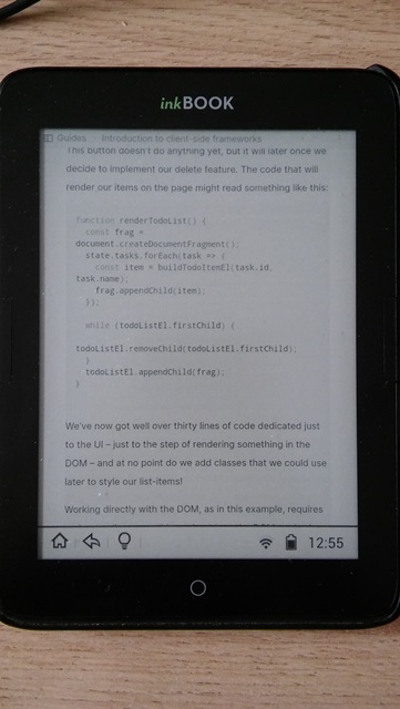
codefont size in relation to other text size. Thecode fontis a bit small at 100% screen's size The first thought is to zoom a page, but it increases a much the problem described in the 1st point. - The code wrapping. . This is the biggest problem because now it is definitely hard to read the code when it's wrapped because of not fitting to the screen. As for me scrolling a bit is not a very big problem.
- The code font's lightness. On such a readers is harder to see the text which has a light color. It's better if it would be a little bit darker (However, this point is not a critical one).
Below are the example screenshots attached of the present and previous versions (have no idea why github turns over the images, I tried to change orientation, but it behaves strange and only one image looks normal ):
Edit: I attached below another image
Kind regards
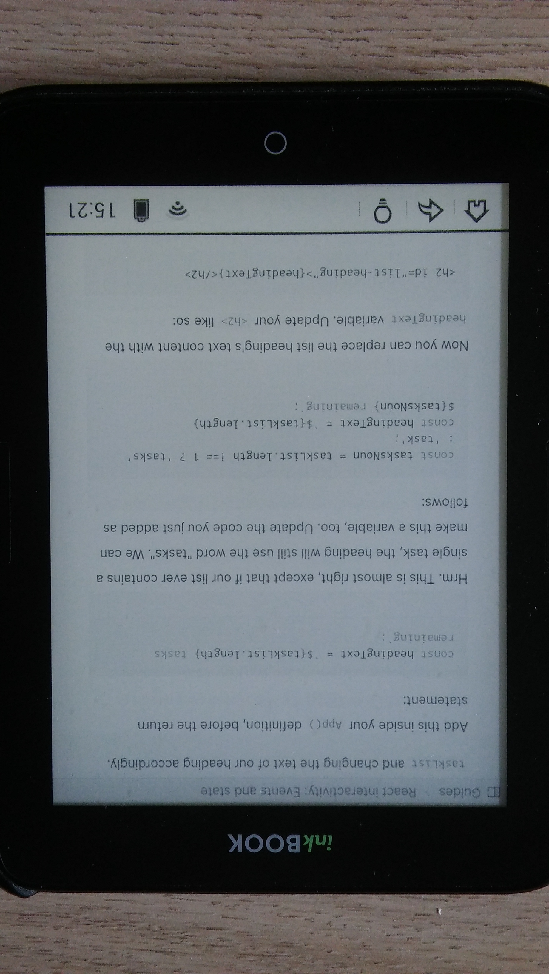
I would like to show you the image (finally in the right position), in which it can be seen that the code area is starting to become a mess, indentations are violated
I'm not sure what is the best way to target e-readers, but I will add the accepting PR label.
Any solution that improves the layout for e-readers without changing the layout for other devices (mobile + desktop) is appreciated!
I'm not sure what is the best way to target e-readers, but I will add the
accepting PRlabel.Any solution that improves the layout for e-readers without changing the layout for other devices (mobile + desktop) is appreciated!
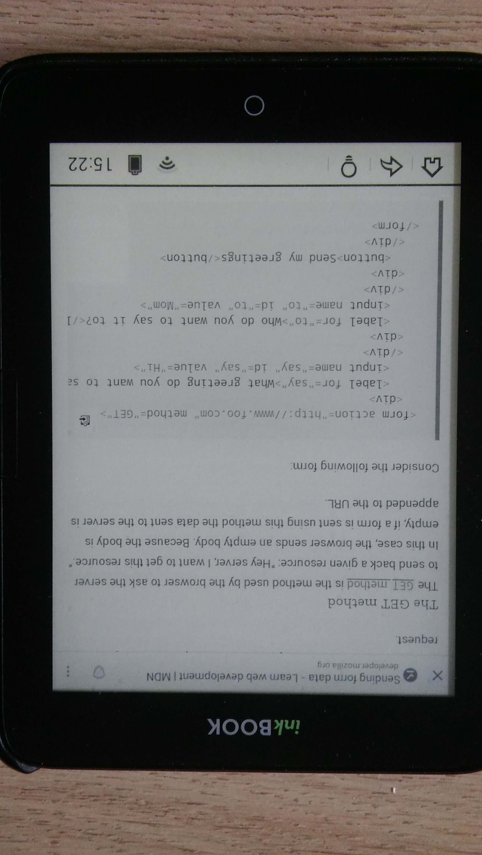
@caugner Thank you, but it looks like the same situation on mobile phones? Here is for example horizontal screen views

The redesign added white-space: pre-wrap; to pre, which causes the code blocks to wrap, so they no longer overflow with a scrollbar, cf. old design vs. new design.
PS: This refers to point 5 of the issue description.
The redesign added
white-space: pre-wrap;topre, which causes the code blocks to wrap, so they no longer overflow with a scrollbar, cf. old design vs. new design.PS: This refers to point 5 of the issue description.
Hello, thank you for the answer
We have discussed this issue, but decided to close it as won't fix, because a) the issue only received a single upvote since 2022, and b) user preferences regarding code wrapping vary (and we don't want to make this a setting).
Nevertheless, we thank you for taking the time to report this, and for your patience! 🙏