sidebery
 sidebery copied to clipboard
[Feature request] Don't hide the tab thumbnail of a collapsed branch
Description
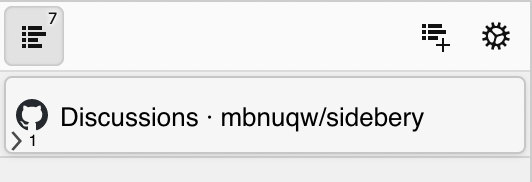
When a branch is collapsed in a tabs tree, the thumbnail of the top tab is hidden by an arrow icon :

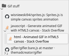
The problem is that it makes the tabs tree much less readable : thumbnails are great visual indicators and should not be hidden. Something like that (or really anything that does not hide the thumbnail but still shows it's a collapsed branch) would be much better :

Thanks !
You can try this CSS to show arrow only on hover:
/* Show expand arrow only on hover */
.Tab[data-parent="true"][data-folded="true"]:not(:hover) .fav .exp {
 opacity: 0;
}

/* Shift child count for better visibility */
.Tab .fav > .child-count {
 right: -4px;
}
Thank you @emvaized, this does the trick !
@Elaws As an alternative, you can also try something like this – just shift the arrow and child count to the corner. But it may require some playing with numbers to make it look good in your setup.

/* Increase opacity for folded tab icon */
.Tab[data-parent="true"][data-folded="true"]:not(:hover) .fav img {
	opacity: 1;
}

/* Shift the arrow */
.Tab[data-parent="true"] .fav .exp {
	top: 55%;
	left: -12px;
        opacity: 1 !important; /* <- keeps arrow always visible */
}

/* Shift the child count */
.Tab .fav > .child-count {
	right: 0px;
	top: 105%;
	bottom: unset;
	left: 4.5px;
}
It also looks great with "use lines instead of dots" snippet, which I recently wrote for myself:

/* Show tab indents as lines */
.Tab .body::after {
	top: 0;
	height: 100%;
	border-radius: 0;
	width: 1px;
	left: 7.5px;
}
@emvaized : Great css snipets, I'll use them : thanks !
@emvaized : I tried your Show tabs indents as lines snippet but lines do not appear. Are there options to activate in Sidebery ?
/* Show tab indents as lines */
.Tab .body::after {
	top: 0;
	height: 100%;
	border-radius: 0;
	width: 1px;
	left: 7.5px;
}
@Elaws Yes, you have to enable Show marks to indicate tabs sub-tree levels to show default dots
@emvaized : Weird, it's already activated, and all it shows is dots, not lines.
/* Increase opacity for folded tab icon */
.Tab[data-parent="true"][data-folded="true"]:not(:hover) .fav img {
	opacity: 1;
}

/* Shift the arrow */
.Tab[data-parent="true"] .fav .exp {
	top: 55%;
	left: -12px;
        opacity: 1 !important; /* <- keeps arrow always visible */
}

/* Shift the child count */
.Tab .fav > .child-count {
	right: 0px;
	top: 105%;
	bottom: unset;
	left: 4.5px;
}

/* Show tab indents as lines */
.Tab .body::after {
	top: 0;
	height: 100%;
	border-radius: 0;
	width: 1px;
	left: 7.5px;
}
@Elaws It's important to note that I'm using version 5, and the snippet was written for that version. If you're on v4, it may be needed to inspect the tree and rewrite some things to make it work
@emvaized, thanks for the snippets and @Elaws, thanks for the feature request. I'll add an option to choose the style of arrow icon (when it will be shown and where).
I've implemented this like so:
/* Resize the favicon div */
.Tab[data-parent="true"] .fav{
	margin-left: 8%;
}

/* Shift the arrow */
.Tab[data-parent="true"] .fav .exp {
	margin: auto;
	left: -20px;
        opacity: 1 !important; /* <- keeps arrow always visible */
}

/* Shift the child count */
.Tab .fav > .child-count {
	top: 78%;
	left: -100%;
}