daily-dev-tips

daily-dev-tips copied to clipboard
Improve UI for filtering by tag
The current tag cloud for filtering articles on the archive page is overwhelming and distracting, especially on smaller screens. I'm not yet sure what I would propose as a solution, but I'm sure there is one for a better user experience.
Possible solutions:
- Hide the tags in a collapsable section.
- Create a "filter" UI that includes sort and tags.
- Use a sidebar layout on desktop to separate the tag cloud.
- Show only a subset the most relevant tags, truncating the rest with a collapsable section.
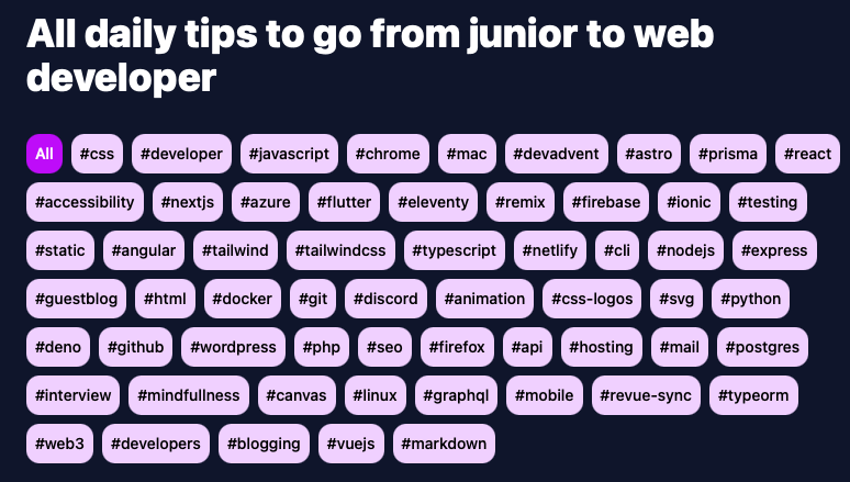 The tag filter on large screens is cluttered, but not terrible.
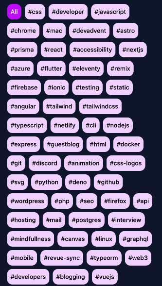 The tag filter on small screens takes up the entire page.
@trvswgnr Thanks for logging that, and indeed you are right. It's super overwhelming.
I'm thinking of both rethinking the tags and perhaps revamping it. Raises another issue that I really need some kind of search. 😅