Feature Idea: Swap order of comment and description sections
Summary:
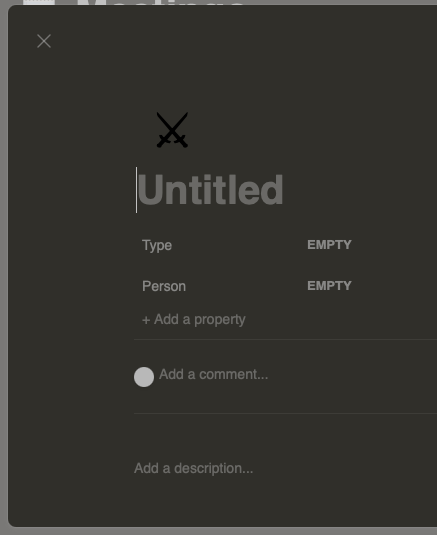
Currently the comment section renders above the description section. I personally find this a little inconvenient when working on a board alone because I rarely ever use the comment functionality but I very frequently edit or read the description section.
Even in multi-user scenarios, I think it would be more intuitive to have the two sections swapped. When looking at a card, it seems more likely that you first want to understand all the details about the card before reading other people's comments. As an example, Jira (not that it would be the pinnacle of UX) displays a task's summary, description and attachments before the comment section.
Instead of (or in addition to) swapping the sections, there could maybe also be an option to disable comments or to freely reorder the two sections per card (though that might be overkill).
How important this is to me and why:
Importance: Low
Use cases:
- I want to parse the information on a card without other people's comments getting in the way
- I'm a single user and don't want to use the comments
@michaelgamble please weigh in on this. The current organization is based off Notion, which is different from Trello and Asana.
@chenilim I created a ticket to dig around and try to understand why comments are above descriptions - both research online and loosely canvas some existing heavy notion users to try understand if their is some sort of perceived benefit gained...
My best guess is that its a purposeful choice to bring conversation to the forefront as the primary focus.. so the first thing you are reading above the fold line is the most recent portion of the conversation as opposed to the traditional model that buries the conversation as a secondary item.
Now me personally I would need to take some time to research / think about it to form my own opinion on the topic.
I also find having comments above description to be counter-intuitive and inconvenient.
After starting to use Notion for a writing project, my theory for having comments above description is that when you're working on a really long document, it may be a bit tedious to have to scroll all the way down every time to see/add comments. So it may make sense for a tool like Notion, where long pages with hundreds or thousands of words are the norm.
I do feel like for task management on Asana or Board, the use case is different because the description in cards is rarely so long as to make it annoying to scroll down to see comments.
I'm so glad I found somebody that has reported this. I'm a big fan of Focalboard, but this is something I find really strange. The comments, which ideally would have an option to turn off completely, should be at the bottom. The more important information that goes within the description should be directly below the properties. Currently, with any length of conversation in the comments, the details can be easily forgotten about at the bottom.
+1 on this.
I came from the Asana world, so it'd be really nice to have a setting that swaps positions of the main content and comments.
Any movement on this? While I get that Focalboard is looking to replicate how other software works, having never used such software, I find it so strange that comments would ever come before the description of an item. It would change this software from 'good' to 'great' in my project if we could just put the comments at the bottom of an item. Those that want to see any extended conversation below an item are free to use the scroll button on their mouse, instead of potentially missing out on information from the author that directly relates to the item.