matrix-react-sdk
 matrix-react-sdk copied to clipboard
reactions in IRC layouts are pushed to the right
Before:
 After:
Better showcase:
I hope I tested all event line cases:
- Bubbles (not touched, like calls or special events)
- Images
- Videos
- Replies
- ?
I honestly would like to submit this for the main layout, but:
- I am not an UX designer
- I don't know how it feels to have a lot of space between text and reactions for normal people
- I am not an UX designer, again
Anyway, feel free to review. Especially the grid-template-columns that took me so long to get well.
Signed-off-by: Adrien CLERC [email protected]
Notes: Reactions in IRC layout are displayed at the message right for even more compact text lines.
Here's what your changelog entry will look like:
✨ Features
- Reactions in IRC layout are displayed at the message right for even more compact text lines. (#6706). Contributed by @Glandos.
Preview: https://612b8c09db24b07543075dc0--matrix-react-sdk.netlify.app ⚠️ Do you trust the author of this PR? Maybe this build will steal your keys or give you malware. Exercise caution. Use test accounts.
Thank you for your contribution! I have removed the web team for the review queue as this need to first go through a design first.
For future work like this I could only encourage you to sync up with the design team to gauge interest in those changes. https://matrix.to/#/#element-design:matrix.org might be a good place to start this kind of conversation
I have removed the web team for the review queue as this need to first go through a design first.
Tbh, I am not 100% a design review is relevant here since the IRC layout is experimental :man_shrugging:
I have removed the web team for the review queue as this need to first go through a design first.
Tbh, I am not 100% a design review is relevant here since the IRC layout is experimental 🤷♂️
On this, I'd say definitely worth giving input. The experimental flag is there to set reasonable expectations for end users on features as well as give more agency to community contributors on changes.
In this case, as the PR modifies existing functionality it's worth us exercising more caution and validating the design decisions being made. Although, given it is an experimental feature we'll bias for action and speed when reviewing!
I believe for changes of this amplitude in the layout it'd be good to do a bit of research/analysis as to whether that's the direction we want to head in or not.
Definitely, because this feature is in labs there's probably a bit more flexibility here
While I really appreciate the work involved in this exploration 🙏 I, unfortunately, don't think it successfully addresses the intended goals, and at the same time it's introducing new challenges that make for a less optimal layout.
By spacing out messages from reactions we're making more difficult for users to visually track which reactions relate to which message. At the same time, by bringing reactions closer to read receipts we're establishing a confusing relationship between those two elements, which could be interpreted in many ways.
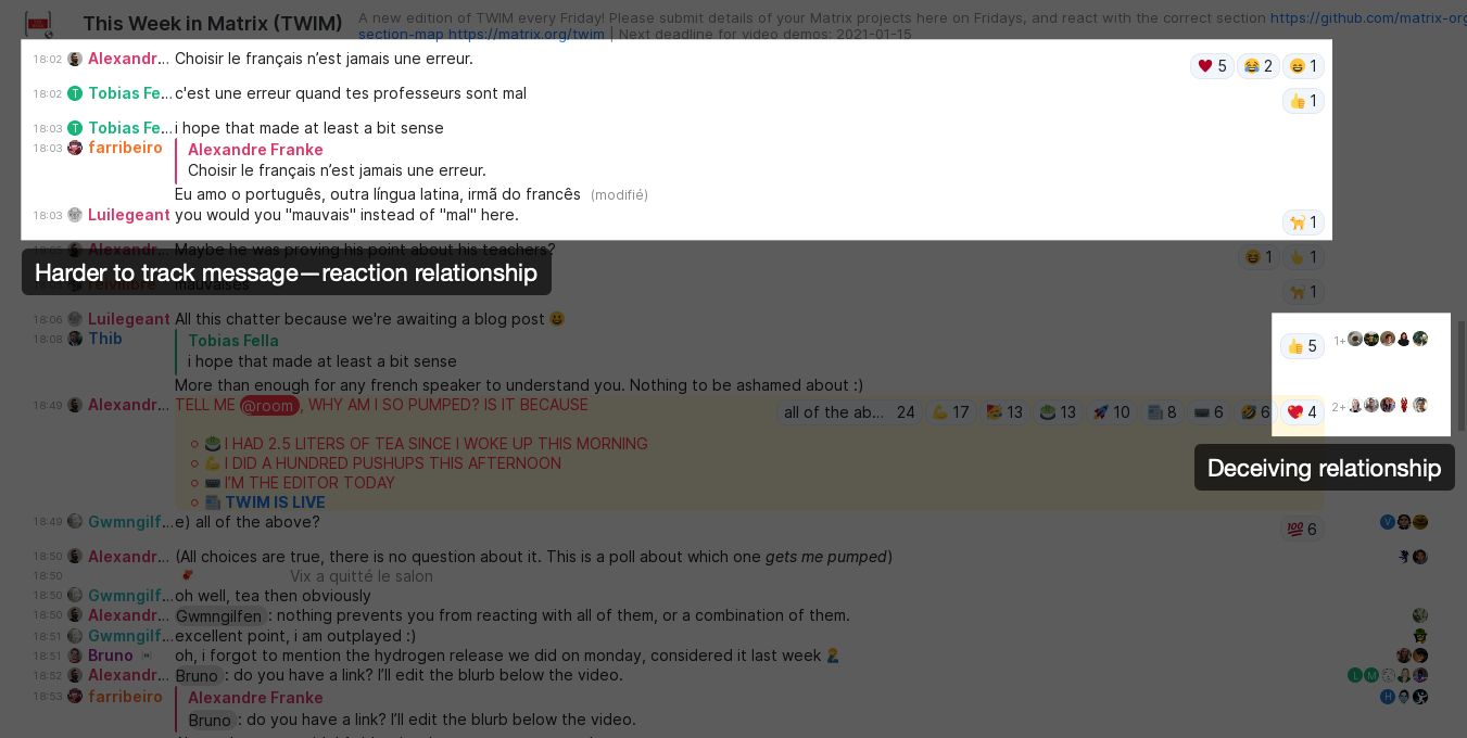
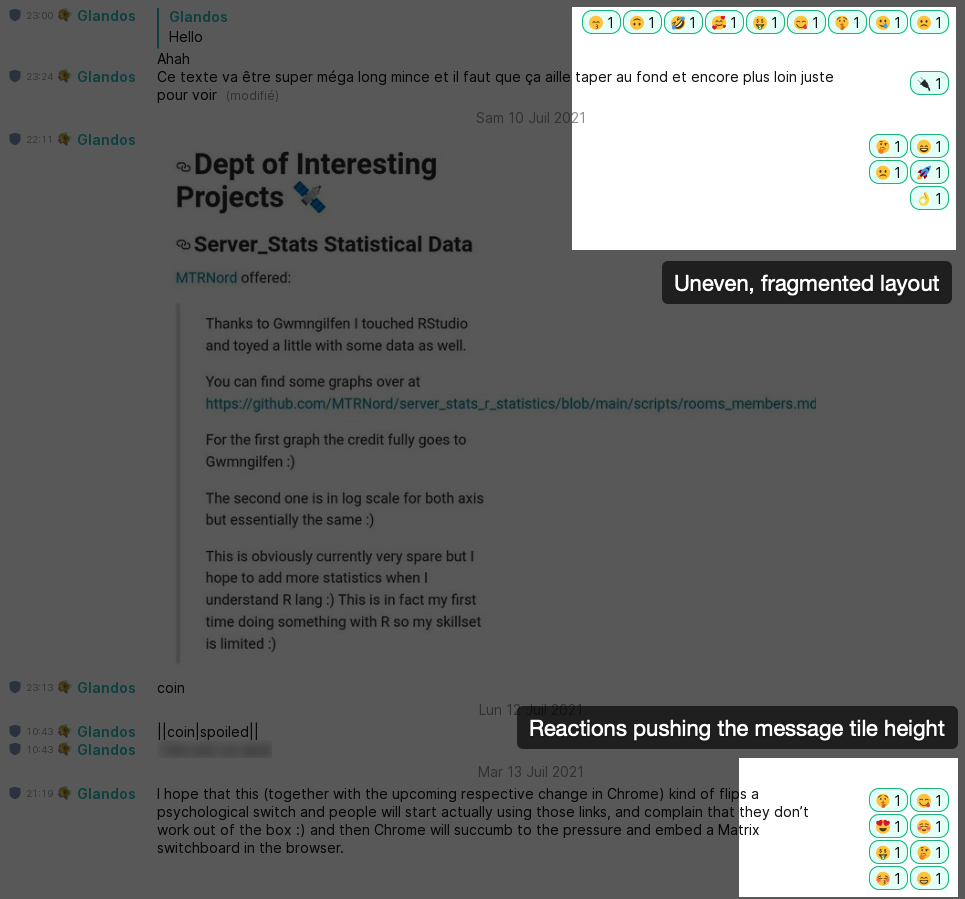
The layout for the reactions is highly dependent on the message length, which translates in a highly uneven, visually broken and distracting layout. As a side-effect we are even introducing additional vertical white/empty space in some instances between messages (e.g. "Reactions pushing the message tile height" example on the screenshot below), which is just the opposite the PR author was trying to optimize for in the first place.
Let's be honest, it's nearly the first time I have to justify my UI design with a real designer, so of course there are some inconsistencies in my choices. And while it is uncomfortable to face the truth, I'd like to solve those bad choices to achieve my goal. So, thanks for the report, it is really helpful to me.
The first argument is that there is too much space between reactions and message. I also think this is not optimal, but then, a question arise: message options (like read receipts) are also separated from messages, and they are a bit difficult to associate visually. Of course, options are less tightened to messages, but I am still wondering if it can be better.
Do you know in the past if some options like alternating colors or horizontal separators were discussed (or even used) to make message parts linked in a more obvious way?
This will lead me to the second point of "uneven, fragmented layout". This is exactly what I feel when I read a conversation cluttered with reactions: they are in the way of the reading experience, exactly like read receipts would be if they were below the message itself. This is, of course, a personal use case. For me, reactions are more a "small threaded response" than a "followed inline answer".
To be sure that messages were not taking more vertical spaces than before, this CSS attempt is trying to lie down as more reactions as possible horizontally, giving priority to the message. That's why they are sometime in one line, when the message is small, and sometime in two columns (the smallest accepted width) when the message is wide. But I guess that you figured this out by yourself :) However, the last topic is a trade-off of this constraint. It seems to me that it's impossible in CSS to minimize a container height by changing children widths. I tried hard, without success.
Now, let's talk about solutions. To enhance the message <-> reaction relationship (and remove the deceiving one with read receipts), I see two ways:
- Move them closer to the message. Or before. In any case, this will lead to either unaligned reactions or unaligned messages, which seems worse.
- Add visual indicators, like alternating colors (I'm not sure I want this…) or horizontal lines, along with a border on the right to separate it visually from read receipts. This indicators can be drawn only for message with reactions, to have a clean message.
For solving uneven layout, I have two ideas:
- Keep it like this. This is not a real idea, but reaction clutter is usually rare, and having a bunch of reaction in the middle of a conversation will attract the focus to a hot message.
- Have a fix width for reactions. This will give an even layout at the price of space waste, when there are too few reactions on a short message.
I'm going to close this, as it looks like the design team don't agree it's an improvement as it stands and don't have the bandwidth to discuss further. There doesn't seem to be any value in keeping the PR around in a zombie state.
Sorry @Glandos, and thank you for your work here!
Sometimes, work is a dead-end, that's life!
However, I'm still using my Stylus stylesheet for me, because it's far less disrupting to have reaction on the right than in the conversation flow. If people want me to share it, raise your voice.