Adding pie chart via external axes method
Hello,
I have been using returnfig=True and adding a couple of things to customise my chart, but when adding a pie chart I recieve the follow error:
ValueError: Image size of 65243x662049 pixels is too large. It must be less than 2^16 in each direction.
I have tried reducing everything so that the pie chart can be as bareboned and as rudimentary as possible, but the result remains the same. I have been using the pie chart successfully in standard matplotlib so I feeling like it should be working and I am at a bit of a loss.
Please show your code. Please also show code that displays the exact same image file successfully with plain matplotlib. And please make the pie chart image file available somewhere so that I can try to reproduce.
Yes, I apologise for not doing that.
When trying to reproduce a code snippet the pie chart would in fact appear (and hence not produce ValueError), but the pie chart would be so large the candlestick chart is nowhere to be seen.
import matplotlib.pyplot as plt
import yfinance as yf
import pandas_datareader.data as data
from datetime import datetime, timedelta
import mplfinance as mpf
end_date = datetime.today()
start_date = datetime.today() - timedelta(days=150)
df = data.get_data_yahoo('SPY', start_date, end_date)
pie_data = [7,20,11,13]
fig, axlist = mpf.plot(df,type='candle', returnfig=True, mav=(20,50), tight_layout=False, figsize=(18,7), volume=False, title='SPY', scale_padding={'left': 1, 'top': -0.1, 'right': 0.85, 'bottom': 1})
# axlist[0].pie(pie_data, autopct='%.1f', textprops={'fontsize': 13}, wedgeprops={"linewidth": 2, "edgecolor": "white"})
plt.show()
I commented out the line with the pie chart just so you can see the chart loaded beforehand.
I guess the biggest piece of information that I left out was the fact that in matplotlib I didn't have it sitting on top of another chart as I am trying to do here. I guess that is the problem?
Anyhow, the simplified version in matplotlib:
pie_data = [7,20,11,13]
fig, ax = plt.subplots(figsize=(5,10))
ax.pie(pie_data,autopct='%.1f')
plt.show()
After playing with this a bit I realize you will have to create an additional Axes object. I recommend using fig.add_axes().
The problem with the Axes in axlist is that they all share the same x-axis ... but the pie chart cannot share that x-axis.
Therefore I suggest the following:
fig, axlist = mpf.plot(df,type='candle', returnfig=True, mav=(20,50), tight_layout=False,
                       figsize=(18,7), volume=False, title='SPY',
                       scale_padding={'left': 1, 'top': -0.1, 'right': 0.85, 'bottom': 1})

pie_data = [7,20,11,13]

pie_ax = fig.add_axes( [0.1, 0.6, 0.35, 0.35] )
pie_ax.pie(pie_data, autopct='%.1f', textprops={'fontsize': 13}, wedgeprops={"linewidth": 2, "edgecolor": "white"})

mpf.show()
The tricky part is the positioning of pie_ax.
The parameter to fig.add_axes() is a list as [left, bottom, width, hight] in terms of fraction of the whole Figure (which includes all panels).
For example, given the above code fig.add_axes( [0.1, 0.6, 0.35, 0.35] )
left:0.1is 10% of the way from the left side,bottom:0.6is 60% of the way up from the bottom, andwidthandheight:0.35for the width and hight means take 35% of the Figure width and Figure height.
Note that these measurements are for the Axes object that the pie chart is on (not for the pie chart itself).
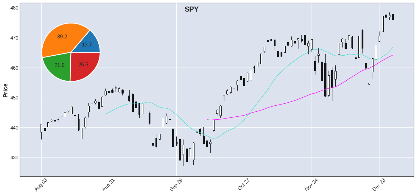
It may be tricky (but do-able) if you want to come up with an algorithm to position the pie chart based on the data (so that it does not cover any candles), unless you always put it in a panel of its own. Alternatively you could set the alpha of the pie chart to 0.5 or something less than 1 so that you can see through it partially to be able to see any candles that it covers. Here is the chart that I was able to make with the above code, given your example:
Thank you very much Daniel. This will be sufficient to accomplish what I was trying to achieve.
@grdnryn Happy to hear it. If you don't mind, please post an image of your final result here ... we love to see the cool things people are doing with mplfinance. Thanks.
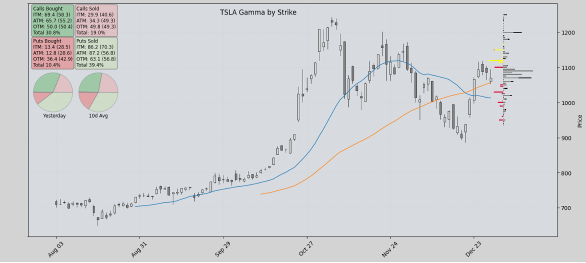
Still a work in progress, but starting to visulise things they way I would like. Thanks again.