mplfinance

mplfinance copied to clipboard
Feature Request: Superimpose larger-timeframe candlesticks
Is it possible to represent two candlestick charts of different time-frame using mplfinance ?
I see an example using bokeh from this repository.

The idea would be:
- Choose a lower-timeframe (e.g 5 Min)
- Choose a larger-timeframe (e.g 15 Min)
Then, inside each 15 Min bar would have 3 five-minutes bar
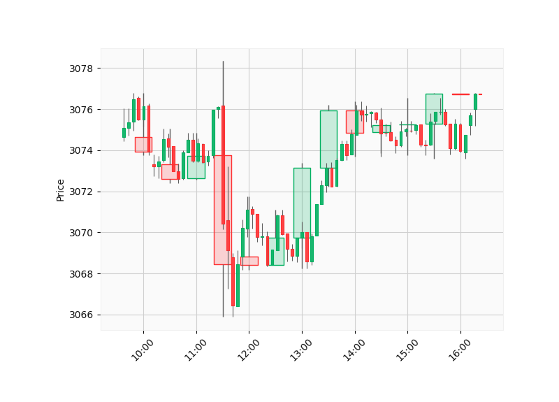
This can be done using some matplotlib and mplfinance tricks. Here is an example script that uses a data file that you can find in the examples/data folder:
import pandas as pd
import mplfinance as mpf

# Read in the Data:
intraday = pd.read_csv('../data/SP500_NOV2019_IDay.csv',index_col=0,parse_dates=True)
intraday = intraday.drop('Volume',axis=1) # Volume is zero anyway for this intraday data set
intraday = intraday.loc['2019-11-06 10:00':'2019-11-06 16:01',:] # only need part of the data.

# The frequency of the data we read is per minute.
# We can use pandas.DataFrame.resample to create
# two different frequencies: per 30 minutes, and per 5 minutes:

map = {'Open':'first', 'High':'max', 'Low':'min', 'Close':'last'}
iday1 = intraday.resample('30T').agg(map).dropna()
iday2 = intraday.resample( '5T').agg(map).dropna()

# Create custom styles.  The style for the slower frequency
# will have low alpha candles so we can see through them:
m1 = mpf.make_marketcolors(base_mpf_style='yahoo',alpha=0.2)
s1 = mpf.make_mpf_style(base_mpf_style='yahoo',y_on_right=False,marketcolors=m1)
s2 = mpf.make_mpf_style(base_mpf_style='yahoo',y_on_right=False)

# Plot the slower candles, and gain access to the Figure Axes:
fig, axlist = mpf.plot(iday1,type='candle',style=s1,returnfig=True)

# Create another Axes for the faster candles:
ax2 = axlist[0].twiny()

# Plot the faster candles on the new Axes:
mpf.plot(iday2,type='candle',ax=ax2,style=s2)

# Turn the axis display off for the extra Axes
# (since they are overlapping anyway)
ax2.set_axis_off()

# Display the plot:
mpf.show()
Result of the above script: