material-web
 material-web copied to clipboard
 material-components
Ability to customize mwc-dialog's heading
It would be very useful to be able to customize the heading of a mwc-dialog to provide background, html content such as tab-bar, x button, etc
I'm submitting a:
- [ ] bug report
- [x] feature request
Related code:
<div class="mdc-dialog__surface">
    ${this.renderHeading() || ''}
    <div id="content" class="mdc-dialog__content">
renderHeading() {
    if(this.heading)
        return html`
            <h2 id="title" class="mdc-dialog__title">${this.heading}</h2>`;
}
One could then extend DialogBase and override renderHeading
Unfortunately extending the header to something other than text this is outside of the material design dialog spec.
We ask that you please instead override the render function as that is outside of our support surface.
Here's a screenshot of a dialog in Google Forms:
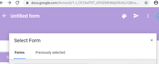
As you can see the header has tab-bar and an x button. Making a header like this with a colored background would be a matter of 5 lines of code with a simple forward thinking change in mwc-dialog-base versus 50 lines to copy and maintain a copy of the entire render function.
Hello, My soluction is:
you can extends to dialog and you can use your own MWCDialogCustom:
import { Dialog } from '@material/mwc-dialog';
import { customElement, html, TemplateResult } from 'lit-element';
@customElement('mwc-dialog-base-mod')
export class MwcDialogMod extends Dialog {
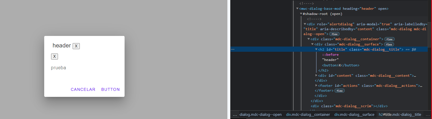
protected renderHeading(): TemplateResult {
return html`
<h2 id="title" class="mdc-dialog__title">
${this.heading} <button>X</button>
</h2>
`;
}
}
Use this to allow anything within the header via a slot and still preserve the default behaviour:
import {Dialog} from '@material/mwc-dialog'
import {customElement, html, property} from 'lit-element'


@customElement('mwc-dialog-header')
export class MWCDialogHeader extends Dialog {

    @property({type: String}) override heading = 'Heading'  // Must not be empty or slot won't show

    protected override renderHeading(){
        return html`
            <div class="mdc-dialog__header">
                <slot name="headerSlot">
                    <h2 id="title" class="mdc-dialog__title">${this.heading}</h2>
                </slot>
            </div>
        `
    }

}