material-components-web
 material-components-web copied to clipboard
 material-components
Allow overriding default overlay width of MDC mat-select
Feature Request
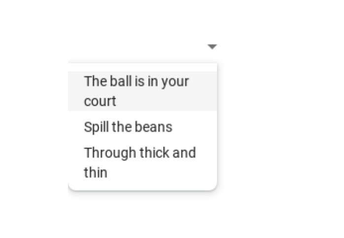
Please allow overlay width override on MDC mat-select component. Currently mat-select overlay width matches the width of trigger box.
There are various reasons why this may happen:
- overlay options have some additional long descriptions that aren't displayed in the mat trigger box
- fonts/formatting makes contents of the mat trigger box smaller
- overlay padding always makes the overlay width larger than the trigger text length given the same formatting
Smaller width of the trigger box results in some longer options occupying multiple lines, which may not be the desired experience. An alternative to multi-line options is increasing the trigger box, which may also result in sub-optimal user experience.
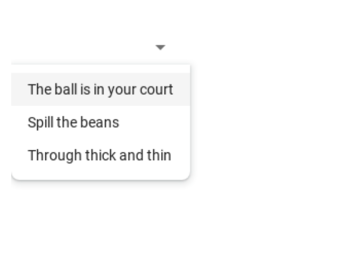
Therefore, we'd like to have an option of having overlay values inlined as a tradeoff to maintaining same width as the trigger box.
Proposed solution
An option for the mat-select component that would allow users to control width of the overlay either as free variable or as a set of options like "max-option-width", "mat-trigger-width" etc. with the latter as the default.
Alternatives considered
We find this way of displaying mat-select as an important part of user experience, and therefore we looked into different ways to override the overlay width.
We looked into
- breaking component encapsulation to modify width of the children directly.
- using (this.matSelect as any)._getOverlayWidth = () => 'auto', which is our current workaround.
None of these solutions are "clean", and we would much prefer if mat-select provided in-house solution to the problem.
Additional context
Current usage:
Desired usage:
+1 The current behaviour is not the best with tight spaces.
Workaround:
.cdk-overlay-pane:has(.mat-mdc-select-panel) { width: auto !important; }