Support Pandoc preprocessing / enhance MD support
Hi Andrew,
This project actually uses this package for generating HTML from markdown. It does indeed support the original markdown spec, rather than GFM. However, I've just enabled some more extensions and removed some elements from the HTML sanitisation operation. Namely, these are now working:
- footnotes
hrmarksup- the complete list: https://github.com/sirodoht/mataroa/blob/9ddce2e3d1e23c80c72fdd6363bc21a54d910eaf/main/helpers.py#L129-L199
Looks much better!
However, this doesn't solve typography/typesetting. E.g. -- isn't converted to — and text isn't aligned horizontally.
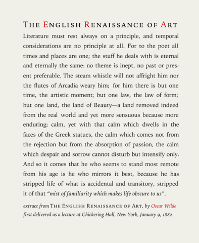
Example of well-aligned text:
Hmm, is -- converting to an em dash part of GFM or another markdown spec? You can always use the literal em dash character — inside your markdown text.
As far as well-aligned text, are you referring to justified alignment? As in flush both left and right? I am not a fan of that style due to space irregularity between words.
Regarding the first point: https://pandoc.org/MANUAL.html#typography
On the second one, let's open pretty much any printed book and look inside... Looks rather justified and well-balanced, right? People have spent significant amount of time figuring out how to help fellow humans to read text. I just humbly suggest to take an advantage of the pre-existing knowledge.
For typography, my authority is Practical Typography by Matthew Butterick: https://practicaltypography.com/
So, on multiple-hyphens-as-dashes the book's decree is that it's a bad typewriter habit (see number 3 here: https://practicaltypography.com/typewriter-habits.html)
On justified text what the book says is that it's a matter of preference rather than indication of quality. I agree, justified text might look better, but I really don't like when the spaces between the words become too coarse. And the reason is this:
Keep in mind that the justification engine of a word processor or web browser is rudimentary compared to that of a professional page-layout program. So if I’m making a word-processor document or web page, I’ll always left-align the text, because justification can look clunky and coarse. Whereas if I’m using a professional layout program, I might justify.
From https://practicaltypography.com/justified-text.html
I am not aware of mr. Butterick, but rumours are, Jan Tschichold's "The New Typography" still holds.
So, on multiple-hyphens-as-dashes the book's decree is that it's a bad typewriter habit
Precisely. This is why -- should be converted to — and hyphens shall be contextually "upgraded" to en/em dash where appropriate.
Regarding the implementation, you might consider Python MD extensions. For example, Smarty might be a good start.
Precisely. This is why -- should be converted to — and hyphens shall be contextually "upgraded" to en/em dash where appropriate.
My problem with that is sometimes people might want to just write literal two or three hyphens in a row, -- or ---. I don't want to upgrade those when they didn't mean to. I have experienced that and it was annoying.
Typing the literal em and en dashes (here's a how-to) seems to allow the user more typographic control.
thanks for pointing to the markdown package, [TOC] generates TOC automatically