joinmastodon

joinmastodon copied to clipboard
Fix show stopper in onboarding UX
Yesterday, I signed up for Mastodon and I encountered what I think is a show stopper. I'm coming from an IT background and still I struggled a lot on this page:
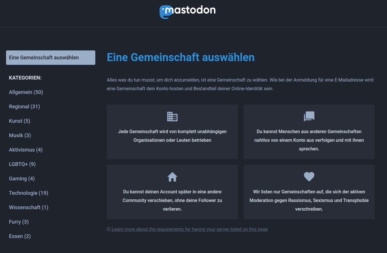
There's no call to action and an average user will stop trying to sign up at this point. It is not clear that a filter needs to be selected first. Filters (as a design pattern) limit the information that is visible on the screen rather than extending it.
Suggestion
Show all Mastodon instances by default. When selecting a filter, limit instances to only the ones matching this filter.
Alternative
Select the first filter by default so that the instances matching that filter are visible.