elevatorsaga
 elevatorsaga copied to clipboard
Improves readability of floor numbers and makes better use of space in the "waiting area".
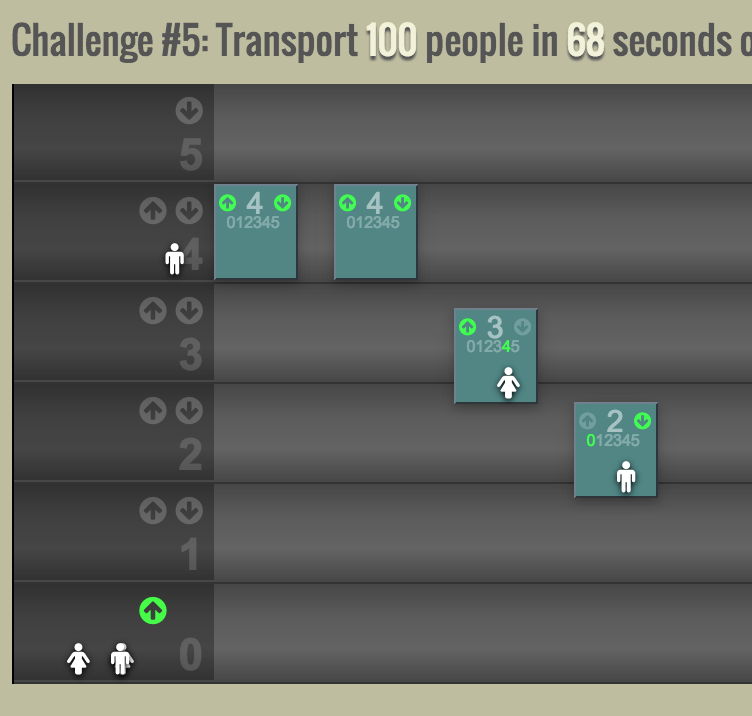
Nice! However, I don't like how users will spawn on top of the floor number, and that they will "fly" past the floor number when they get on an elevator.
Any specific reason that the floor number is lower right? Otherwise I suggest moving it to the left again.
Main reason for floor numbers on the right side: much closer to the elevators which are in constant flux. It makes tracking/comparing elevators with the floor's arrow indicators much easier. The main drawback, as you've stated, is users can appear over the floor numbers. But those numbers are constant, motionless, and large.
Although, I don't like that users can appear above floor numbers either. Maybe we can place the .floor-info at a higher z-index? Or even increase the background darkness?
Nah, maybe it's not a big deal. Can experiment with it later. I wouldn't want the floor number to have higher z than passengers, as I imagine the floor number is written on the wall of each floor.
Another idea is to shorten the waiting area width so that users don't wait on top of the floor number. The only time they'd cover it is when they pass it on the way to an elevator.