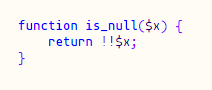
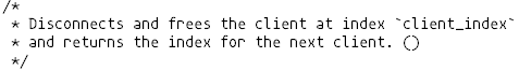
mononoki
 mononoki copied to clipboard
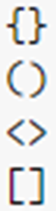
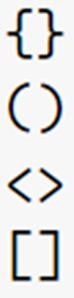
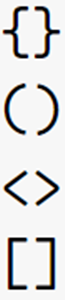
"(" and ")" should be mirrored
Personally I kinda like this, it adds some character, but looks like it's a bug. Other brackets don't have this.
I've also noticed that the higher the font size, the smaller the visual error (VSCode, Windows), but maybe that's just me.
| 14px | 24px | 34px |
|---|---|---|
 |
 |
 |
The following is a guess I have about the parenthesis issue:
The source, using cubic bezier, of the parenthesis glyphs is perfectly symmetrical for ( and ). The exported ttf (and woff) use quadratic bezier curves, which somehow results in asymmetry between ( and ) that might play into the result.
Source (cubic bezier):
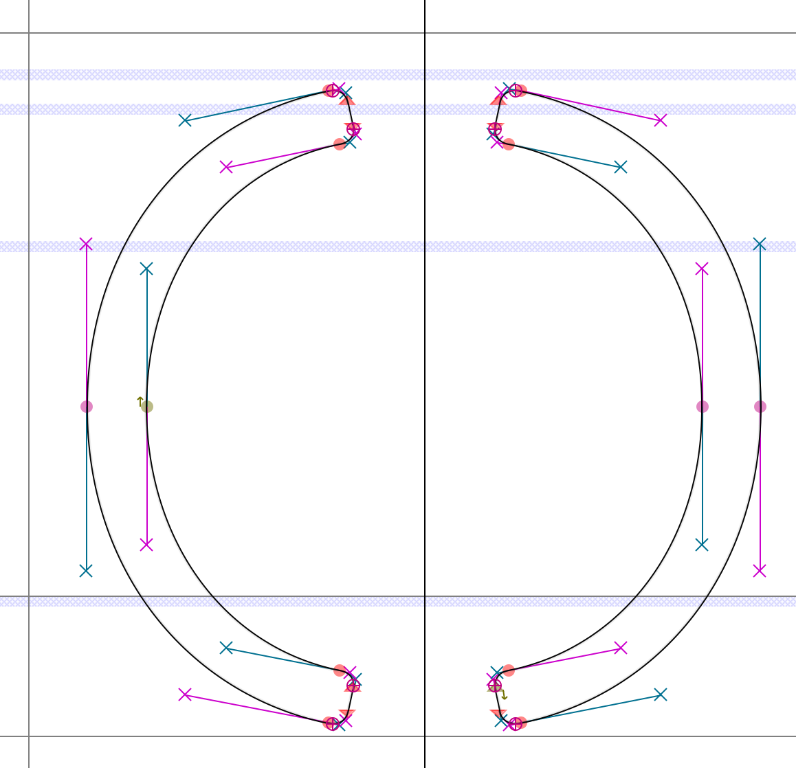
Exported ttf (quadratic bezier):
The top of the left parenthesis is pretty much identical to the bottom of the right parenthesis (and vice-versa):
(VsCode on windows)
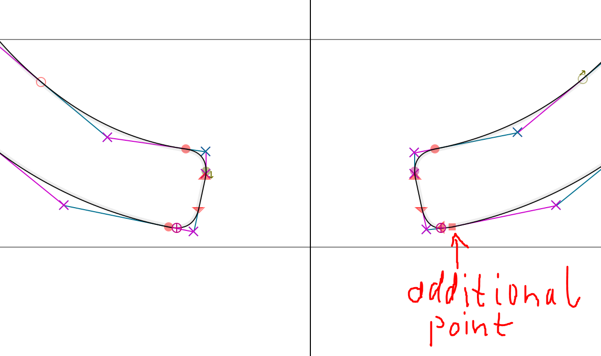
 The additional point seems to greatly strengthen the stroke.
FontForges conversion is in the aspect of symmetry better (though, pretty horrible in a different way xD):
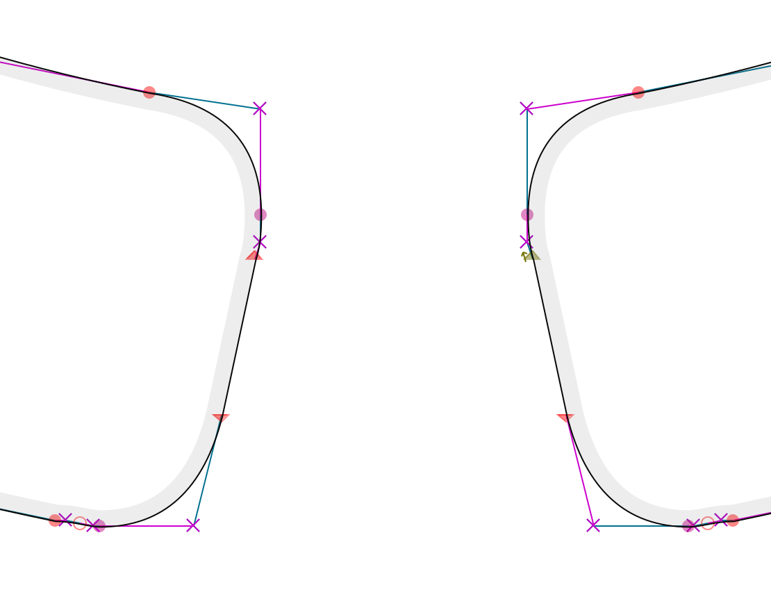
Resulting in VsCode rendering of:
Hinting might also be involved.
I'm currently trying to figure out how to persuade the export to not do that stuff. Meh, this sucks. Maybe i have to repaint the parens completely to get around it
I support this idea! Having this
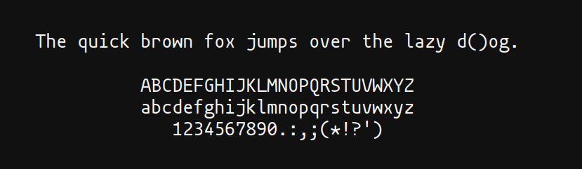 makes me feel uncomfortable.
@madmalik sorry for the ping, did you managed to look into the issue in much depth?
makes me feel uncomfortable.
@madmalik sorry for the ping, did you managed to look into the issue in much depth?
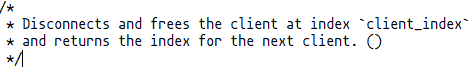
I have investigated this issue to the best of my ability, but was unable to pinpoint the reason for this rendering issue. Unfortunately I also was unable to reproduce it in my own environment (MacOS), making further investigation difficult. I have therefore decided to redraw the parens characters for version 1.4, in hopes that the slightly changed shape will lead to more consistent rendering across all font sizes and rendering engines. I would very much appreciate any feedback on how the new parens are behaving in version 1.4!
Useful information to include in your feedback:
- The OS and program you're using
- The affected font size(s)
- If you're using the ttf or the otf version
- If possible, a screenshot
Thanks everyone for your patience and cooperation as I'm figuring this out!
I would very much appreciate any feedback on how the new parens are behaving in version 1.4!
Looks good now! Tested under Windows 10 (21H2); 8pt, 9pt, 11pt, 13pt, 20pt; otf; VSCode and Notepad.
Looks good now! Tested under Windows 10 (21H2); 8pt, 9pt, 11pt, 13pt, 20pt; otf; VSCode and Notepad.
thats great to hear! Did you test the otf or the ttf files?
Looks good now! Tested under Windows 10 (21H2); 8pt, 9pt, 11pt, 13pt, 20pt; otf; VSCode and Notepad.
thats great to hear! Did you test the otf or the ttf files?
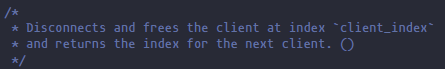
OTF, but hang on, something's wrong. Now a lot of characters look really incosistent, especially u and e.
VSCode (13px, OTF):
Notepad (11pt, OTF):
on Windows 10 (21H2).
Ok, this is a problem with the OTF files. Using TTF it looks better.
VSCode (13px, TTF):
Notepad (11pt, TTF):
Since the redraw seems to have fixed the parens rendering issue, I'm closing this issue. If someone is still encountering this on version 1.4, please comment here and I will reopen!
I've opened a new issue (#94) for the faulty otf rendering.