slides
 slides copied to clipboard
Two column layout
Thank you for this great program!
When bullet points are short but many, it makes sense to not display one long list, but two next to each other. If images will be implemented, showing images next to text might be very appealing.
Maybe this could this be done via theming. Not sure whether images shown in terminals allow text next to it.
Hey this is a cool idea! Thanks for opening up this issue ❤️
If you do want to show images though (before I get around to implementing this) I would recommend using tmux and putting the slides in one half of the screen and imgcating the image in the other half.
has a centered layout also been considered? or is this already possible?
Could this issue be generalized to an n column layout ?
Could this issue be generalized to an
ncolumn layout ?
It could be generalized. What are the use cases for 3, 4, 5, ..., n columns?
If there's an easy / simple way to introduce generic layouts (sort it like tmux layouts) I would do that, but I don't want to unnecessarily complicate the interface for layouts the user will probably never use, if that makes sense.
but I don't want to unnecessarily complicate the interface for layouts the user will probably never use, if that makes sense.
It absolutely makes sense, yes!
What are the use cases for 3, 4, 5, ..., n columns?
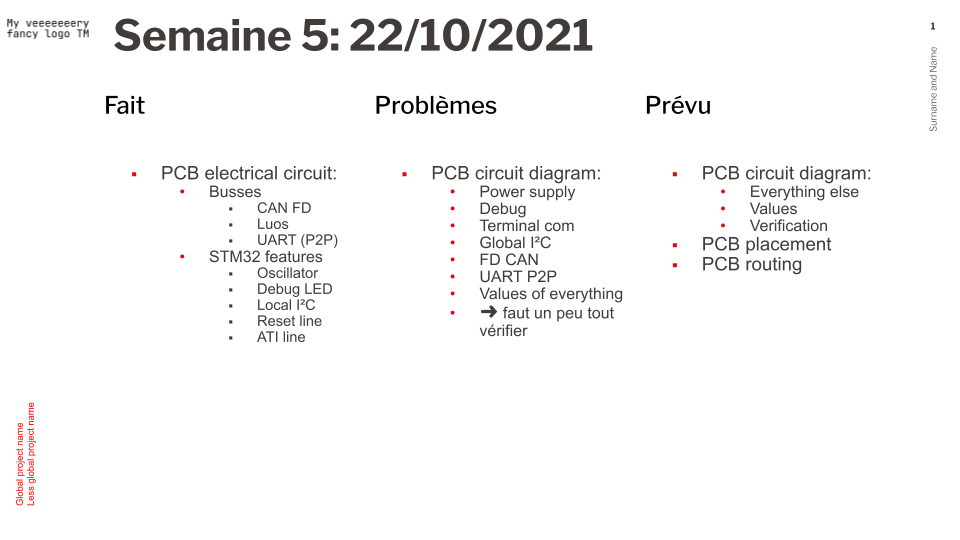
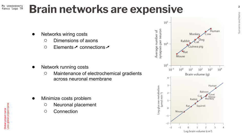
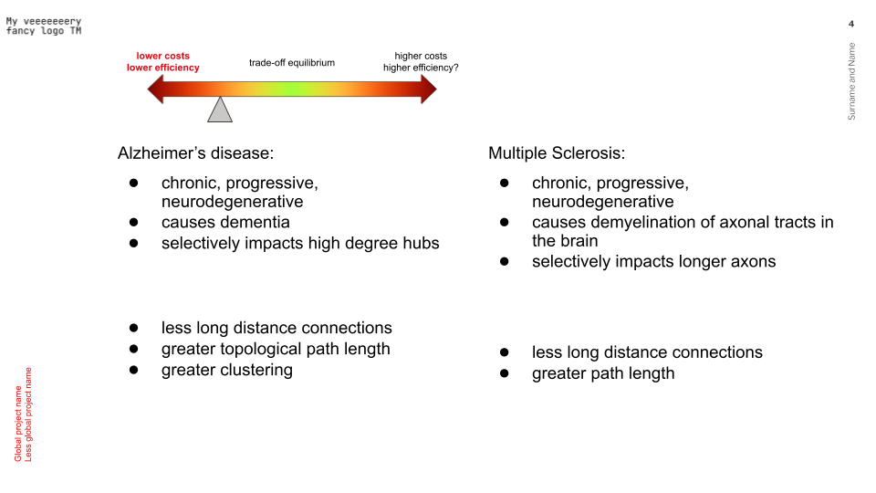
I've gathered a few (cat-censored) slides to try and answer that question. While there is only one example for more than 2 columns (3, in that particular instance), I've also aimed to offer varied layouts (for 2 columns), because I feel like if you know what people might want to do with columns, it might help you when implementing features. Hope that helps / answer the question!
Use case 1: 3 columns with semantic grouping of the information

Use case 2: 2 columns with different or same widths for balanced usage of screen space


Use case 3: n*2 columns, with different or same widths for further balanced usage of screen space
Here it's 2 columns of different widths, then 2 of equal width

And there it's 1 columns followed by two columns of the same width

Use case 4: Again, screen space balancing, just trying to provide insight of layouts that I personally find relevant


Just to throw in my 2 cents at this, and I don't know if this is implemented already, but since lookatme is an inspiration, maybe we can do the styling like it does? In the markdown header itself? I noticed that in the tour section.
And if this is already a feature, than I guess the big thing would be to document it
Congratulations on the app, btw. I use this for all weekly meetings I have to present at my company!
Any idea how this would be represented syntactically?
This would be the first instance of a per-slide config item, right?
Some suggestions:
HTML Comments:
---
<!---
layout: two-column
-->
---
Code blocks with a custom qualifier:
---
```slides-metadata
layout: two-column
```
---
Abuse anchor labels:
---
[layout]: # "two-column"
---
And then how do you tell the slide when to split? By heading?
---
```slides-metadata
layout: two-column
```
# Col 1
- A
- B
- C

# Col 2
- D
- E
- F
---
@joerdav I think if the layout: two-column then essentially the slides will be placed two on a screen at a time:
# Slides

First Left

---

# Slides

First Right

---

# Slides

Second Left


---

# Slides

Second Right
Would this be reasonable?
I would expect the layout to be per-slide, rather than global. You might want to have a mixture of two-column and one-column.