Inconsistent height of feed items listview rows in wide view mode
Trying out 1.12 RC3, I've noticed that the items inside a feed are now listed with bigger row heights... interesting change I guess, however beyond the cosmetic issue of "favicons are usually low-resolution and thus don't look too good scaled up", there is the issue that the height is not enforced to be consistent. Sometimes I can tell why (because text is wrapping; it probably shouldn't, by the way) and sometimes I have no idea why the height is different:

The screencast in https://github.com/lwindolf/liferea/files/1253993/Screencast_2017-08-26.zip demonstrates the issue, where the "RaspbianFrance" item is already taller than the three above it, and becomes even taller when the text starts wrapping due to the addition of the "Important" marker label.
I can sometimes reproduce the uneven spacing. I have no idea what is causing it.
Wrapped lines being larger is actually intended.
The favicon issue is due to be expected. I'd estimate 10% of the webpages given 16x16 icons only. Upscaling those looks ugly. I'm not sure what to do with those. Maybe not displaying very small icons. But that would confuse people.
Hi @lwindolf , I don't understand why the wideview mode has a different layout for the feed title list (comparing to the normal view): larger favicons and text font.
I think a user would choose to use wideview when on a large screen, to save vertical space; but if you enlarge favicons and font size, less items fit the window, so there's no real advantage to use wideview 😞
I attach a mockup I made, to suggest you to make the feed title list looks the same in normal view and wide view (as it was in liferea 1.10):
This way, you won't face the blurry favicon issue (due to small, 16x16 favicons), too 😉
Thanks a lot for your work, I hope you can find my suggestion useful.
@tilt-me Thank you for your feedback. For the final release the wide view saw some additional changes. Icons are now not blurry anymore and I believe the teaser texts now added are a real benefit for several use cases:
- small screens and half-screen mode (allowing for small wide view column, giving a lot of space for the HTML view)
- touch screens (providing touch targets)
I understand that you use case to save vertical space is broken by this. On the other hand consider the readability of the current large icon+teaser solution: the end goal is to skim information and only when needed deep dive into the webpage. I believe that this works very well. The darker headlines allow identifying interesting keywords, while the large favicon provides context. Once a relevant keyword is identified checking the teaser leads to a quite good decision on wether it's worth on opening the article. In the past the wide view had a significant problem: you had to look to the left for the title and then to the right for the article, again and again to decide if it is worth reading. Or something you'd ignore the item list and just stare at the HTML view seeing the articles appearing in full glory while loosing oversight on the next headline coming... I believe the new view solves this problem.
I plan to see how general user feedback on the wide view change in 1.12.0 is and if the uproar is to large I'll consider a preference to restore the old behaviour.
Update: so far feedback didn't turn out too bad.
How is the latest code for you guys?
I'm very unhappy with the wideview layout too, but i understand your decision. So i wan't to change the source for myself. Can you give me a hint where to start to change back to the old layout?
Greetings and thank you.
I personally don't mind the buttons having a larger surface in the wide view, but I would like them to be at least of the same height, even if that height is rather large.
A rather extreme case, with the Pidgin Bitbucket commit feed:
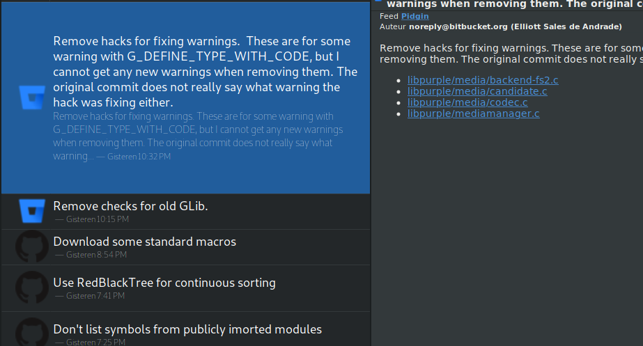
But, as mentioned, I think showing a lot of information in wide view for the reasons posted by @lwindolf is in itself a good idea. It currently just looks a bit out of whack because the row heights are not consistent. What Feedreader is doing sounds like it's worth stealing for the wide view in Liferea as well; it exclusively uses a wide view and also has large list items, but they are of the same height and ellipsized at a certain point.
That, and I'd also make the favicons a bit smaller, since they tend to be rather low in resolution. I also doubt favicons this large contribute a lot compared to smaller ones.
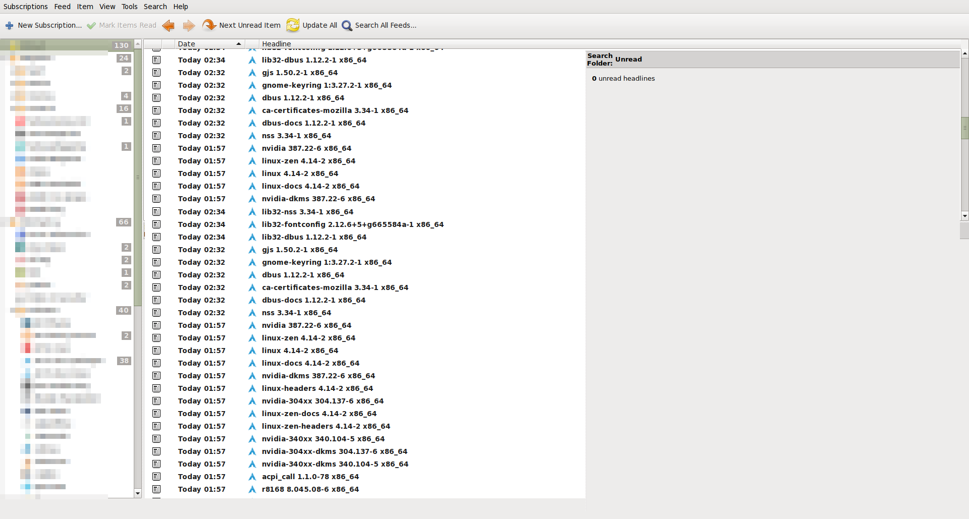
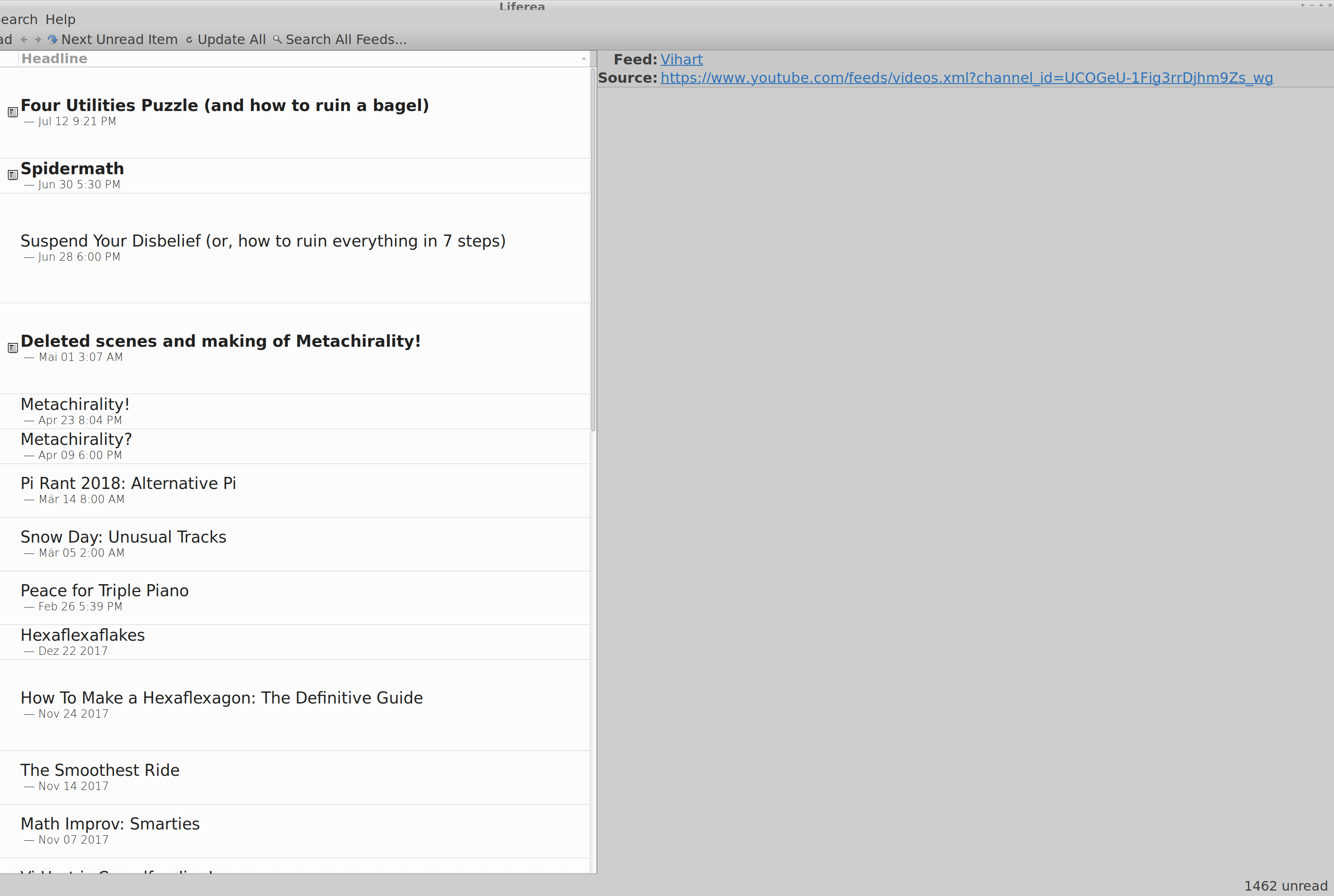
My feedback: wide view is now useless to me. I have a rather wide monitor with 4k resolution, and fonts set correspondingly large. The reason why I used wide view was so I can use monitor space efficiently, with a list that is wide enough to read the titles and see unread items, while having an article view that is not too wide for reading the text. Not only does the new list look weird with the masses of white space it has, it has shrunk from 50 entries to an inconsistent number, sometimes just 2.5, making skimming for unread titles tedious. Maybe the excessive amount of whitespace is a bug?
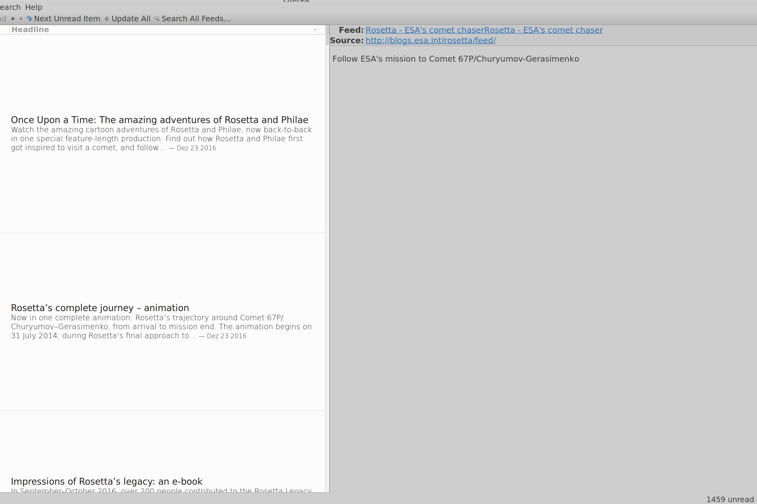
@spielmannj I tried the ESA Rosetta feed and cannot reproduce the excessive wide spacing. Which Liferea version did you test with?
Oh, sorry, I thought that this layout was common now. The version I have is the one bundled with Ubuntu Bionic, 1.12.2. I used the version bundled with Ubuntu Xenial before (1.10.17-1ubuntu2), that did not show this strange behaviour. This concerns all kinds of feeds, not just the ESA Rosetta one. Another screenshot of a Youtube feed is attached. Please note that this is a 4K screen, with the font size set to 10, at a custom DPI setting of 229. There are a handful of programs that seem to scale strangely with these settings, but it's usually fixed-size dialogs. If you cannot reproduce the layout, I'll attribute it to my strange setup. =)
Many thanks!
Hi @lwindolf, I've got some good news. Looking at this issue again, and realizing that it was stuck in a bit of a "fuzzy situation" where some sample feeds might help reproduce the issue, I went down the rabbit hole, spent the day investigating this, and have some potential solutions, even code. My comment here is a bit long but I think it will prove insightful.
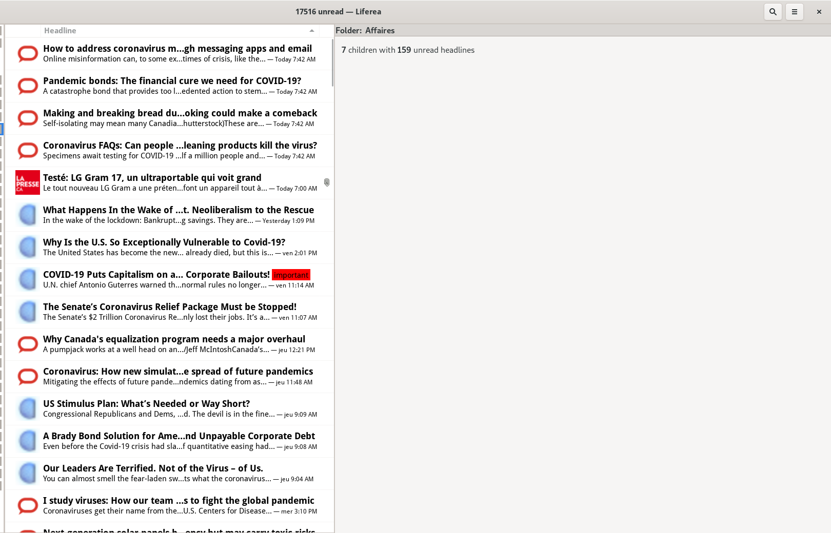
For starters, here are three example feeds:
- https://theconversation.com/ca/business/articles.atom
- https://www.lapresse.ca/affaires/rss
- https://www.globalresearch.ca/theme/global-economy/feed
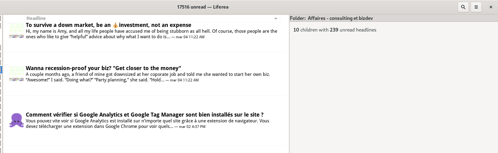
...when combined (by putting them in a feed "folder" and telling Liferea to only show unread items for that folder), they yield this result:
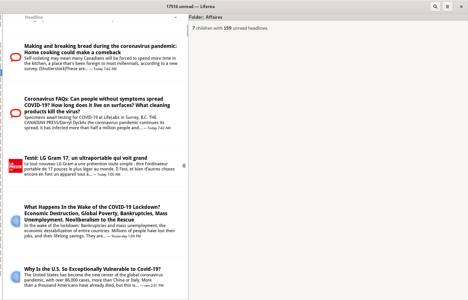
Here we see a couple of issues:
- Height can vary a lot from one feed item to another depending on the title length ("does it wrap onto two lines or not") and the presence of a description or not. In fact, my screenshot above doesn't show the "worst" case of this problem, because all the items have ample descriptions/teaser texts, but it can look way worse than this, believe me.
- In nearly all cases there is a very thick "margin" above and below each row, which compounds to eat about half the vertical space.
Now, I just realized that this margin is not created intentionally, it seems to actually be the result of Liferea calculating the height of the text "when wrapped to the maximum", i.e. when the column is super narrow, as you can see here:
This is further confirmed by using the Gtk Inspector.
- If you select the "Headline" GtkTreeViewColumn and change its "expand" property to False instead of True, you see the text wrapping to fill exactly the height of that blank space. That explains the blank space!
- If you set the "fixed-width" property to "800" (instead of "-1"; note that you can also set that column width simply by dragging the column divider in the UI instead of going through the Gtk Inspector), you see that at 800px it can fit snugly on three lines in a way that matches the height of the feed icons, which I suppose is what you intended in the first place. The strange margin problem remains then.
Going two levels deeper in the inspector's object hierarchy, to the GtkCellRendererText widget, which only affects the currently selected item:
- Setting the "height" property there to "60" (pixels; this gives room for 1 header line + 2 description lines, and a little bit of whitespace above and below the feed icon). Note that for some odd reason the height changes are only applied when you mark the item read/unread (with a middle-click). With this, the row can now finally have a fixed height, though I'm not sure if this is the "perfect" solution (see end-note below).
- The problem then becomes that the text is not correctly ellipsized to fit those 60 pixels (as the trailing stuff typically goes into a third line that is cut off. I then set the "ellipsize" property on the GtkCellRendererText to "PANGO_ELLIPSIZE_MIDDLE" and it worked! Why did I pick "MIDDLE" instead of "END"? Because if you ellipsize the end of the string... the timestamp gets ellipsized out! It would be better if you had a way for that part of the string not to be affected by it, especially since middle-ellipsizing actually causes double ellipsizing since you were already manually truncating the description string at the end with "..." so you end up with this:
If you choose this path, then you would probably need to stop ellipsizing the end of the description manually.
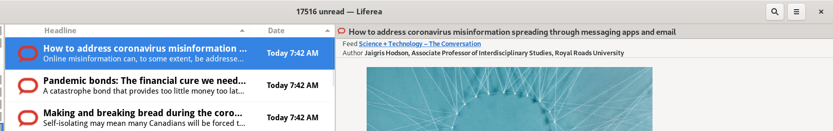
An alternative to this would be to show the Date column again, and ellipsize the Headline column to "END". You don't really save space if it's hidden and you yet you don't miss a ton of critical information with it present, it looks more natural in my humble opinion:
The problem with ellipsizing at the end is that your current implementation also uses the end of the title string for the "important" status label, which can then get truncated if the title is too long...
So, while my experiment puts us before a choice to make (middle-ellipsizing vs having the date as a separate column) I think already my first commit gets us 90% of the way there and is a much better situation than what we have now. To summarize: no need to set GtkTreeViewColumn's "expand" property to false after all, to achieve my result it seems you just need to set the CellRendererText objects to have height = 60 and ellipsize = PANGO_ELLIPSIZE_MIDDLE.
Anyway... You can find my basic attempts at fixing the code here: https://github.com/nekohayo/liferea/commits/fix_534_widemode_row_heights (and you can cherry-pick/merge them if you like them, then build upon that work). Check out that branch and see if it improves the situation on your side? Disclaimers:
- I have not tested that code, only "proven it to be correct" ;)
- There might be other approaches I haven't figured out / couldn't find simply by using the Gtk Inspector, so maybe you or other people subscribed to this bug report can find the optimal solution.
End-notes:
- When you look at the "FeedReader" app (which is basically Geary's interface but for feeds) you see that usually there's space for 2+2 text lines, and if a feed item has no excerpt/description the feed reader tries to fill it with one line, but FeedReader does not have an exactly equal height among feed items (if you measure with a pixel ruler), it just has a "nearly equal" height by virtue of controlling the number of text lines shown, so it plays a perceptual trick on the user, but the result seems good-enough. Perhaps you could adapt that code?
- There is one problem with my personal "fixed height" implementation: setting the height to a hardcoded 60px value is problematic if the user's system font sizes are not 1.0, it will break like this if you set it to 200% (note that I'm talking about font scaling, not global HiDPI scaling, which is unaffected; also note that since FeedReader doesn't use such a fixed height implementation, it does not have that problem):
And if you prefer to look at how FeedReader does it, I think this is the code that makes it happen:
- https://github.com/jangernert/FeedReader/blob/master/src/Widgets/ArticleRow.vala#L76
- https://github.com/jangernert/FeedReader/blob/master/src/Widgets/ArticleRow.vala#L189
Not only does it handle complex layouts with icons and multiple labels, it also hints at this particular trick, telling GTK how many lines a label is supposed to be:
		body_label.set_line_wrap_mode(Pango.WrapMode.WORD_CHAR);
		body_label.set_line_wrap(true);
		body_label.set_lines(2);
FeedReader's approach might be superior to mine in terms of flexibility and appearance, so if any of you feel motivated to go further than I did, feel free to study that code and see if something great could be done for Liferea!
Also, I stumbled upon this old blog post tonight: https://blogs.gnome.org/chergert/2017/07/01/reflowing-text-in-gtktreeview/ which seems to hint that trying to handle dynamic text wrapping and reflowing, in a gtk treeview, is not possible without hacks. So my "~ 60px" approach above that ends up limiting the height to roughly two lines, might not be a bad approach in practice.
Thinking on this quite some time now, I believe reimplementing the item list using Webkit seems much more easier and we can apply any eye-pleasing layout we can imagine. I'm guessing when using <div>s it surely will be faster than GtkTreeView anyway. Although accessibility might suffer a lot...
Alternatively for your long-term implementation, perhaps https://developer.gnome.org/gtk3/stable/GtkListBox.html would be a better widget for this than either TreeView or a webkit thingy? The "Description" section of that page says:
A GtkListBox is a vertical container that contains GtkListBoxRow children. These rows can by dynamically sorted and filtered, and headers can be added dynamically depending on the row content. It also allows keyboard and mouse navigation and selection like a typical list.
Using GtkListBox is often an alternative to GtkTreeView, especially when the list contents has a more complicated layout than what is allowed by a GtkCellRenderer, or when the contents is interactive (i.e. has a button in it).
[...]
In https://github.com/aprilis/messenger/issues/10 @Philip-Scott had good words to say about that widget.
Anyway, in the short-term... implementing a stopgap two-liner "fixed height" hack like what I've proposed in my previous comment, while not entirely perfect (it "can" mess up if users have non-standard font sizes, but a bit unlikely for most people), could be a good "maximum bang for the buck" compromise to improve the lives of 80-99% of current liferea users interested in the widescreen view, until an "optimal" widget solution is found and implemented. Worth giving my branch a shot maybe?
What is also visible in the screenshot of the OP is that it items seem to be missing padding, so if you have larger favicons, they are "glued" to the border in between the items, which doesn't look pretty, to say the least:
I did some tinkering with CSS, and think that this can rather easily be solved by something such as:
#itemlist.view {
	padding-top: 0.5rem;
	padding-bottom: 0.5rem;
	padding-left: 0.25rem;
	padding-right: 0.25rem;
}
The result:
The left and right padding is to get some additional padding between the favicon and the feed title, but it will also affect the item itself. I couldn't find any more specific selectors to limit that appropriately. Also, height and width don't appear to be allowed here - probably because GTK handles sizing through its own widgets.
I don't mean to add additional pressure for getting this change in (although if it works, nice! :smile:), but since the headerbar plugin instantly rocketed Liferea into looking more modern on the GNOME desktop, I feel that consistent row heights on top of these padding changes could make Liferea even more visually appealing, even though the change seems minor.
Would making a pull request with @nekohayo's changes help in getting this reviewed? If it is undesirable to make this global, a plugin may also work - though I'm not sure it's possible to access the cell renderers from the tree view only (I'm not that familiar with GTK).
@nekohayo Rereading through all the hints so far I found that Feedreader actually uses GtkListBox which enables the precise positioning along with using a GtkLabel for the headline and to do advanced Pango magic on the label. All of this cannot be applied to the GtkTreeView.
What I'd also like to avoid is to have an implementation based on GtkTreeView and one on GtkListBox. Maintaining twice the code is not good. And realizing the "email" like view with GtkListBox doesn't seem like a good idea.
I think the complexity stems from having an application with diverse view modes. All the simpler contenders can optimize on one mode. In comparison in Liferea probably "email" like view mode is most optimized.
Checking the GtkBuilder code investigating https://gitlab.gnome.org/GNOME/gnome-builder/-/blob/master/src/libide/gui/ide-fancy-tree-view.c might be worth it (although it is explicitely single-column only, GPL3+ only and would still be a 2nd GtkTreeView implementation).
@Gert-dev Thank you for suggesting the CSS fix. While it would help those users affected from the spacing issue it would waste vertical space for all others, which according to bug report frequency I believe to be a large majority. This is why I'd not apply this workaround.
Personally I think if only one view mode must survive (if it comes to this), it should be the "wide view" mode; and if you're worried about not fitting 4:3 screens, there's a design trick for that: having the ability, when window width is insufficient, to combine the "feeds list" with the "feed's items" in the same column by dividing them as two rows within that column. Geary's UI preferences offer that ability to combine the first two columns into one, as you can see in this example:
(and a smart app could simply activate that behavior automatically when the screen width is too small)
I will also say that, as someone who has a ton of unread items to go through everytime, I preferred the old (pre-1.12) wide view mode, which was using the exact same view widget as the normal view mode, except that the pane was vertical instead of horizontal; it was more compact and it had no bugs. It would also make it highly compatible with a two-columns layout like the Geary screenshot above.
This is how it would actually look like in practice if you combined the old wide view's listview layout with a two-columns global layout, on a laptop screen at 1366x768 (and it would still work even at 1024x768):

This is barely modified from reality, I could already achieve 70% of that just by changing two properties using the GTK Inspector, but then I had to GIMP a bit so that the "feeds list" was not full-width and instead let the contents view pane go full height. So it's actually a rather simple implementation, and it would let you shave off a TON of code.
Gentle reminder (if it went unnoticed above) that there were some tentative fixes for this available in https://github.com/nekohayo/liferea/commits/fix_534_widemode_row_heights, though I don't know if they are still applicable today, and/or if you intend to port away from TreeView to a more modern widget provided by GTK4 (such as ListView), like many other applications are doing (it seems the hate for TreeView is nearly universal ;)
@nekohayo I still intend to look at your fixes. Just found no time yet. Will take a bit longer.
As for going to GtkListBox that is probably something realistic to be done with the GTK4 port.
Indeed, I also recently learned that GTK ListView (whose scrolling functionality is broken as of February 2023) is a brand new GTK4-exclusive widget, alongside ListBox and some others. For some reason I was under the impression than ListView existed since time immemorial.
So potentially you'll be able to rebase my old attempt (if it works) as a stopgap before the eventual GTK4 port, if it actually works.
Argh... this is the ugly Nautilus bug when you scroll with large icons. That explains a lot.
The listview scrolling issue has been fixed in 4.10.1 (which is available in up-to-date distros) and 4.11.x, and this piece of news may be relevant to you in general, in the way ListView is meant to become the replacement for TreeView: https://blog.gtk.org/2023/04/05/gtk-4-11-1/
Looking at this again today I'm a bit confused as to whether this ticket was closed by mistake, or if there is a fix somewhere that is not referenced here?