self-service-password
 self-service-password copied to clipboard
Interface is confusing
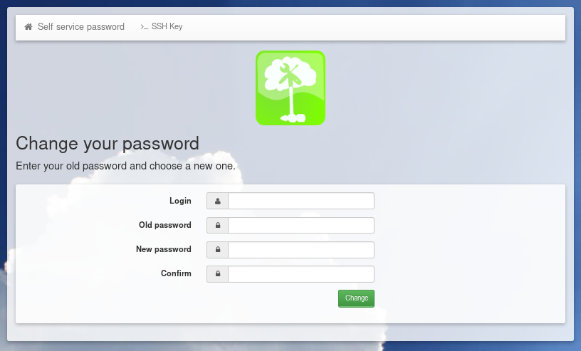
The interface for changing passwords is clean and simple, yet it is confusing:
- the main title "Change your password" looks like the result of a previous action
- the sub-title, inviting to enter the old and new passwords looks like a warning.
Actually, the bootstrap classes are self-explanatory and — in my opinion — wrongly used: "result alert alert-success" and "alert alert-info".
I can propose a pull request.
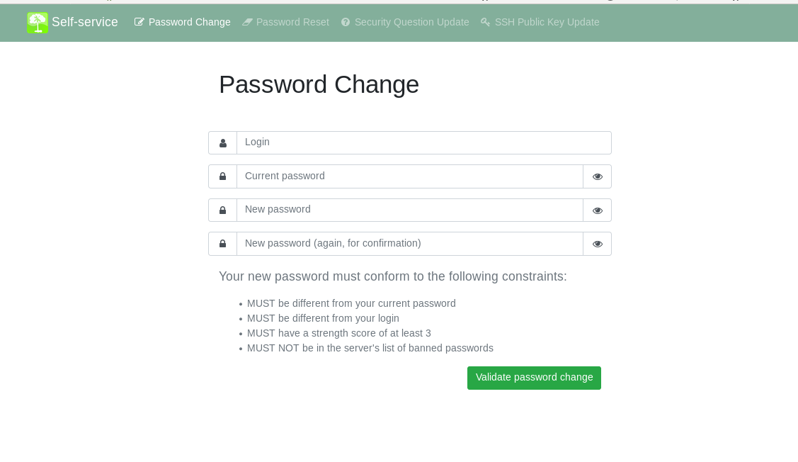
Well, I'm no designer and I like simple things. I would probably start by removing the CSS classes, using more meaningful tags (h1, p.lead) and removing icons:
@ntoniazzi I think you are on the right direction,
@coudot @ntoniazzi
How do you feel about this draft design ?
 'self-service' link will open a list of enabled features of SSP
'password reset' will open a page with a link to reset by questions, reset by email or reset by sms
'self-service' link will open a list of enabled features of SSP
'password reset' will open a page with a link to reset by questions, reset by email or reset by sms
Hello @plewin,
your proposal is nice. I'm not in favor of using full screen but this can be discussed.
There is a lot of work if we want a 2.0 version with all your changes. For the 1.X versions, I think we will keep the interface as it is.