New Name and Logo
As discussed in Issue #1, "Hexiano" and the Hexiano Logo are trademarked. To prevent any issues with IP infringement when publishing, the program needs a new name and logo (for the second time).
Let's discuss proposals for names and Logos here in this issue.
I tried in Inkscape for an hour or so, and this is the result. It was peer-reviewed by my wife, let's see what others think of it.
Short description: Hexagonal to point out the key layout principle, with an "x" inside as a symbol that it can be adapted to a lot of layouts; also "x" is maybe a shortcut for "hex".
Under Austrian law I cannot give up my "Urheberrecht", which is similar but not equal to Copyright. I would place it under an Creative Commons license, as permissive as possible.
I propose the name "IsoPiano"
@trapicki 's logo is very nice: clean, simple and elegant.
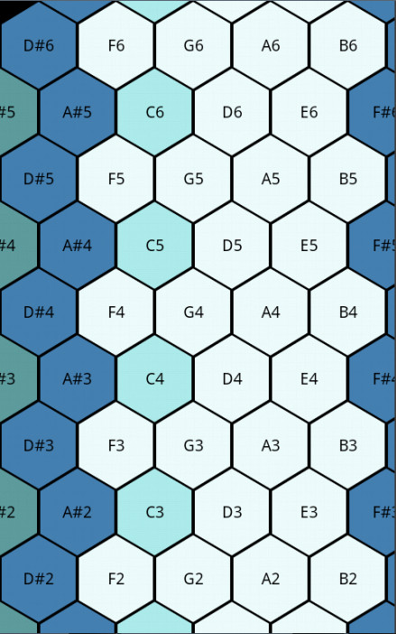
It looks nice, but I'd expect to see "keys". I made a few changes, is it too noisy/confusing?

PS: As for a shorter name, how about (he)X(mu)sic? Edit: Made a smaller preview, 256x256 is quite large.
@vimino It's a bit noisy, maybe having the x be half-white half-black?
Also, the bottom background goes from "less dark" to "darker", while the top background is "medium" "dark" "light" (from left to right) could you normalize it a bit? (either "all ordered" or "no ordered")

Nice! It's much more readable.
Can you try an "all unordered" version? Also I see a small border where each section meet, can it be removed?
Hey guys, sorry for the late reply, thanks a LOT for the contributions!
I like the logo design! I just would prefer something a bit more "punchy", maybe we can simply add colors to the background, such as the shades of blue colors of the app's keyboard? (there are 3 different blue colors, if we add white and black there are 5, just need to invent one, can be purple like the special keys or another shade of blue).
As soon as we agree on a name and logo, I will update and upload the app everyone :-) Thanks a lot guys!
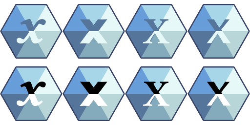
Alright, I hid the separating lines (Inkscape is very precise) and figured I might as well make several combinations, ending with the counter-clockwise (brightest to darkest) I made last. That way you can compare and pick your favorite. I also colored them with the colors from that image (I had to interpolate 2 of them). PS: The zip file has easily-editable SVG files I made for each of them in case you'd like a different combination or colors. They might only work with Inkscape though.

@vimino Thanks a lot, that's very useful!
I agree with @0x5c that the color ones are confusing, but I think it's because of the black key, we should probably exclude black from the "blue colored" logo type. I'm gonna give it a try :-)
Here is a draft of what I mean (but I'm no designer so I'm not sure the new "dark blue" color fits with the rest!):

I chose this one because the ordering of colors (whiter on the right, darker on the left) gives a subtle effect of 3D :-)
What do you think about it guys?
Hi, this last 3d blueish one is a step in the right direction definitely! The diamond association is nice. What do you think about the font of the x? It breaks the symmetry in an "unpolished" way, maybe checking out other less slanted versions could help to find one that aligns/blends more naturally into the background shape?
@lrq3000 It's was the black key :)
I think that putting the darker on the bottom would be better, for matching with the two halves of the x, and the "3d" effect would be a more pronounced.
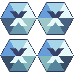
Hey guys, you sure are energetic :) TL;DR: Fixed the Font and made one with Colors chosen by me.
@0x5c As there were only about 4 colors (in the screenshot) I interpolated the other 2. I was lazy and subtracted the same amount which resulted in that dark color. Feel free to play with the SVG on Inkscape (F7 is the hotkey for the color dropper). @lrq3000 You did a good job but still needed to set the top-side of the text to that color. ;) Also, if you modify the SVG, you should name it as a next-version (in this case 5). @Forevian The problem with Linux Libertine (the font) is that it doesn't have middle-points. To fix that I changed to the sans-serif variant of the font (still no middle-point) and duplicated the wider \ so it had one. Here's both fonts with that last color and a variant with (softer) colors that I chose.

@vimino IMO, the x was better with the top half in black, and the new font is not fitting at all.
Also, it would be nice to put the darker tiles in the bottom half, like your second proposition.
TL;DR: Changed the colors and tested several variants of the font.
@0x5c The top and bottom of the x was always the same color as the lightest and darkest colored keys (as in, not black/white). The colors I chose are softer and mathematically balanced, that's all. They are still colors based on the screenshot with darker versions on the bottom.
Here's what it looks like with both the original uppercase letters and actual black/white.
 Of course, we could change to a different font, I just happen to like this one and it was the one used on the original logo by @trapicki.
As for the black/white, I don't think that plays well with the other colors. I would instead suggest to use colors which are darker/brighter but still in that area of blue (like the outline). Like so:
Of course, we could change to a different font, I just happen to like this one and it was the one used on the original logo by @trapicki.
As for the black/white, I don't think that plays well with the other colors. I would instead suggest to use colors which are darker/brighter but still in that area of blue (like the outline). Like so:
 Edit: Added a screenshot with the outline color as the letters' top. Also applied Italics to the font when available along bold. Note that it's litteraly spelling "xXxxX", with the (Linux) Libertine font, followed by the sans-serif (Linux) Biolinum. The fourth one being my modified one.
@vimino The darker bleu looks way better, but the white is lost in the mix of pale and dark tiles in the bottom half. The x is very clear in the last set of gray-scale ones, because they are half pale, half dark, along the same axis as the x.
Thank you all very much for helping! :D
@vimino Thanks a lot for fixing my bad design attempt :p The one with the character in the same blue as the outline looks the best to me! About the middle point issue, I also noticed it and tried to fix it, but it did not look nice. I have no idea what to do either, as I also like this font quite a lot :-/ I think either we keep it like that (because anyway it's not that bad and most of the time people will only see a miniature) or we take the fourth one, but I think we should now choose a name and settle for the real character, this may also resolve the issue by luck ;)
I would like to propose yet another name (and depart somewhat from the utilitarian tradition of similar softwares): Nuska. And another name: Hexia.
Maybe we can make a doodle to vote :-)
Alright, final attempt before moving on to the names. I used -20 and -40 Luminosity (using HSL) on the bottom side, although it brings the "key too dark" problem back.
 And here's the last SVG, note that it matches the top-right one.
Logo7c.zip
And here's the last SVG, note that it matches the top-right one.
Logo7c.zip
As for the name, Hexia sounds nice, although it doesn't give an idea of what it is (doesn't sound like an instrument). Even less so with Nuska.
Edit: Typo
@vimino The 3rd one's colors looks awesome! I really liked the first font though, it had a more piano/music look, while this one feels "generic programming framework logo".
@lrq3000 Why not use the x? It' fitting, x --> hex, and it looks nice.
The original font was the Linux Libertine italic. I like the fine touch of it.
Btw it's the font Wikipedia uses in its logo :-)
I would like to suggest another name: Starboard. The logo could be almost the same as above but replacing the X by a star.
The idea behind is that the star represents the hexagonal nature of the keyboard, which allows progressions in all 6 directions.
Other names propositions:
- Tonnetz, in hommage to likely the first theoretical hexagonal isomorphic keyboard mapping ever in the 18th century.
- Bosanquet or Erv Wilson in hommage to the inventors of the modern isomorphic keyboard (aka generalized keyboard).
Personally, I like Tonnetz, Erv, and Starboard.
Starboard sounds to me like project management software 🤔
Some ideas from my asking ChatGPT:
- HexClavier
- SesToets
link: https://chatgpt.com/share/c16d5ac1-49e2-4e96-905a-4def4d8ef041
EDIT: Tonnetz is good too!
Thank you @medavox. HexClavier is nice and I like it personally, but I don't think it is the most appealing because it mixes French with Hex which is the prefix that all similar apps are using (either Hex or Iso). I think we would do well to depart from this to try to make a unique brand. (And I was in favor to keep Hex in the past as can be shown in the discussion above, but now that time has passed I think we can and should differentiate - after all this is the only such project still alive ;-) ).
I did some more brainstorming with ChatGPT, here are more names, with a short summary explaining each name's rationale and appeal:
-
ChordStar
- Cleverly combines the star-like pattern of the keyboard with the idea of becoming proficient at playing chords, offering motivational appeal.
-
Tonnetz
- Pays homage to the historical hexagonal musical layout, adding sophistication and depth to the brand.
-
Hexone
- A modern and relevant contraction of "Hexagonal" and "Tone," making it both clever and brandable.
-
HexaKey
- A concise, memorable name that directly references the hexagonal keys, making it highly impactful and relevant.
-
StarChord
- Emphasizes the consistent visual patterns of chords on the hexagonal layout, making it both relevant and easy to remember.
Names that are I think less good but still interesting:
-
StarScale
- Combines the star pattern with musical scales, effectively tying the visual layout to fundamental music theory.
-
HexaTune
- A catchy name that blends the hexagonal element with musical tuning, offering strong brand potential.
-
StarFlow
- Suggests ease and fluidity in music creation, perfectly aligning with the intuitive design of the keyboard.
-
StarHarmony
- Highlights the intuitive creation of harmonious music using the star-like pattern, appealing to musicians.
-
HarmoniKey
- Blends harmony with the concept of keys, offering a name that’s closely tied to the musical essence of the app.
-
StarKey
- Short and impactful, it connects the star pattern directly with the keys on the keyboard, making it easy to recall.
-
KeyFlow
- Implies a smooth and fluid experience in playing music, perfectly aligning with the app’s intuitive design.
-
Erv
- Carries historical significance as the surname of a key figure in hexagonal keyboards, adding depth to the brand.
-
StarMap
- Implies easy navigation through musical patterns using the star-like grid, making it relevant and intuitive.
-
StarTone
- Combines the musical aspect of tones with the star pattern, offering a name that’s both memorable and relevant.
Personally, I prefer by far either ChordStar, or Tonnetz, or Hexone.
Tonnetz is a personal favourite because it is a hommage to the likely first hexagonal musical keyboard (and keep in mind nobody has ever made the link to my knowledge - actually it's my brother who did when we discussed about hexagonal keyboards, so kudos to him!), but it may sound like a niche.
ChordStar is a very strong brand name, it even sounds too good for a free open-source product. Its purpose is directly understandable. But there is no historical roots in this name. StarChord is very nice too, just an inversion of ChordStar.
Hexone sounds nice but is still in line with the past tradition of having "hex" or "iso" in the product's name.
What do you think @medavox, what name(s) would you prefer so far from all those we both suggested? Since you are taking back the mantle on this project, your opinion is essential on this matter. So please just consider my personal preferences as suggestions, and please feel free to let me know what name(s) appeal the most to you, or if you have other suggestions..
Thanks for these suggestions!
I don't want to barrel in and completely take over :)
But having said that, I'd be happy with StarChord, Tonnetz, or ChordStar - in that order of preference.
I think the pronunciation of Hexone is a bit ambiguous. Like is it hex-1, or hex-own? Hex-own-ay? (/hɛks.wɑn/, /hɛks.on/, /hɛks.əʊn/ or /hɛks.one/, if you're familiar with IPA) And if it's ambiguous for me, it'll be ambiguous for others.
But I absolutely don't want to be too pushy, it should be a group decision!
Thank you very much @medavox for your very insightful feedback :-)
I agree that an ambiguous name should be avoided, especially since we have other very good candidates, so let's reject Hexone.
Ok for your selection. I agree and I can't really decide between them. Do you have a much bigger preference for StarChord over Tonnetz or is it a small preference? Like if you had to rate both between 1 and 10, what woud be your rating?
About the project leadership, don't worry, I will continue to stick around as I always did in case I can be of help, but I can't actively contribute to the project so since you are, it's normal you have a say in the project decisions :-) And for the moment the group is you and me lol, so unless someone else chips in, I guess we will have to choose by ourselves ;-)
Once we have decided about the name, I will make a draft of the logo (btw did one of the logos in this thread look good to you as a basis to build upon the final logo?).
Regarding the name: I have a slight preference for StarChord, if that helps :)
Refarding logo: the first AI-generated one is pretty good. With the ones created by @hyperagon , any of the versions in this message https://github.com/lrq3000/hexiano/issues/2#issuecomment-357506302 would be perfect, except I would change the 'x' to a musical note symbol ♪ . The 'x' makes me think it's some kind of mathematics app.