Additional padding above buttons on analysis screen
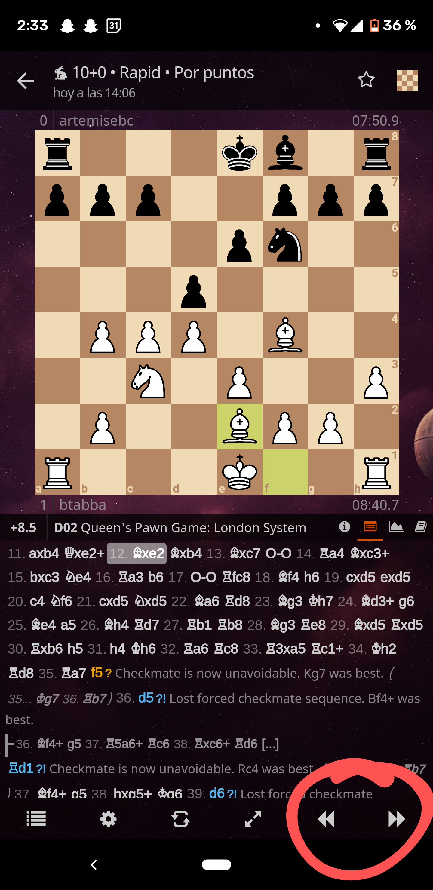
Issue: When analyzing my games, I often click just above the "next move" button, which selects a move further down the list and takes me to that point in the game.
Proposed solution: Either a small amount of additional padding above the game controls for the analysis board, or just slightly larger buttons in that menu in general. This solution seems reasonable given the fact that the only thing which would be cut off by additional padding (or slightly larger menu/buttons) is a line of two of moves.
Alternatives I've considered: Not fat-fingering the buttons. Unfortunately this approach has failed.
Additional context: Please see the attached photo (featuring big red circle) for a reference:

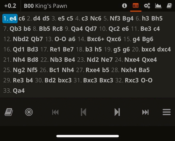
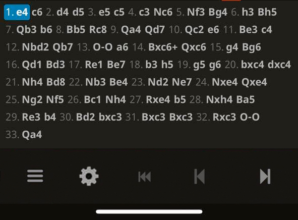
I agree, long list of moves is unnecessary and bottom line can be more wide. Also evaluation and opening opening name can be reworked as well. Here's my examples: first - as on website; second - adapted for the app (sorry for my bad photoshop skill)


Also interested in this fix, you can't scroll back and forth on mobile without accidentally clicking moves from the move list. The bottom menu bar just needs to be a little larger.