feature: add extra information in the last page of session launcher
resolve #1367
I added project name. I made it simply to match styles around it. Please let me know if I need to change in style or to add additional information.
Hmm, Isn't it too big for locating the project name at the top of the panel? I think what users really want is "the environment information", "resources to allocate" mostly, and virtual folders to mount, and then "the project name". I would rather put them below the mounted folder section, what do you think @mihilt ?
@mihilt
And I just updated the description of the issue, so It would be appreciated if you refer to it and apply your ideas to it.
I agree with you.
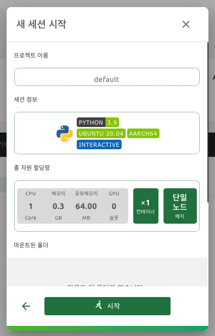
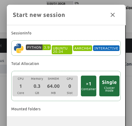
I moved Project Name's location under Mounted folders.
And I checked suggestion and also added Resource Group.
results are as follows:
Hmm, Isn't it too big for locating the project name at the top of the panel? I think what users really want is "the environment information", "resources to allocate" mostly, and virtual folders to mount, and then "the project name". I would rather put them below the mounted folder section, what do you think @mihilt ?
Also, it will be better to locate 프로젝트 and its name.
e.g.
프로젝트 default
Does this mean it need to express name and value in one line?
Hmm, Isn't it too big for locating the project name at the top of the panel? I think what users really want is "the environment information", "resources to allocate" mostly, and virtual folders to mount, and then "the project name". I would rather put them below the mounted folder section, what do you think @mihilt ?
Also, it will be better to locate 프로젝트 and its name. e.g. 프로젝트 default
Does this mean it need to express name and value in one line?
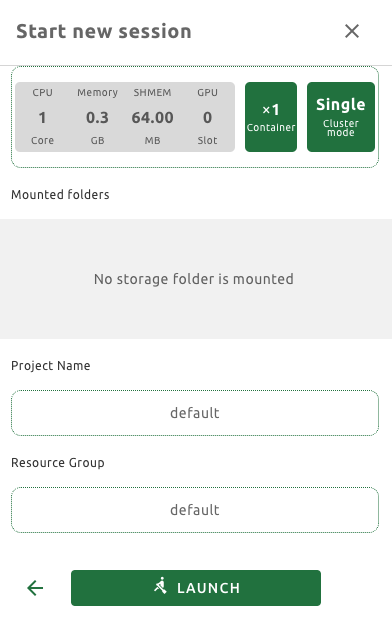
Yes. Also, there's one more thing to suggest. I think we can put the project name and the name of resource group into the session info section rather than splitting each of them into a separate section.
Making design without exact decided design is hard for me. First I simply put strings in it. And It looked so insincere so I tried to copy the surrounding design.
Can I get some advice on the design you want?
Making design without exact decided design is hard for me.
First I simply put strings in it. And It looked so insincere so I tried to copy the surrounding design.
Can I get some advice on the design you want?
I think it seems okay, but I guess it's better to ask @yomybaby . What do you think of this layout above?
Already @inureyes mentioned, "Project : default" instead of "Project Name : default" is LGTM.
About the design, Plain text looks better than tag box(badge). Because the name is not a spec(category) of the session such as python. It's a name which is uniq, right? The tag box design is good for categorizing rather than showing name.
How about Just adding every title inside the section like this?
I just found an appropriate layout idea from dribbble:
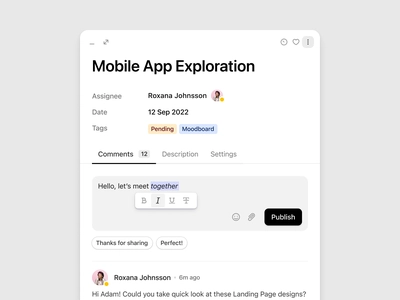
You see, adding the title on the left-side of the content doesn't break the whole layout.
In our case, you may put title/content like the screenshot above, like Assignees / Date / Tags
And each title and content will go like this...
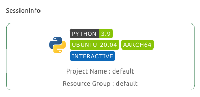
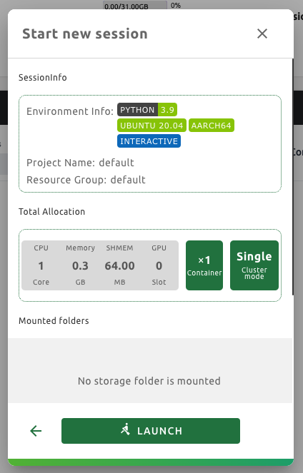
- Environment Info: Python 3.9 / Ubuntu 20.04 / AARCH64 / Interactive
- Project Name: default
- Resource Group Name: default
I tried this, but I couldn't complete adding Environment Info: Python 3.9 / Ubuntu 20.04 / AARCH64 / Interactive in one line because there was not enough space. In order to proceed in this way, it seems that needs to be further separated title.
And it is also hard for me to choose to remove language icon image. Can I do that?
I tried this, but I couldn't complete adding
Environment Info: Python 3.9 / Ubuntu 20.04 / AARCH64 / Interactivein one line because there was not enough space. In order to proceed in this way, it seems that needs to be further separated title.And it is also hard for me to choose to remove language icon image. Can I do that?
Any examples? perhaps screenshots?
Like this way, even if I didn't put Environment Info: text yet, but it already don't have any space.
So, Ubuntu 20.04 lablup-shields component turned two lines.
And the language icon image that I wrote before is the python image on the far left.
Anyway, I made it similar to image you put in.
But I couldn't show all badge near Environment Info: in one line.
And, I deleted the language icon image.
Does this look all right?
Like this way, even if I didn't put
Environment Info:text yet, but it already don't have any space. So,Ubuntu 20.04lablup-shields component turned two lines.And the language icon image that I wrote before is the python image on the far left.
Anyway, I made it similar to image you put in. But I couldn't show all badge near
Environment Info:in one line. And, I deleted the language icon image.Does this look all right?
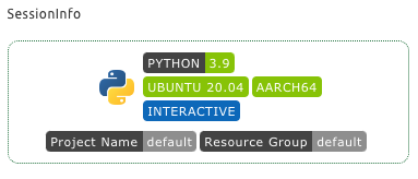
It looks good! Just an additional comment:
- Let's remove colon between text and tags
- Align text and tag area. (how about environment info, Project name, resource group text have same width?)
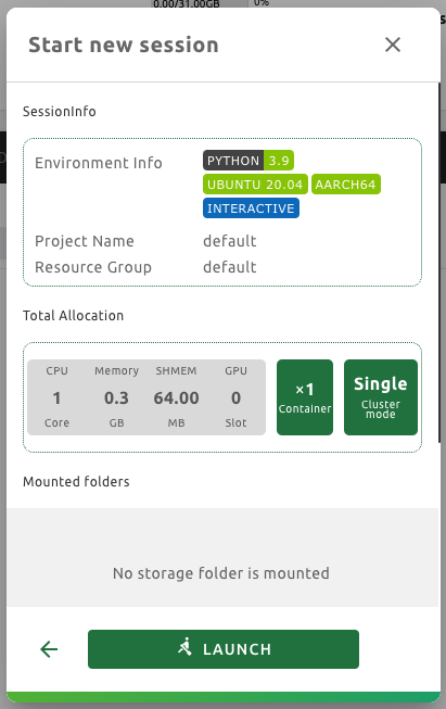
I did it. But it doesn't seem not much pretty compared to the surroundings. I'm sorry I think I don't have an aesthetic sense. If there is anything strange, tell me.
I did it. But it doesn't seem not much pretty compared to the surroundings. I'm sorry I think I don't have an aesthetic sense. If there is anything strange, tell me.
LGTM