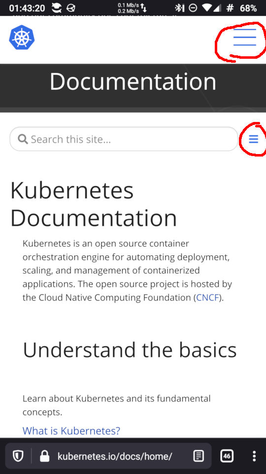
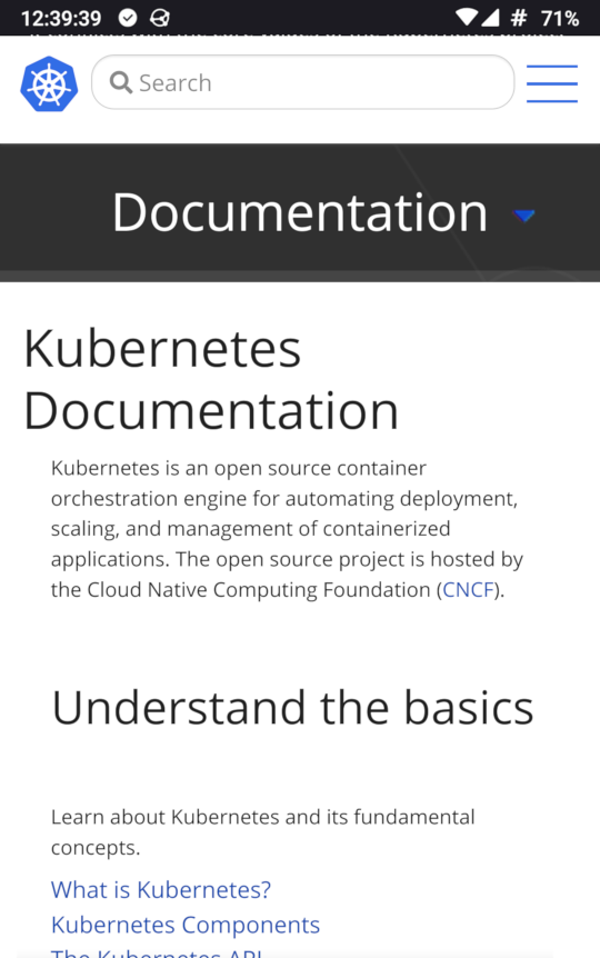
Two hamburger buttons
I believe two hamburger buttons confuses users on https://kubernetes.io/docs/home
Hi @532910
My guess is that there are a few different approaches to address this. What should solutions focus on?
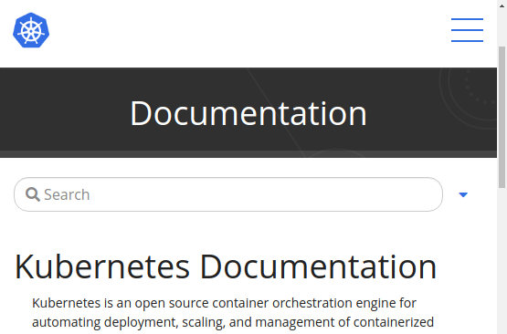
Hi, my idea is replacing the second hamburger icon from the top with a caret icon (▼/▲).
This is an example of using fa-caret-up and fa-caret-down of Font Awesome (ref. Triangle Icons | Font Awesome):
hamburger & caret icon
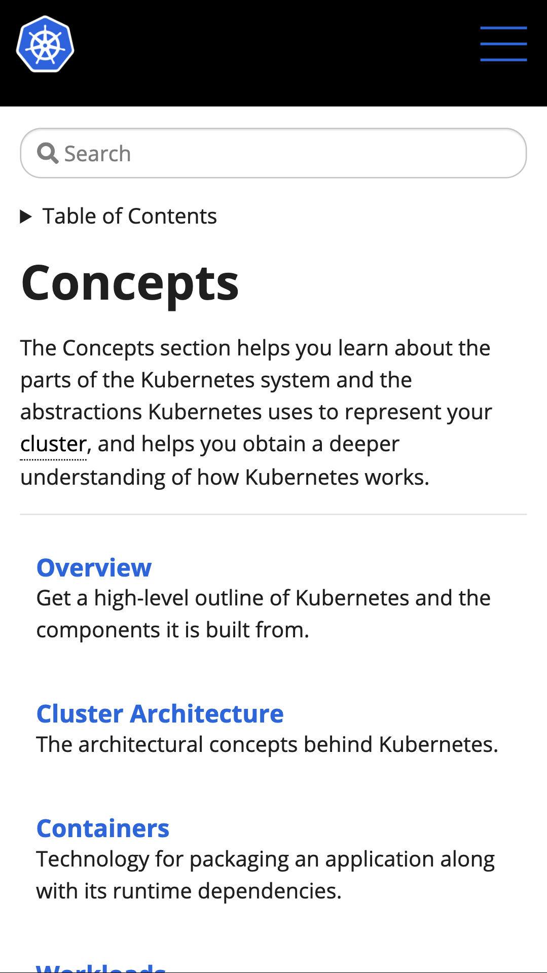
initial collapsed state
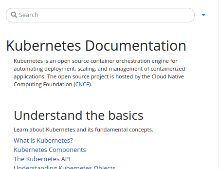
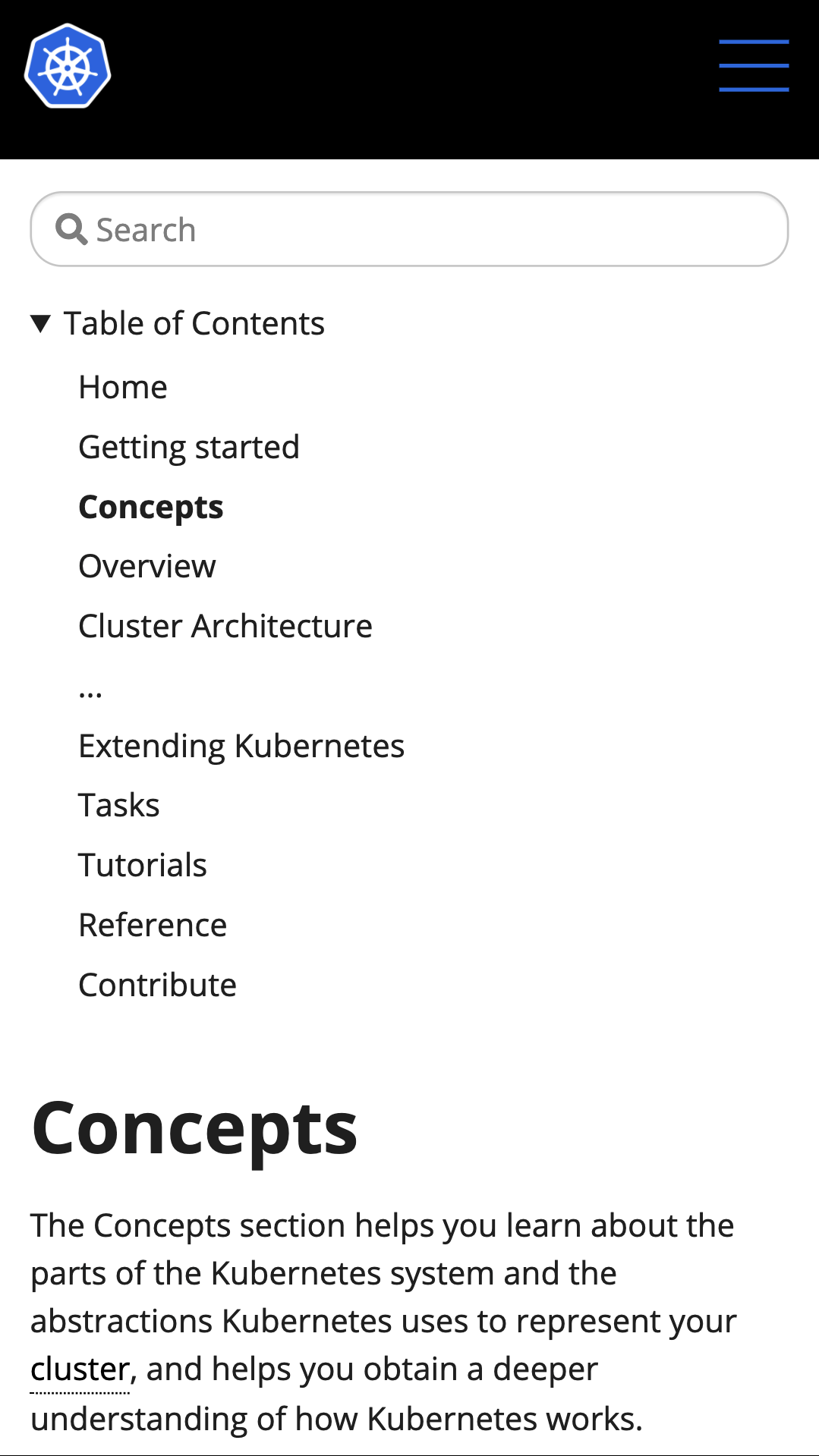
expanded state

Why I replace the second one Because it's more common there is a hamburger icon on the top right corner.
Why I chose the caret (triangle) icon When we tap the icon, the TOC area moves up and down with animation. Its move fits the triangle shape. I think the shape can imply the motion of up and down, so it's more intuitive.
First of all, the second hamburger button is related to the documentation and must not be grouped with the search field.
The search field is related to the whole site and must be above documentation section.
Ths second hamburger button is the TOC for documentation and must be placed the same line as Documentation
The triangle button should be nice for this.
I like this modification. It sounds reasonable to me.
Putting a search box on the header allows users to search soon because it is always shown on the header. Currently, we cannot see the search box after scrolling the page, so we need to scroll the page to the top.
Issues go stale after 90d of inactivity.
Mark the issue as fresh with /remove-lifecycle stale.
Stale issues rot after an additional 30d of inactivity and eventually close.
If this issue is safe to close now please do so with /close.
Send feedback to sig-testing, kubernetes/test-infra and/or fejta. /lifecycle stale
Stale issues rot after 30d of inactivity.
Mark the issue as fresh with /remove-lifecycle rotten.
Rotten issues close after an additional 30d of inactivity.
If this issue is safe to close now please do so with /close.
Send feedback to sig-testing, kubernetes/test-infra and/or fejta. /lifecycle rotten
Issues go stale after 90d of inactivity.
Mark the issue as fresh with /remove-lifecycle stale.
Stale issues rot after an additional 30d of inactivity and eventually close.
If this issue is safe to close now please do so with /close.
Send feedback to sig-contributor-experience at kubernetes/community. /lifecycle stale
Stale issues rot after 30d of inactivity.
Mark the issue as fresh with /remove-lifecycle rotten.
Rotten issues close after an additional 30d of inactivity.
If this issue is safe to close now please do so with /close.
Send feedback to sig-contributor-experience at kubernetes/community. /lifecycle rotten
I tried to use <details> and <summary> elements. What do you think about the below design?
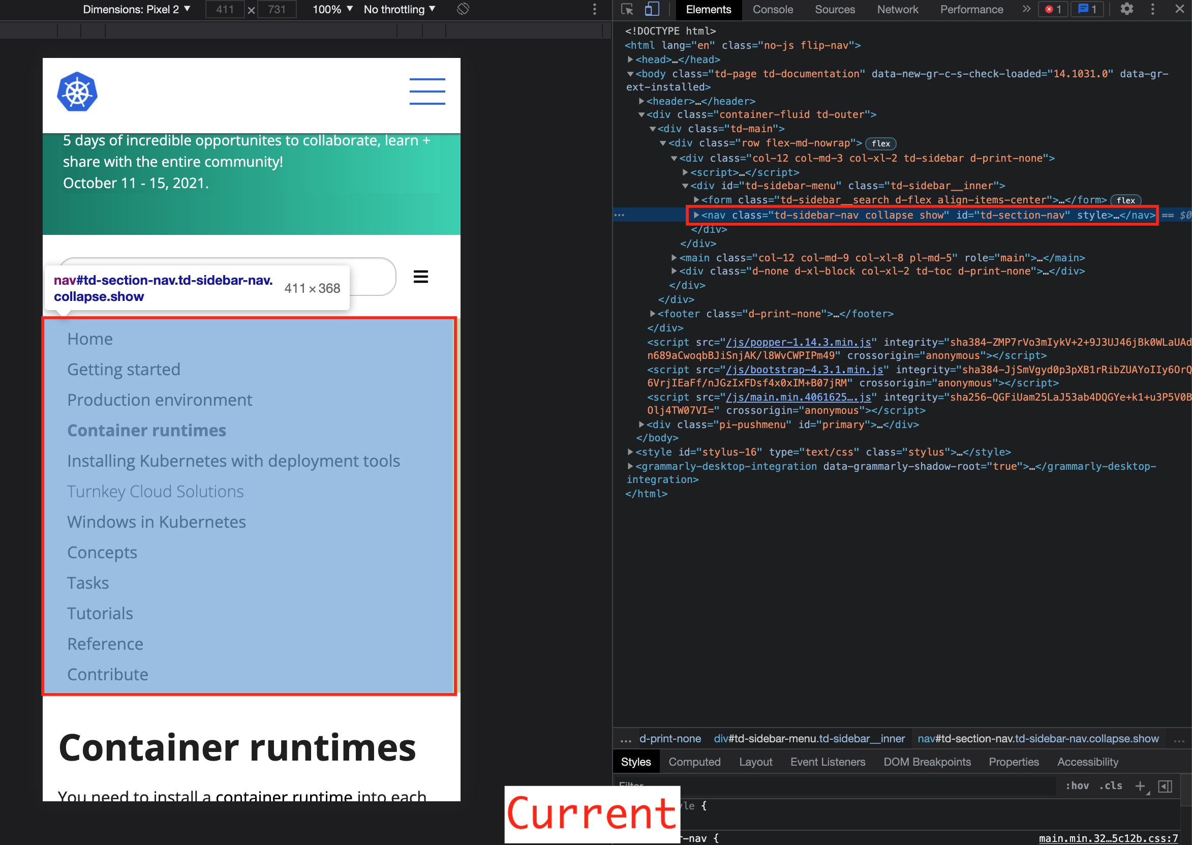
Screenshot
Before a tap:
After a tap:
 (intentionally elipsising several elements)
Issues go stale after 90d of inactivity.
Mark the issue as fresh with /remove-lifecycle stale.
Stale issues rot after an additional 30d of inactivity and eventually close.
If this issue is safe to close now please do so with /close.
Send feedback to sig-contributor-experience at kubernetes/community. /lifecycle stale
Stale issues rot after 30d of inactivity.
Mark the issue as fresh with /remove-lifecycle rotten.
Rotten issues close after an additional 30d of inactivity.
If this issue is safe to close now please do so with /close.
Send feedback to sig-contributor-experience at kubernetes/community. /lifecycle rotten
This is a great issue for anyone to work on. It'd be great to see progress here.
@sftim No, I have not prepared a PR for this issue. The above screenshot was a just experiment on the browser. I'm glad if someone can work on.
@kLamda do you have a time to work on this issue?
Thank you! 🙂 Maybe I can post the html snippet I tried in the experiment later.
I tried to replicate the above "Table of Contents" screenshot again. Here is the difference of HTML structure:
Before change
After change
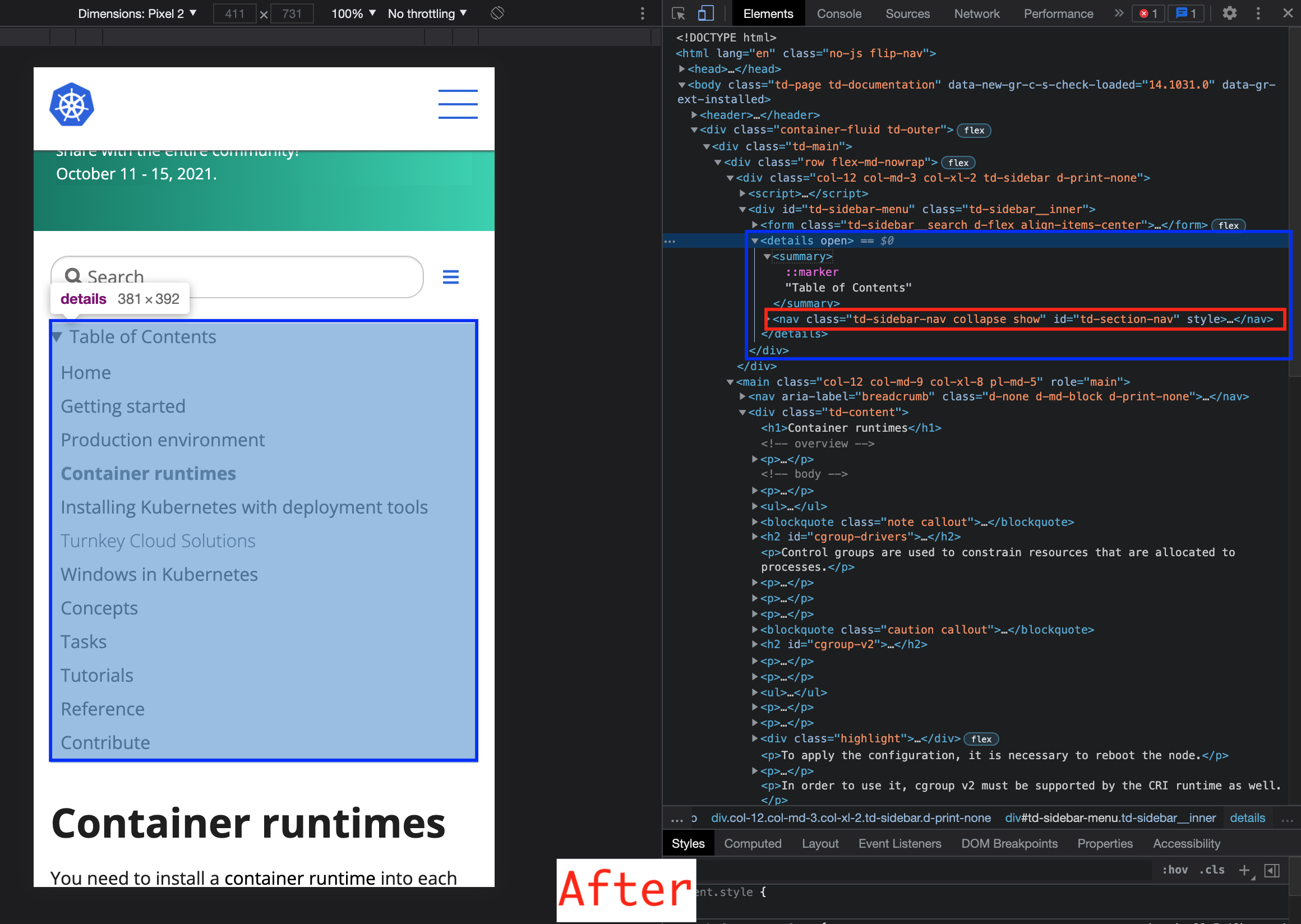
I created a new <details> and <summary> elements and moved the <nav id="td-section-nav"> element next to the <summary> element inside the <details> like this:
<details open="">
  <summary>Table of Contents</summary>
  <nav id="td-section-nav">...</nav>
</details>
In addition to this change, I think we need some modifications of classes and the second hamburger buttons etc.
I hope this would be helpful.
ref. <details>: The Details disclosure element - HTML: HyperText Markup Language | MDN
I'd like to give this a try, This hasn't been fixed yet. @sftim can this issue be reassigned due to inactivity?
I'd like to give this a try, This hasn't been fixed yet. @sftim can this issue be reassigned due to inactivity?
For Kubernetes SIG Docs, anyone can work on any issue (our more jargon-y way of saying this is “no cookie licking”) and open a pull request to propose a related change.