Status icons and colorblindness
What would you like to be added
It would be great if the colors used to indicate the objects status were more colorblind friendly.
In my case, I cannot rapidly find the broken pod in this screenshot:

Why is this needed
It would help colorblind persons (10% of the users).
Comments
I don't know an easy solution to this problem, there are lots of different colorblindness...
It would help colorblind persons (10% of the users).
Just by quickly looking this up, most sources seem to provide numbers anywhere between 4.5% and 8.5% (globally).
Nevertheless, such a feature would be definitely on the bottom of the list as it requires deep investigation into types of colorblindness, what colors should be used for different types of conditions, etc. Then someone has to actually prepare from the scratch different themes. We do not have enough people to work on such features as we do have many more important things on our list and the list is quite long. If someone would be willing to investigate and contribute such change we can definitely introduce that into the Dashboard.
Issues go stale after 90d of inactivity.
Mark the issue as fresh with /remove-lifecycle stale.
Stale issues rot after an additional 30d of inactivity and eventually close.
If this issue is safe to close now please do so with /close.
Send feedback to sig-testing, kubernetes/test-infra and/or fejta. /lifecycle stale
Hey @bcroq @floreks Can i help with this good first issue. I am a beginner to this project and am looking to get started
@ShivamTyagi12345 You can start with proposal or a draft to show how the change would look like. At the moment there is nothing specific because some investigation about colorblindness needs to be done first. Ping us when you will have some questions.
@floreks @maciaszczykm Can we just keep the icons at least or make it a setting? I just upgraded the Helm Chart from 4.2.0 to 5.0.3 and was a bit surprised to see the status icons have been removed. I've relied on them heavily to know the status of my resources. Keeping the icons does not require any research into colorblindness and is invaluable to people who are colorblind like myself.
A setting that converts the color indicators to text could be very simple and useful, too!
I'd prefer to make it a setting and I like the idea to switch to text. It makes a lot of sense.
I think this is equally important as any other issues and also requires people with UI/UX research background to help us review the work submitted specific to this.
At this moment, do we have UI design work somewhere on Figma or Adobe XD or UI components on Storybook?
the Workload Status screen also needs some work with the pie graphs. I see the dark green all the time and think something is wrong because I think it is red. The tooltip only shows the percentage and now a label, it's so bad.
Hello Everyone 👋🏼
I'm new to open-source and contributing in large codebases in general, and this issue felt like a good starting point.
I did a little research on the issue before contributing to it, you may skip to the end to find possible color alternatives I found for the image referenced in the issue.
Research
The Challenge:
As the issue suggested, I did a little research on UI/UX design and types of Color Blindness. I found out that there are 3 types of color blindness's. The problem for UI designers is to come up with design that works best in all the 3 cases.

The Solution: The solution as suggested by a lot of UI articles is to have difference in iconography, texture, and text accompanying the UI if possible. The lack of the specific UI element can also be used as a indication. The other less recommended solutions are changing contrast levels to noticeable levels and changing saturation.
Conclusions and Solutions
- If possible we can have the icons distinguishable, and not rounded. Like the failure can be indicated with a
Xand the success can be just a✓symbol. - We can have labels / tool-tips alongside the icons.
- While researching I also came across a website that suggested using
#fff2b9instead of red and#008000(green).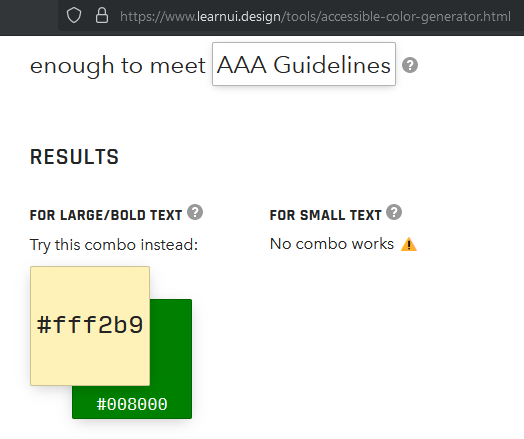
Unfortunately, colorblindness isn't really as neatly defined as those three types. It's more of a sliding scale with tons of variations. The best solutions that I've seen involve using symbols in addition to colors and/or allowing the end-user to customize the color pallet for themselves.
As a person with CVD, I can tell you that I've spent more than a little bit of time trying to find out why a job was showing failed when it indeed was successful, but I couldn't tell the green-stopped status apart from the red-failed status.
Hello @maciaszczykm @ashutosh887 ! I see this issue is still open. I would like to contribute to fixing it if help is needed.