twinejs
 twinejs copied to clipboard
2.4 icon feels out of place in Windows
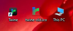
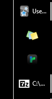
I really don't like the fact that this new iOS-style icon is also being used by the desktop app. The old one was fine to me - this new one not only lacks the transparency that gave the Twine logo its shape over a desktop background (old icon drop-shadow issues aside) (fig. 1), but the framing black "button" forces the actual logo part of the icon to be microscopic. This microscopic logo looks especially ridiculous in the taskbar (fig. 2).
Most of the major Windows apps (Firefox, VSCode, Foobar2K etc.) still use traditional icon design standards instead of mimicking iOS "buttons". I haven't used modern macOS in awhile so I don't know whether this is an Apple ecosystem design trend, but it seems very out of place in Windows (and probably Linux as well). I'd much prefer the 2.3 icon be reinstated for just those desktop platforms.
Presubmission checklist
- [ ] I am interested in working on code that would implement this feature request. (This is not required to submit a suggestion.)
- [X] I have done a search and believe that an issue does not already exist for this idea in the GitHub repository.
- [X] I have read and agree to abide by this project's Code of Conduct.
Leaving aside personal opinion (calling something "ridiculous" is not especially actionable, nor is it constructive)...
- I'd like to verify on my side that the icon itself doesn't have transparency around it in Windows--that may be exacerbating some of what's in the screenshot.
- I'm reluctant to have separate icons per platform because it's a maintenance hassle, but certainly MS guidelines and Apple guidelines have diverged quite a bit. It would be nice but, indeed, perhaps impossible to split the difference.
- If we redo/revert the app icon, we'd need to also take a look at the prerelease icon too.
I would note that the icon looks very "in place" on MacOS. The logo to surrounding space ratio is very similar to the icon for VSCode, for example. However, at taskbar size the contrast between the dark background and the logo is quite low.
I would note that the icon looks very "in place" on MacOS. The logo to surrounding space ratio is very similar to the icon for VSCode, for example. However, at taskbar size the contrast between the dark background and the logo is quite low.
On windows it is much smaller compared to others. I think if the icon isn't going to be changed, it should be made larger.

That's interesting, it doesn't look like that on OSX. Maybe the OS resizes it?