New Mesh Topology page
Last update [jshaughn, Feb 9, 24] See original description at bottom of comment
We have decided on an approach and it will be to implement a topology-based Mesh Page, showing the mesh deployment in a graphical way. It will be natively implemented using Patternfly Topology so that it will be compatible with both Kiali and OSSMC.
Milestone 1: POC [COMPLETE]
- [x] Initial POC
- [x] Initial PR behind feature flag (as part of POC)
Milestone 2: Replace the current Mesh Page and make available to users
- [x] Add side-panel for Cluster
- [x] Add side-panel for Istiod
- [x] Add side-panel for Prom // start with common "InfraNode" panel
- [x] Add side-panel for Grafana // start with common "InfraNode" panel
- [x] Add side-panel for Tracing // start with common "InfraNode" panel
- [x] Fix Fit
- [x] Initial Cypress support (done as part of 7298)
- [x] Finish initial Find/Hide
- [x] Improve non-infra namespace box handling
- [x] Add Initial Health
- [x] Improve layout/look
- [ ] Remove legacy Mesh Page
- [x] Remove GetClusters API, needed only by legacy Mesh Page (done as part of 7298)
- [x] https://github.com/kiali/kiali/issues/6431
- [ ] Update https://kiali.io/docs/faq/general/#how-do-i-determine-what-version-i-am-running.
- [x] Add/Check Graph Tour (done as part of 7298)
Milestone 3: Necessary improvements
- [ ] control-plane specific data
- [ ] correct multi-cluster istio and cluster versions
- [ ] More work on PFT issues like Layout and Resize
- [ ] Add Legend
- [ ] Replace plane JSON with formatted version (see suggestion in this review comment)
Future improvements
- [ ] Finalize impact with Overview page
- [ ] Tech debt: look at combining common graph and mesh page components
- [ ] Flesh out any more infra visibility (gateways, etc)
- [ ] Improve target panel formatting (see suggestion in this review comment)
============== Epic: #5620
Today we have a left-hand navigation option "Mesh" that shows up (but only when "mesh-id" is set). This page is flagged as "experimental". We want to make this more production ready, particular as we start adding multi-cluster functionality.
Some thoughts:
- I don't think we need to conditionally show this when mesh-id is set. I think we should always show this page. Or, alternatively, we could conditionally show it if more than one cluster is participating in the mesh (ignoring the mesh-id setting).
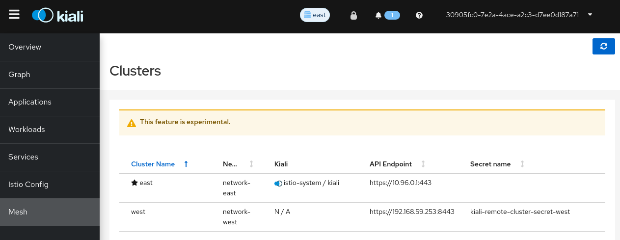
- There is a "star" on the row that indicates which cluster is the one that the Kiali is running in. This used to be important when we had multiple Kialis running (one in each cluster). Since we are moving away from that paradigm and now assuming one Kiali per control plane mesh, I wonder if the "star" is useful anymore
- The Kiali column shows the namespace and name of the Kiali application for the given cluster. Again, this may not be needed anymore just as with the "star" (see above # 2). But I could see keeping this column as it would indicate which cluster the Kiali app is running. Perhaps we remove the "star" but keep this Kiali column.
- It will be useful to know which mesh namespaces can be found in which cluster. It could be the case that some clusters have some namespaces that other clusters do not have. I do not know the best way in the GUI to show namespaces-per-cluster, but somehow it would be nice to show the names of the namespaces that are found in each cluster.
Here's what the current Mesh page looks like:
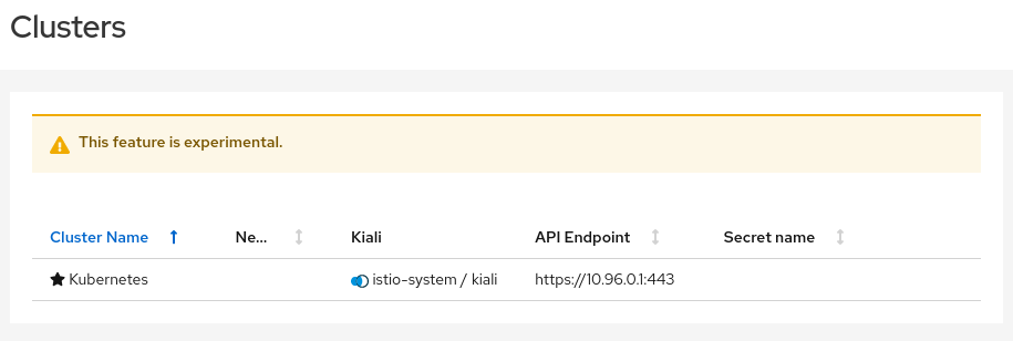
Just for completeness, this is what the page looks like when there are no clusters defined (no cluster secrets are available, the mesh is only in a single cluster, the local one):
@jmazzitelli I agree with you and I think we need to go even further here. I think the Mesh page should be a new, always-available page that is the go-to place for everything related to the mesh itself. Meaning, everything that is not related to the applications deployed on it, nor already available somewhere else when selecting the control-plane namespace is the Namespace Selector. So, the control plane information, the cluster information, etc. I think we should move the Control Plane card from Overview to here. I think users could go here to see which namespaces are on which clusters, etc. We may even want to make it obvious where the Prometheus and Tracing repositories are.
I made this a sub-epic of the MC UI Epic, because it's critical to visualizing the MC mesh, but it would also apply to a single cluster. We should involve UX on a re-design of this page.
Just connecting some other threads here. This seems to also be related to this epic: https://github.com/kiali/kiali/issues/4435. iirc the original idea was to iteratively make the control plane more explicit with the control plane card being the first step in that process.
I like using the mesh page to display more detail around the controlplane. Everything that @jshaughn mentioned and perhaps even the istio configuration that I think is located in the "debug info" today.
This could also be a good place to show infra related to ambient such as ztunnels and waypoint proxies.
I'll try and summarize some conversations about what should be shown on the mesh page. To make that easier, here's some shoddy diagrams that show common multi-cluster deployment models to give a picture of what should be represented on the mesh page:
Here are two separate primary-remote deployments: one with revisions and one without. istiod is deployed on one cluster (primary) and is managing all the mesh namespaces (without revisions) or a subset of the mesh namespaces (with revisions) across the primary and remote clusters.
Here are two seprate primary-primary deployments, again one with revisions and one without. There's an istiod deployed to each cluster and each cluster's istiod(s) only manage all the mesh namespaces (without revisions) or subset of namespaces (with revisions) on that cluster.
This is an external primary where istiod is managing mesh namespaces for clusters outside of where istiod is running. The difference between this setup and primary-remote is that istiod stores the istio config objects (VirtualService, Gateway, DestinationRule, etc.) on the "Remote with Config" cluster in addition to managing the dataplane for the "Remote without Config" cluster.
Note that these diagrams just say "istiod" for the controlplane but in reality the controlplane might also include some webhooks or other infrastructure like ztunnels and some of those pieces might be present on the "remote" clusters as well. I think it's fine for now to just focus on istiod and the controlplane configuration rather than representing all the individual pieces.
Here's what can be represented on the mesh page:
-
Clusters
- Show all Clusters that Kiali is connected to.
- Show what controlplanes are managing that cluster.
-
Controlplane
- Show each controlplane (istiod instance).
- Show the namespaces that the controlplane manages.
- Show some configuration for the controlplane (mTLS lock icon, istio version, revision, etc.). Things like the mTLS lock icon are shown in the masthead today but will need to be associated with a specific controlplane.
- Show some basic stats for the controlplane: move CPU/Mem from controlplane card to here. Possibly show things like proxy push time.
-
Status - status warnings that show up in the masthead for various components
- These warnings can either link to the "component" on the mesh page or be removed from the masthead entirely
- istiod (required), optional (prometheus, jaeger)
In the beginning I think we should start simple and just group components inside cards or something. Later we could possibly add more complicated visualizations of the controlplane like a controlplane graph.
@andrew-ronaldson @jmazzitelli wdyt?
- Where is Kiali deployed in all of those scenarios? How are they represented in the Mesh page?
- Sounds like the masthead items are no longer going to be able to do what we want since we now have to represent multiple control planes (potentially) so having a "mTLS" icon in the masthead will be ambiguous and confusing (which control plane does it refer to?) But what if we only have a single controlplane? Do we keep the masthead? But as soon as two control planes are in play, the masthead icons will need to disappear (and that will be confusing itself). So it sounds like we need to get rid of the masthead icons like mTLS and just move them to this Mesh page
- Where is Kiali deployed in all of those scenarios? How are they represented in the Mesh page?
It depends. I'd imagine that most often Kiali will be deployed on a single primary but as long as Kiali has access to the different clusters in the mesh it could be deployed anywhere.
Sounds like the masthead items are no longer going to be able to do what we want since we now have to represent multiple control planes (potentially) so having a "mTLS" icon in the masthead will be ambiguous and confusing (which control plane does it refer to?) But what if we only have a single controlplane?
It's already confusing today for single cluster when you have multiple controlplane revisions. Kiali has some support for controlplane revisions but not every case is handled well (like this one). Moving it to the mesh page would also make this better. It also makes the mesh page more relevant for single cluster.
- Show some configuration for the controlplane (mTLS lock icon, istio version, revision, etc.). Things like the mTLS lock icon are shown in the masthead today but will need to be associated with a specific controlplane.
- Show some basic stats for the controlplane: move CPU/Mem from controlplane card to here. Possibly show things like proxy push time.
Yeah, at minimum we might want to show the same information we have today in the cp card, for every cp available.
Very nice gathering of information. I really like this.
I missed today meeting unfortunately but did you discuss about having more that one topology like a primary-primary with several remotes each?. I see a line conecting the cards, at some point we discussed about creating a static "graph" that if we are linking cards, it's pretty much easy to do rather than two cards side by side (I know this is probably an example, but wanted to discuss and highlight this idea).
I see a line conecting the cards, at some point we discussed about creating a static "graph" that if we are linking cards, it's pretty much easy to do rather than two cards side by side
The diagrams above aren't mockups of what the page could/should look like. They're just conversation aids to make it easier to talk about the mesh page requirements. There are better diagrams out there for the different deployment models but I just wanted something basic with all the extra context removed. I wasn't trying to propose a design here but rather just spelling out the requirements for the page.
wrt the graph: I thought having some more basic elements like namespace cards would be easier to start with and still allow us to add a static graph in the future but I'm just assuming that adding a graph would be more work. In other words, I don't think a static graph is a requirement of the first iteration of the mesh page but that's just my opinion.
I agree with you if we are not linking the cards in any way. 100%
Great to see this consolidation of information.
Just to be contrary, I wonder whether the mesh page should natively be a graph, in the same basic format as the traffic graph. "Cards" would become the side-panel, likely with the Kiali home cluster being initially selected.
Pros:
- We can use an analogous impl approach to what we have today for the traffic graph.
- We avoid having two impls, first a card-based approach and later possibly adding a graph representation.
- Users seem to like graphs
Cons
- User can't see detailed information for multiple "Cards" at the same time.
- May take a little longer than a card-based impl.
Great to see this consolidation of information.
Just to be contrary, I wonder whether the mesh page should natively be a graph, in the same basic format as the traffic graph. "Cards" would become the side-panel, likely with the Kiali home cluster being initially selected.
Pros:
* We can use an analogous impl approach to what we have today for the traffic graph.

* We avoid having two impls, first a card-based approach and later possibly adding a graph representation.

* Users seem to like graphs
Cons
* User can't see detailed information for multiple "Cards" at the same time.

* May take a little longer than a card-based impl.
I like the idea of visualizing the information in a graph. I think it can be very helpful to see quickly the Mesh components.
I think you could have two different views, maybe one with a graph to show some basic information, more simplified - something like the deployment graph, that could include some errors, for example, red arrows for issues with the connectivity from the primary to any remote cluster - and maybe another view, something like the cards view, where you could have all the information from a cluster.
This is just a very basic idea getting the information from previous comments:
And it can be done in different phases, starting for the more simple view.
Yes, something like this would look pretty good, I think. We can also have edges between things like Kiali and Prometheus. One nice thing about a graph is you can keep adding more and more stuff.
I'd probably suggest that if we were to go this way that we use PFT, not cytoscape, to be more compatbile with other tooling. I don't think it matters too much if the traffic graph and deployment graph look completely the same.
Yes, I think it will be useful to have edges between Kiali and Prometheus and other components, also the "single" cluster graph view still would make sense, IMO.
And if you click on a cluster you can go to another view to show further information about it, more detailed: Something like the control plane card, including information, as @nfox mentioned, like the namespace list managed by the cluster, that could be a long list and use more space in the UI.
This is just a very basic idea getting the information from previous comments:
Looking at the mockup, if we're going for a graph perhaps a "minigraph" would work better than a full blown graph page. The mesh topology will almost certainly be more sparse than the traffic graph. It might also be useful having the graph side by side with more detailed information.
Here's what I think we need out of the mesh page, graph or no graph:
- More controlplane information. Much of what is in the controlplane card on the overview page can probably be moved here and expanded in addition to showing this information for each controlplane (can be multiple with revisions even on single cluster).
- Move some of the info on the about page to the mesh page. Look at the current about page:
Istio version should be "per controlplane". Kubernetes version should be "per cluster".
Stretch goal: Better visibility for various "status" checks. Often you'll get an error in the notification center if some component isn't configured correctly or Kiali can't talk to something. It'd be helpful to have more context around this.
IMO before we close out this epic we should look at consolidating what's in the mesh package with what's in the graph package. There seems to be a lot of overlap between the two.
IMO before we close out this epic we should look at consolidating what's in the mesh package with what's in the graph package.
Maybe at some point, but I don't see this as a major priority. When the default graph is PFT, and we have moved on from Cytoscape, maybe we can look at more unification. It's somewhat philosophical, I lean towards being OK with similar code not always being unified.
I'm going to close this Epic at this point (We've reached milestone 2), given that the page is in decent shape. We will proceed iteratively with individual issue enhancements. Some issue are already created, and other ideas are listed in the main description, for reference.