manimate

manimate copied to clipboard
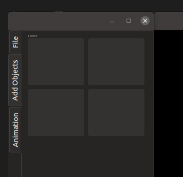
UX: Simplify 'add objects' panel
Type of issue
Suggested features for UI
Describe the issue
- Buttons in 'add objects' panel provide visual clutter
- Irregularity with capitalisation compared to other UI components
How should this be implemented in my opinion?
Remove 'add' for each button, as the user has already clicked in the 'Add objects' panel. They know they're adding an object.
Alternatively, I would replace every button with a large square button as shown, where in practice the icon for the corresponding action would be shown in the button. If you really want the 'Add' indication to each button, I'd put a '+' in a corner of each box.