react-native-tear-lines
 react-native-tear-lines copied to clipboard
Published
20 hours ago •
 kenmaca
kenmaca
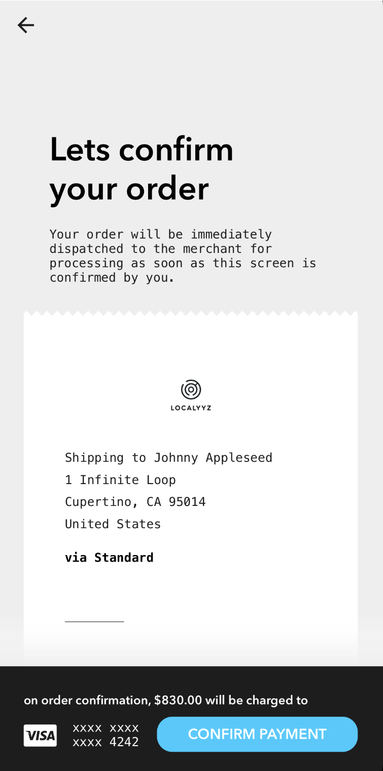
Zig-zag borders to simulate tear lines normally seen on receipts.
react-native-tear-lines
Zig-zag borders to simulate tear lines normally seen on receipts.
Installation
yarn add react-native-tear-lines
Usage
Use TearLines's onLayout method in the attached component's onLayout prop
to dynamically match its width as demonstrated below:
import { View } from "react-native";
import TearLines from "react-native-tear-lines";

<View style={{ backgroundColor: "#CCCCCC" }}>
  <TearLines
    ref="top"
    color="#FFFFFF"
    backgroundColor="#CCCCCC">
  <View
    style={{ backgroundColor: "#FFFFFF" }}
    onLayout={e => {
      this.refs.top.onLayout(e);
      this.refs.bottom.onLayout(e);
    }} />
  <TearLines
    isUnder
    ref="bottom"
    color="#FFFFFF"
    backgroundColor="#CCCCCC">
</View>
Properties
| Prop | Description | Default | Required |
|---|---|---|---|
isUnder |
true if this TearLines is used at the bottom of the attached view rather than the top. |
false |
No |
color |
Foreground color; should match attached content view's background color. | #FFFFFF |
No |
backgroundColor |
Background color, should match container's background color. | #CCCCCC |
No |
tearSize |
Specifies how large each tear tile is. Larger values will render less tiles. | 10 |
No |
width |
Width can be provided if you don't want to use the onLayout method to dynamically match the attached content view. |
None | No |
License
MIT License. © Kenneth Ma
 kenmaca