[Features] UX re-designed
In another thread I wrote about redesigning the app, and for a while I actually did it, now I've stalled on some decisions. The key is to redesign the home page and interface during training, the second is to redesign the profiles. This should include creating new ones as well as a bigger selection of presets and editing existing ones. Voice charts need to be integrated into the training profiles, but in a quick and convenient way. The rest is all but trivial, for example changing the settings items to the new design, and displaying recorded workouts.
From what I noted, a list:
- Adjusting the display of the permanent notification. on a locked screen, the line length is not long enough to see the data you want. Solution: for example, to set the order of the data in the line (pace is relevant for paces)
- item to remind about water consumption in the profiles. It can be an audible notification as well as the usual text in speech.
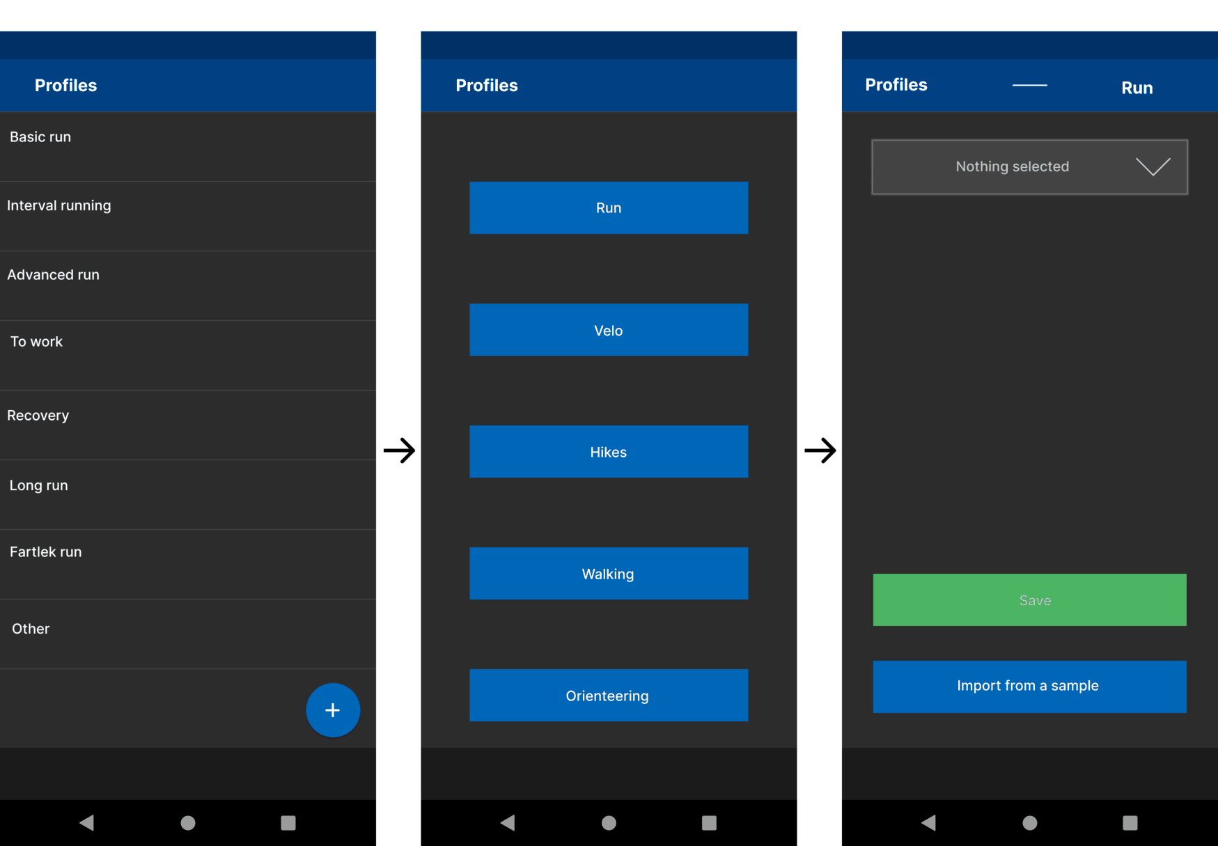
- tab profiles instead of accounts. One of the key and first decisions that should be started now, and the easiest. The Court can temporarily move the setting of voice schemes and the profiles Basic, Interval, Advanced, for editing. Then gradually apply the new design. This is so that users will receive the new changes in batches and know where they are.
- Redesign the look of the workouts. Keep tabs to a minimum and try to have 1-2 screens, for example with swipes to the side and scrolling screen down. Display brief but essential information first.
- A. Dialog for connecting an account after the first workout, for those who did not do this before the first use. This is very basic, a reminder, the Do it now button, the Do it later button and a check mark for no more reminders.
- B. make a dialog to remind you to unload the track in 24 hours, with buttons to postpone, cancel, with a checkbox to not remind you again
- Lock screen during workout and several settings for this. Display data without password and fingerprint (will require new Android credentials), pause with pile or long press, mark a lap or fartlek without locking, or with two quick presses.
- widget on the desktop, in the long term.
- in training analysis: % deviation from the set profile / plan
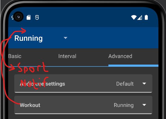
- in the basic running profile: indication of the tempo in a period, not a specific one. For example 5:00-5:30 (can already be implemented)
- Replacing Android notifications with on-screen app notifications. Android notifications are intrusive and when you swipe them they return, this wastes the user's time for example to change workout type (bike to run or vice versa, for example)
- In the future, the watts will appear on the profile screen and in the analysis, based on the cyclist's weight, bike weight and other data.
- new design of the workout upload, in the form of a status button, taking into account whether the track has been uploaded before. no small checkboxes or pixel hunting
- redesign of the sensor connection
- Different screens for sports and emphasis on metrics that are important to them. For hiking, it will be, for example, altitude, kilometrage, reminders for drinking, eating and distance to rest point, based on a pre-created profile.
- The design should be changed for the first time while maintaining the style and palette (this is roughly what I do).
- Headings in the app, taking into account the transition of the user to the sub-items (can already be implemented)
Throwing in an example of a profile page instead of setting up accounts
My thoughts
- use only advanced workouts as profile (Basic and Intervals should be preinstalled workouts)
- sport type is just a property, running/biking/other (maybe walk). Other could have a name textfield.
a profile can have more than one notification. then hit is possible to get other info for periodic and end of laps. This could be tricky to implement.
a notification can be an android notification etc too so info can be customized
but I would accept most changes. if someone has put some thoughts to it, the change should be an improvement
RU need love by someone that use the app more than what I do now
"Switching" Workout and Sport can probably be done without too much changes. Multiple notifications are trickier.
* Adjusting the display of the permanent notification. on a locked screen, the line length is not long enough to see the data you want. Solution: for example, to set the order of the data in the line (pace is relevant for paces)
If Notifications is not just audio, it could have output Notification. Of course, there must be at least one persistent notification (there could be multiple transistent).
* item to remind about water consumption in the profiles. It can be an audible notification as well as the usual text in speech.
Another notification.
* tab profiles instead of accounts. One of the key and first decisions that should be started now, and the easiest. The Court can temporarily move the setting of voice schemes and the profiles Basic, Interval, Advanced, for editing. Then gradually apply the new design. This is so that users will receive the new changes in batches and know where they are.
Accounts tab can probably be removed, but if workouts (renamed as profiles?) are quite visible in the header. Enough to discover the structured workouts?
* Redesign the look of the workouts. Keep tabs to a minimum and try to have 1-2 screens, for example with swipes to the side and scrolling screen down. Display brief but essential information first.
I find the current setup fine (but Download must be hidden!), but there can be improvements.
* A. Dialog for connecting an account after the first workout, for those who did not do this before the first use. This is very basic, a reminder, the Do it now button, the Do it later button and a check mark for no more reminders.

* B. make a dialog to remind you to unload the track in 24 hours, with buttons to postpone, cancel, with a checkbox to not remind you again
Fine
* Lock screen during workout and several settings for this. Display data without password and fingerprint (will require new Android credentials), pause with pile or long press, mark a lap or fartlek without locking, or with two quick presses.
Slightly different: There is a lock from input right now - slightly different and should have a separate button.
Data to show on lockscreen could be added - I have not figured out the API. I believe actual input requires locking. I have played with the thought of making RU an audio app, playing silent tone so volume/headset buttons can be used. (Will block actual music.)
* widget on the desktop, in the long term.
The existing is not useful as there is no useful feed... What do you want to see in it?
* in training analysis: % deviation from the set profile / plan
Something that is not recorded right now
* in the basic running profile: indication of the tempo in a period, not a specific one. For example 5:00-5:30 (can already be implemented)
Is that just the notification you mean or something else?
* Replacing Android notifications with on-screen app notifications. Android notifications are intrusive and when you swipe them they return, this wastes the user's time for example to change workout type (bike to run or vice versa, for example)
A notification is required to not get killed. The rest I do not follow, but probably OK
* In the future, the watts will appear on the profile screen and in the analysis, based on the cyclist's weight, bike weight and other data.
Of course, if power is recorded - should not be impossible.
* new design of the workout upload, in the form of a status button, taking into account whether the track has been uploaded before. no small checkboxes or pixel hunting
The checkbox need to be replaced, but it requires a minor redesign, I tried it briefly.
* redesign of the sensor connection
To do what?
* Different screens for sports and emphasis on metrics that are important to them. For hiking, it will be, for example, altitude, kilometrage, reminders for drinking, eating and distance to rest point, based on a pre-created profile.
Notifications? Add to current activity?
* The design should be changed for the first time while maintaining the style and palette (this is roughly what I do).
The app should be internally redesigned using fragments. "Workouts on top" is a part of that, removing TabHost. Some other is required for Settings and bottom tabs, that usage was deprecated in Android 3.2...
* Headings in the app, taking into account the transition of the user to the sub-items (can already be implemented)
Not sure what you mean...
- use only advanced workouts as profile (Basic and Intervals should be preinstalled workouts)
The problem with preset intervals is that they can be different too, especially since there are suggestions for changing the profiles themselves.
Accounts tab can probably be removed, but if workouts (renamed as profiles?) are quite visible in the header. Enough to discover the structured workouts?
The thing is, because of the large number of them, those who train different programmes, and maybe even two sports, will need a separate menu for convenience. The more so, they need somewhere to create, edit, delete and see a handy list rather than a drop-down one. Especially the account tab is only needed once when first setting up and is essentially an empty extra screen.
Is that just the notification you mean or something else?
I am referring to the existing basic profile now. You can only specify a specific tempo there now, but I'd like to specify a range.
A notification is required to not get killed. The rest I do not follow, but probably OK
So can't you make a permanent notification just for the duration of the training? And switch it off before the training session.
To do what?
A more intuitive interface for regular users. After all, users are not geeks.
Notifications? Add to current activity?
No, it is the screen during training. The information on it.
Not sure what you mean...
e.g. Recording - Running, while recording a run, e.g. Settings - Display settings, if we navigate to a sub-item. Show sub-items in the header.
A discussion like this will raise opinions, not enough of that for the app...
- use only advanced workouts as profile (Basic and Intervals should be preinstalled workouts)
The problem with preset intervals is that they can be different too, especially since there are suggestions for changing the profiles themselves.
Intervals in Advanced and in Intervals is basically the same. Do you find this worse?
For Basic the goal is a little unclear, may need special formatting.
Accounts tab can probably be removed, but if workouts (renamed as profiles?) are quite visible in the header. Enough to discover the structured workouts?
The thing is, because of the large number of them, those who train different programmes, and maybe even two sports, will need a separate menu for convenience. The more so, they need somewhere to create, edit, delete and see a handy list rather than a drop-down one. Especially the account tab is only needed once when first setting up and is essentially an empty extra screen.
Feed is nowadays not much of use and can be removed. I do not feel that workouts need a tab, is this improving the visibility that much?
Is that just the notification you mean or something else?
I am referring to the existing basic profile now. You can only specify a specific tempo there now, but I'd like to specify a range.
This is already handled in Advanced Workouts
A notification is required to not get killed. The rest I do not follow, but probably OK
So can't you make a permanent notification just for the duration of the training? And switch it off before the training session.
You need a notification when in the background.
To do what?
A more intuitive interface for regular users. After all, users are not geeks.
The logs can maybe be hidden by default I doubt that that scares users though (number of settings may do that...) Just some implementation.
Notifications? Add to current activity?
No, it is the screen during training. The information on it.
This could be a special notification or workout.
Not sure what you mean...
e.g. Recording - Running, while recording a run, e.g. Settings - Display settings, if we navigate to a sub-item. Show sub-items in the header.
You mean change during an activity? Some items could be changed, others not. It is just a matter of implementation.
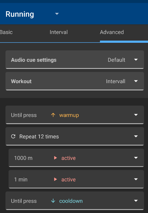
Intervals in Advanced and in Intervals is basically the same. Do you find this worse?
Intervals look simpler. Especially the Target tempo point is a bit confusing, not sure what it's for if the exact tempo for the intervals is specified.
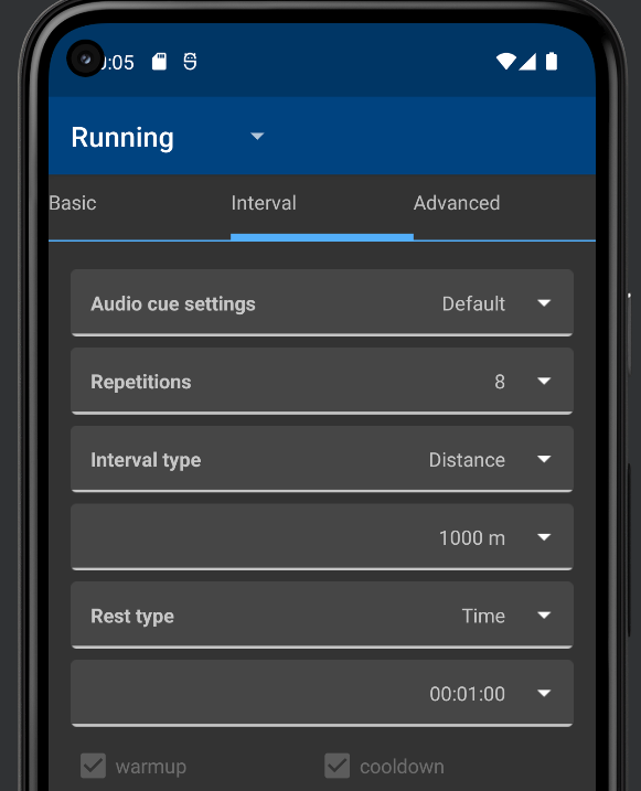
I'd leave Intervals, but instead of Advanced, I think you should create custom scenarios based on a simple user-friendly scheme. By the way, Intervals should be made a little more convenient, to comply with the proximity rule. Indent after the Voice Scheme, then a small indent after Repetitions, and a small indent after Rest Type. To make them look like interlinked sections, and Repetition as a separate but linked item, the Voice Scheme should be separate.
For Basic the goal is a little unclear, may need special formatting.
In Advanced for some reason, it's there.
Feed is nowadays not much of use and can be removed. I do not feel that workouts need a tab, is this improving the visibility that much?
For those preparing for a competition, this function becomes the second most popular after the training session recording.
This is already handled in Advanced Workouts
Yes, I saw. But somehow it's the most basic run, it's not clear why it's in Advanced and not Basic.
You need a notification when in the background.
About the training itself, I understand, and I don't mind the notice. But the user is disturbed by the notifications when the GPS is switched on and the Satellite Search and Ready to Go notifications appear, as they block the choice of workout type. Can we at least remove the Satellite Search notification? In this time, the user can change the training profile.
The logs can maybe be hidden by default I doubt that that scares users though (number of settings may do that...) Just some implementation.
Logs are good. But not in the centre of the screen, not in the spotlight. You can leave the bottom of the screen to them. And make the centre more interactive and understandable.
You mean change during an activity? Some items could be changed, others not. It is just a matter of implementation.
I'm referring to the path to the interface. As for example on some sites when you go to a sub-category, it always shows the path you are navigating through the site. For example: Computer hardware > Drives > SSD. But here: Settings > Display Settings > Units of Measure. And this is what I propose to display in the header of the application.
Intervals in Advanced and in Intervals is basically the same. Do you find this worse?
Intervals look simpler. Especially the Target tempo point is a bit confusing, not sure what it's for if the exact tempo for the intervals is specified.
What is simpler with the example I show? In Interval tab you cannot set a goal right now, only in advanced. (Pace goal in general do not work too well.)
I'd leave Intervals, but instead of Advanced, I think you should create custom scenarios based on a simple user-friendly scheme.
What is more user friendly scheme here?
By the way, Intervals should be made a little more convenient, to comply with the proximity rule. Indent after the Voice Scheme, then a small indent after Repetitions, and a small indent after Rest Type. To make them look like interlinked sections, and Repetition as a separate but linked item, the Voice Scheme should be separate.
That is like the Advanced tab.
For Basic the goal is a little unclear, may need special formatting.
In Advanced for some reason, it's there.
There is no hint for Goal in Advanced. Not really specific to Basic.
Feed is nowadays not much of use and can be removed. I do not feel that workouts need a tab, is this improving the visibility that much?
For those preparing for a competition, this function becomes the second most popular after the training session recording.
The feed will download activities for friends. This used to work for Endomondo. This support should probably be removed (including the widget and the tab.)
Activity upload can be configured from the history and settings.
This is already handled in Advanced Workouts
Yes, I saw. But somehow it's the most basic run, it's not clear why it's in Advanced and not Basic.
If there is only a list of activities (current Advanced), then the functionality is there. I believe Basic+Intervals was implemented first, then Advanced as an addition. Removing Basic could simplify the implementation.
You need a notification when in the background.
About the training itself, I understand, and I don't mind the notice. But the user is disturbed by the notifications when the GPS is switched on and the Satellite Search and Ready to Go notifications appear, as they block the choice of workout type. Can we at least remove the Satellite Search notification? In this time, the user can change the training profile.
If the user switch away, the app could be killed. Maybe the banner could be omitted - not sure if that can be done by default.
The logs can maybe be hidden by default I doubt that that scares users though (number of settings may do that...) Just some implementation.
Logs are good. But not in the centre of the screen, not in the spotlight. You can leave the bottom of the screen to them. And make the centre more interactive and understandable.
What is needed to be more understandable?
You mean change during an activity? Some items could be changed, others not. It is just a matter of implementation.
I'm referring to the path to the interface. As for example on some sites when you go to a sub-category, it always shows the path you are navigating through the site. For example: Computer hardware > Drives > SSD. But here: Settings > Display Settings > Units of Measure. And this is what I propose to display in the header of the application.
Rather not, not a standard in Android. As some forms can be accessed from many paths, such a path must be derived manually which will require some efforts - it is not worth it.
What is simpler with the example I show? In Interval tab you cannot set a goal right now, only in advanced. (Pace goal in general do not work too well.)
It's more intuitive. The intervals have a better structure, I know immediately what to press and where to press it. Other users also need to start using them right away without thinking.
What is more user friendly scheme here?
Time taken to understand a menu, the less the user thinks about it the better.
That is like the Advanced tab.
Possibly, but you have to respect the proximity rule in UX. This way, elements will appear arranged by category, rather than as a continuous list.
What is needed to be more understandable?
This is still in future development.
I've noticed the first changes, it's good to see.
Unfortunately, not much more than removing the obsolete feed and slight restructure of settings (by @Uatschitchun).