Exile
 Exile copied to clipboard
Further refining HUD
I just tested the new HUD. Overall, it's very nice. Good job!
But (as always!) there's room for improvement.
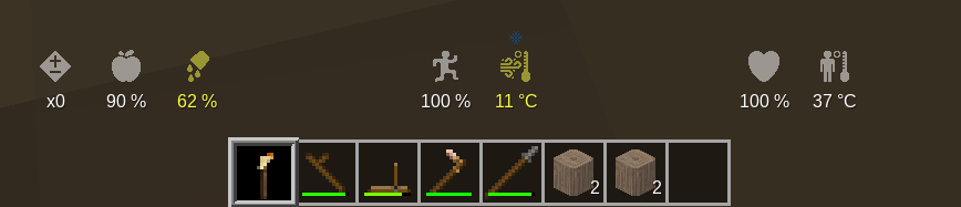
I found myself experiencing information overload. If you compare it with how I arranged the old text based HUD you'll see what I mean. In that one I grouped variables and split them up. It makes it easier to read (at least for me).
We have three variable groups that behave differently
- Fast: Energy, External Temperature. These need to be centered because they are monitored frequently. The new HUD puts internal temp in between these two - it's a very subtle effect, but makes it more confusing.
- Slow: hunger, thirst. These are less critical and can be put off to one side. New HUD is okay here.
- Rare: health, effects, internal temp. These only sometimes change. Least important, so can be where ever is least looked at. New HUD splits these up, which is confusing.
Having it above the inventory looks very tidy. But it's also the most "jam-packed" arrangement. We might need to experiment. e.g. try having gaps between these groupings. Might come down to personal preferences too.
(side note: one day when Health mod gets overhauled internal body temp could get removed. Turn it into a symptom. That removes some info clutter from the HUD).
I liked the previous order. Could we return to that from left to right and space the groups a little to make things less overloaded, maybe?
I propose the following regrouping. I think this makes everyone a bit more happy.
The sick effect icon has been changed as well. I still don't think the new one is perfect, and while I am proud of my clever portrayal, "barfing man" is not a good representation. This is good enough until the health effects system is better defined.
I think the effects / body temperature could be moved to be on the side of the hotbar and lower than the others, so the whole HUD is more compact. I think thirst / hunger could be more centered, these things are important. Some form of symmetry would also be nice: we have an odd number of icons so having one right in the center makes sense, instead of two and a lot of space between the others (maybe energy?).
I actually liked the old "vomiting" icon for health effects, I think it gets the point across that if you have any, it might be bad. The plus-minus icon looks too generic, I doubt I would be able to figure out what it means if I didn't already know.
Here's a quick mockup: (not going to post the code because the values are mostly selected of the top of my head + not tested with HUD scale, but should be trivial to implement)
 The only really needed change here is to provide Y coordinate to some of the elements. I also placed thirst in the center for symmetry and because it goes down faster than hunger. If body temperature gets removed, thirst could be placed above effects instead.
I quite like them both actually, but I'm going to have to leave body temperature on the list until it gets removed from the game. Body temp is a good indicator, if it's even a little low or high you are in danger, it tends to cascade quickly once things go bad.
As for the vomiting, I liked it a lot until I found out there are positive effects as well. It doesn't make sense in that context.
Adding a bit of space looks good. Much more readable. Any of those arrangements might work.
+- symbol for effects looks good too (as fun as "barfing man" might be!). All those symbols are very nicely done.
The code for this change is ready on #199. It's worth noting the hotbar does not scale with the game wide UI scale. I've noticed this across several Minetest games. This is also not compatible with izzy's /hud16 enhancement. I'm not sure how I want to handle that.
I think it shouldn't be to hard to check for the 16-slot hotbar - if it's on, I think the icons that are lower could be just moved to the top of the hotbar - similar to your original image for this issue.
Most of the changes came down in PR #199, although a few intermittent bugs need to be squashed. Nothing game-breaking but players may need to fiddle with /hud16 and /show_stats to get text to align properly until #201 is done and merged.