jenkins.io
 jenkins.io copied to clipboard
Footer enhancement
Suggestion
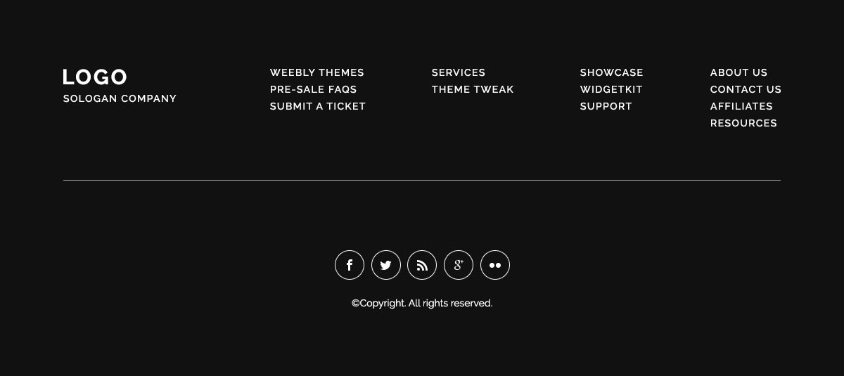
Current Footer is very unattractive and unsorted with respect to the user. For example, the GitHub link is given in the footer only, still not shown very clear. It becomes a little hard for the user to find the Jenkins repository from the site to contribute (I have also faced the same problem.) Additionally, there is no other social media logo given of the Jenkins on the whole site, we can mention them on the footer, for better reach of the users and contributors.

We can improve this by putting each link on its better place and in a more clear way.
Just an example:
Links
No response
Just an example:
It would probably be beneficial if you attached an example/draft for *.jenkins.io domains, instead of a generic template, to see where we're heading to.
Hey @MitAbhay, Are you working on this because me with my friend @SameerGoyal125 want to work on this open
Hey @NotMyFault , Would you like to see some designs before I should start working on this?
@NotMyFault, can you help me within which folder the footer file is I am trying from an hour 😅?
 @NotMyFault
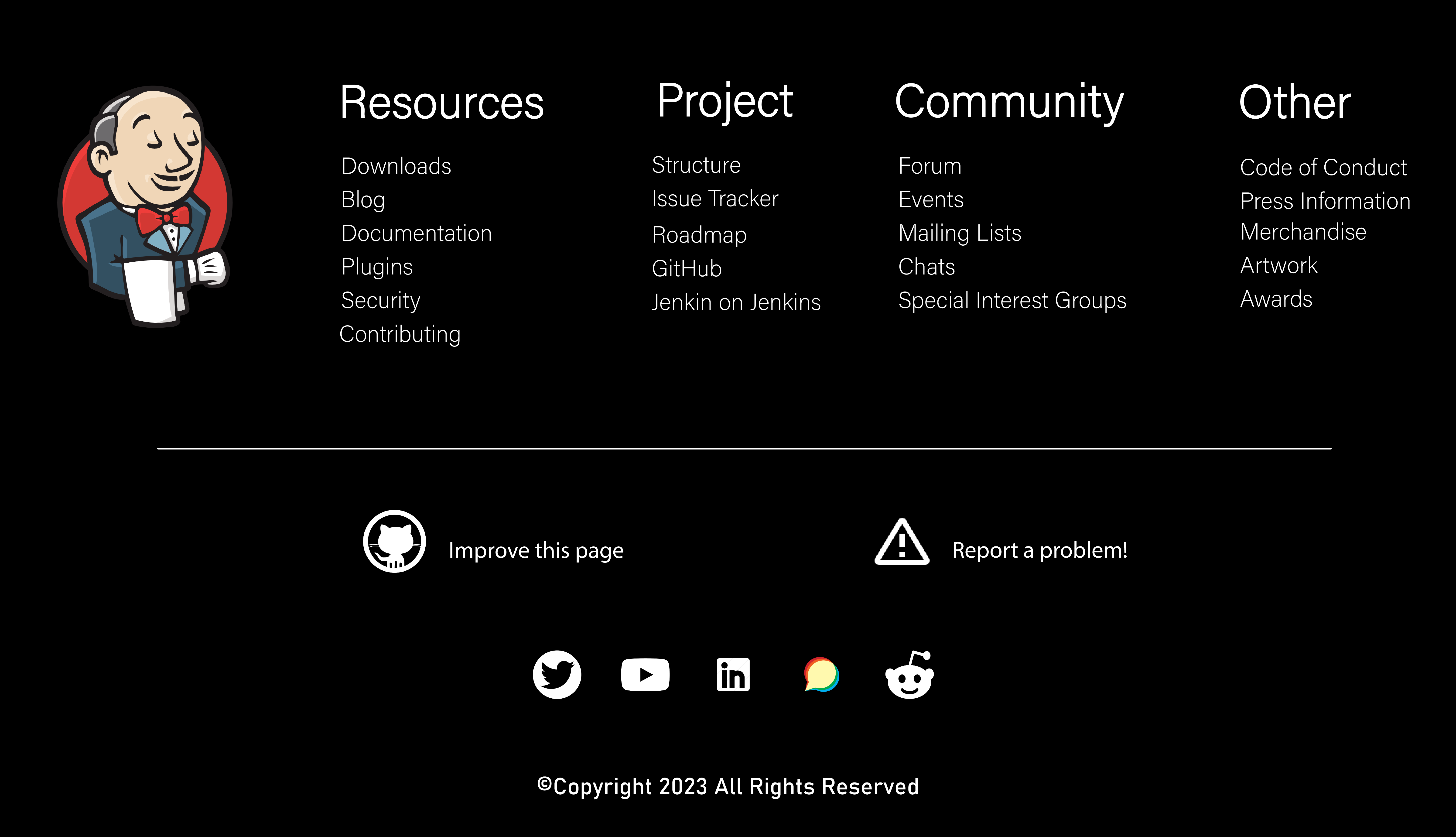
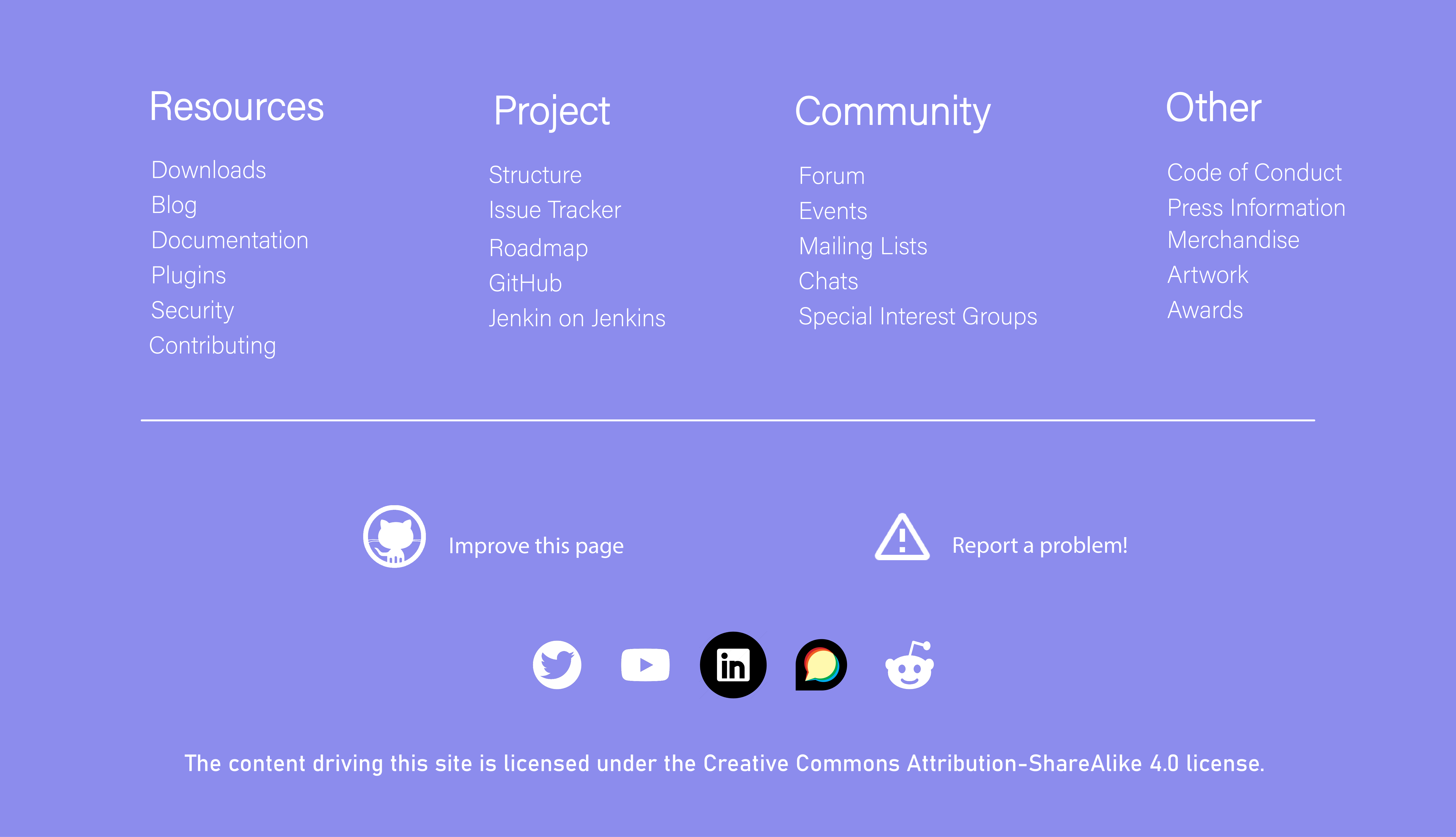
I have attached a photo of my design for your review. I would appreciate it if you could confirm whether I am heading in the right direction with this design or if there are any suggestions or changes you would like to make?
If I am unable to find the best suited free logos I can make that too.
@NotMyFault
I have attached a photo of my design for your review. I would appreciate it if you could confirm whether I am heading in the right direction with this design or if there are any suggestions or changes you would like to make?
If I am unable to find the best suited free logos I can make that too.
Hi @PrathamAditya I think @MitAbhay opened this Issue as part of GSoC for the project "Building jenkins.io with alternative tools" if my guess/hunch is correct? Anyway, if that project goes ahead we will need to work on UI/UX improvements as part fo the project. So maybe we should keep this issue open for further discussion regarding that. Any input from the maintainers is welcome.
Styling-wise the font size for the sub-headings "Resources", "Project", "Community", and "Other" may seem a bit too big to me.
Also, I tend to think adding the five social media logos at the bottom would be a good thing, but am not sure if we have a consensus.
Is there only one screen size for the logo design? Or should we have more say at least one for desktop, one for laptop, and one for mobile?
The Creative Commons license should stay there and copyright should not be added.
Not sure if the Jenkins logo should be there -- it's in header already, personally I'd not add it to the footer.
I have attached a photo of my design for your review. I would appreciate it if you could confirm whether I am heading in the right direction with this design or if there are any suggestions or changes you would like to make? If I am unable to find the best suited free logos I can make that too.
Instead of influencing my feedback with too much personal preference, I'll stick to general items I can build consensus upon with other maintainers.
If I am unable to find the best suited free logos
We're using ionicons, you don't need to find new icons. You can use them.
I would advise against pitch-black banners. Rather, use something light as default, which can respond to the client's preferences, e.g., dark mode, if requested.
On a legal note, the copyright notice is wrong. *.jenkins.io is CC BY-SA, which needs to be outlined.
I think MitAbhay opened this Issue as part of GSoC for the project "Building jenkins.io with alternative tools"
Bear in mind, the footer is used on more pages than jenkins.io. Instead of making it unique for j.io, rather keep it universal and lightweight to fit in more pages.
Styling-wise the font size for the sub-headings "Resources", "Project", "Community", and "Other" may seem a bit too big to me.
Okay I will make it a bit smaller
The Creative Commons license should stay there and copyright should not be added.
Not sure if the Jenkins logo should be there -- it's in header already, personally I'd not add it to the footer.
I will keep that in mind
I have attached a photo of my design for your review. I would appreciate it if you could confirm whether I am heading in the right direction with this design or if there are any suggestions or changes you would like to make? If I am unable to find the best suited free logos I can make that too.
Instead of influencing my feedback with too much personal preference, I'll stick to general items I can build consensus upon with other maintainers.
If I am unable to find the best suited free logos
We're using ionicons, you don't need to find new icons. You can use them.
I would advise against pitch-black banners. Rather, use something light as default, which can respond to the client's preferences, e.g., dark mode, if requested.
On a legal note, the copyright notice is wrong. *.jenkins.io is CC BY-SA, which needs to be outlined.
I think MitAbhay opened this Issue as part of GSoC for the project "Building jenkins.io with alternative tools"
Bear in mind, the footer is used on more pages than jenkins.io. Instead of making it unique for j.io, rather keep it universal and lightweight to fit in more pages.
How you like the idea of 2 footers 1 for jenkins.io other lightweight for other pages
Also, I tend to think adding the five social media logos at the bottom would be a good thing, but am not sure if we have a consensus.
Is there only one screen size for the logo design? Or should we have more say at least one for desktop, one for laptop, and one for mobile?
One for each sounds better to me and is doable

Hi @PrathamAditya I think @MitAbhay opened this Issue as part of GSoC for the project "Building jenkins.io with alternative tools" if my guess/hunch is correct? Anyway, if that project goes ahead we will need to work on UI/UX improvements as part fo the project. So maybe we should keep this issue open for further discussion regarding that. Any input from the maintainers is welcome.
Yes, I have opened this for the purpose of that project. But I think this is not the right place to mention UI issues, it should be mentioned in jenkins-io-components repository. What you say?
Either way is fine. And, since we have already started the discussion here, we should keep this issue open.