jenkins.io
 jenkins.io copied to clipboard
`h4` appears smaller than a `dt`
Compare:
https://github.com/jenkins-infra/jenkins.io/blob/master/content/security/for-maintainers.adoc#upload https://www.jenkins.io/security/for-maintainers/#upload
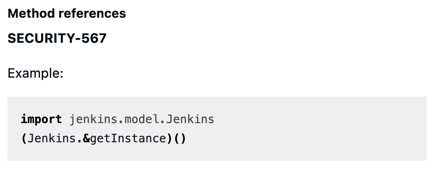
On the site, the h4 of "Plugins with otherwise automated releases (JEP-229 CD)" looks smaller than the dt "Build and deploy the release" (0.95rem vs. 1rem). Additionally, different from the GH rendering of Asciidoc, the site does not indent the dd entries. This makes the documentation unnecessarily difficult to read, because the dt look like the next section (almost like an h3 following the h4).
Caused by https://github.com/jenkins-infra/jenkins.io/pull/5415, see https://github.com/jenkins-infra/jenkins.io/pull/5415#discussion_r997981804 for a before (very clearly distinguishable headers) and after (pointlessly small headers) comparison.
hey @daniel-beck! Should I revert back the changes to this as below? Plz suggest. Thanks
h4 {
  font-size: 0.95rem;
  font-weight: 700;
}
To
h4 {
  font-size: 1.5rem;
  font-weight: 700;
}
@afzal442 Then h4 would be bigger than h3 etc. The whole size minimization done in the linked PR doesn't work in my opinion, but I'm open to other alternatives that allow distinguishing elements. For example, Wikipedia underlines headers.
Ah I see, thanks for reporting that. Can we add like this text-decoration: underline;? 🏷️
@afzal442 Difficult to say without doing it myself and seeing how well it works. Feel free to suggest such an improvement so that we can try it via the preview deployment. I mentioned that only as an example what could be done other than changing font-size back.
FWIW I submitted #5625 for now, but if you're able to create a good solution I don't see why we wouldn't integrate it.