 jbetancur
[FEATURE]: Auto width for columns to fit content
Hello,
I have tried a bunch of options but I am unable to set the width of my columns to fit the content.
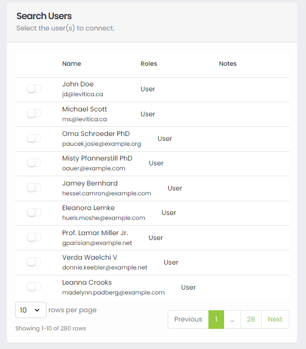
For example, here you can see that the Name column is truncated, while the Notes column is wide even tho all empty:

This is my columns definition:
  const columns = [
    {
      name: "",
      cell: (row, index, column, id) => {
        const isReadOnly = isUserHandledByTS(row.id);
        return (
          <StyledSwitch
            isDisabled={!selectedReport || isReadOnly}
            isChecked={isUserConnected(row.id)}
            elementStyle={
              isReadOnly ? ElementStyle.Warning : ElementStyle.Secondary
            }
            onChange={() => handleUserSelection(!isUserConnected(row.id), row)}
          />
        );
      },
      width: "75px",
      button: true,
    },
    {
      name: "Name",
      sortable: true,
      sortField: "name",
      selector: (row) => (
        <>
          {row.name}
          <br />
          <small>{row.email}</small>
        </>
      ),
    },
    {
      name: "Roles",
      selector: (row) => {
        return Enumerable.from(row?.roles)
          .select((role) => role.name)
          .toArray()
          .join(", ");
      },
    },
    {
      name: "Notes",
      width: "auto",
      selector: (row) => {
        const isReadOnly = isUserHandledByTS(row.id);
        return (
          isReadOnly && (
            <small>
              <StyledLabel elementStyle={ElementStyle.Danger}>
                <i>Managed by TS</i>
              </StyledLabel>
            </small>
          )
        );
      },
    },
  ];
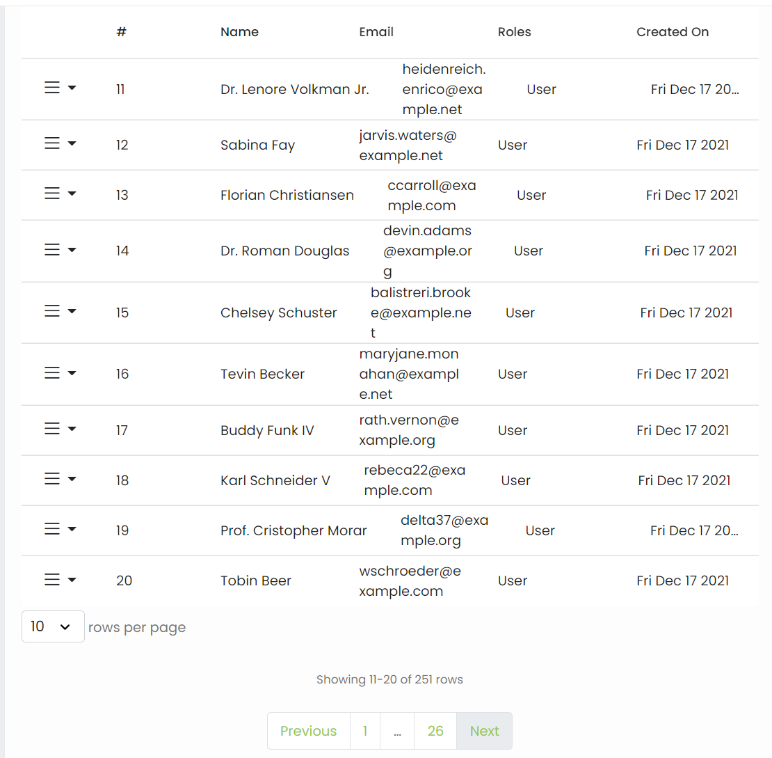
I tried to set width: "auto" also on the Name column, but I did not get the desired result because it messed up the alignment:
Thanks, awesome package btw.
This is another example of misalignment when you resize the screen (or view it in mobile view):
Is there a way to maintain a "table look and feel"?
All columns have a minWidth by default - I think 100px. You can try setting that to be lower for each desired column to see if that helps. I would not recommend using width: auto
   {
      name: "Notes",
      width: "auto",
      selector: (row) => {
        const isReadOnly = isUserHandledByTS(row.id);
        return (
          isReadOnly && (
            <small>
              <StyledLabel elementStyle={ElementStyle.Danger}>
                <i>Managed by TS</i>
              </StyledLabel>
            </small>
          )
        );
      },
    },
This issue has been automatically marked as stale because it has not had recent activity. It will be closed if no further activity occurs. Thank you for your contributions.
![stale[bot] avatar](https://avatars.githubusercontent.com/in/1724?v=4 "Published by a pub.dev verified publisher")
this is a major pain with rdtc , when i fit the content the headers are mis-aligned and do not conform with the 'fit-content' of the column. this happens when i shrink the browser window. when i expand the window the columns keep stretching which is also not what i want. i want a column that will size the the max-content and stay put. i also want to have a scroll bar if i decrease the screen size and not wrap the text within the column
is there any update for this?
const columns = [
   {
      name: 'NIK Karyawan',
      selector: row => row.nik,
      sortable: true,
      width: 'fit-content'
    },
    {
      name: 'Bulan',
      selector: row => row.date,
      sortable: true,
      width: 'fit-content'
    },
    {
      name: 'Minggu ke-1',
      selector: row => row.week1,
      sortable: true,
      width: 'fit-content'
    },
...
I tested tanstack table and all these issues went away. You do have to understand CSS fairly well
Same problem. Wanted to fit columns width, but have no success without complex js
I also have this issue still. Width, min-width to "fit-content", "min-content" or "auto" breaks the columns.
An approach manipulating the DOM directly based on the data-column-id for now is this:
useEffect(() => {
    requestAnimationFrame(() => {
      setMaxColumnWidths();
    });
  }, [finalColumns]); // <= depedency to run the function every time my data change


export const setMaxColumnWidths = () => {
  const outerColumns = Array.from(
    document.querySelectorAll<HTMLElement>("div[data-column-id]")
  ).filter((el) => !el.closest("[data-sort-id]"));

  const columnGroups: Record<string, HTMLElement[]> = {};

  outerColumns.forEach((col) => {
    const id = col.dataset.columnId!;
    columnGroups[id] ||= [];
    columnGroups[id].push(col);
  });


//setting "auto" to have all cells take the space they require
  Object.values(columnGroups).forEach((group) => {
    group.forEach((el) => {
      el.style.minWidth = "auto";
    });
  });

//finding the max width of each group and setting it as minWidth
  Object.values(columnGroups).forEach((group) => {
    const maxWidth = Math.max(...group.map((el) => el.offsetWidth));
    group.forEach((el) => {
      el.style.minWidth = `${maxWidth + 20}px`;
    });
  });
};
I would really like a proper solution. Is there an update here?