react-native-pay-password
 react-native-pay-password copied to clipboard
Published
20 hours ago •
 jayce712
jayce712
react-native 支付密码输入框
react-native-pay-password
English | 中文
Install
$ npm install react-native-pay-password --save
Usage
Export 4 components,if
PasswordInputorPasswordModaldoesn't meet your needs,you should useInputViewandKeyboardto have a try.
PasswordInput(based InputView and Keyboard)
| Properties | Description | Type | Default |
|---|---|---|---|
| clear | clear password value when press the password input | boolean | true |
| onDone | handler called when input done | (value: string) => void | - |
| inputViewProps | password input function component props | InputViewProps | - |
| keyboardProps | keyborad function component props | KeyboardProps | - |
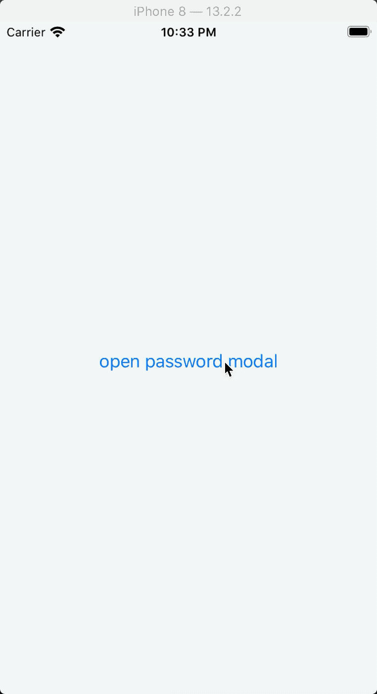
PasswordModal(based InputView and Keyboard)
| Properties | Description | Type | Default |
|---|---|---|---|
| clear | clear password value when press the password input | boolean | true |
| onDone | handler called when input done | (value: string) => void | - |
| backdrop | modal backdrop | boolean | false |
| title | modal title | string | 支付密码 |
| header | custom heade | React.ReactNode | 6 |
| tip | tip | string | #C7C7C7 |
| tipProps | tip props | TextProps | - |
| inputViewProps | password input function component props | InputViewProps | - |
| keyboardProps | keyborad function component props | KeyboardProps | - |
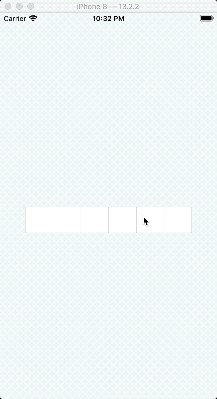
InputView(pay password input view)
| Properties | Description | Type | Default |
|---|---|---|---|
| length | password length | number | 6 |
| value | password value | string | - |
| cover | cover | boolean | - |
| coverText | password cover text | string | ● |
| style | input view style | ViewStyle | - |
| itemStyle | input item style | ViewStyle | - |
| textStyle | password text style | TextStyle | - |
| borderColor | border color | string | #C7C7C7 |
Keyboard(pay password keyboard)
| Properties | Description | Type | Default |
|---|---|---|---|
| dataSources | custom data sources,cover the default keyboard | (KeyboardItemProps[])[] | - |
| onPress | handler called when press num text | (v?: string) => void; | - |
| onDelete | handler called when press delete image | () => void; | - |
| style | keyboard style | ViewStyle | - |
| rowStyle | row style | ViewStyle | - |
Example
see ./example
 jayce712