jacoco

jacoco copied to clipboard
Modernize JaCoCo Report design
By adjusting some CSS the look & feel can be improved a bit:
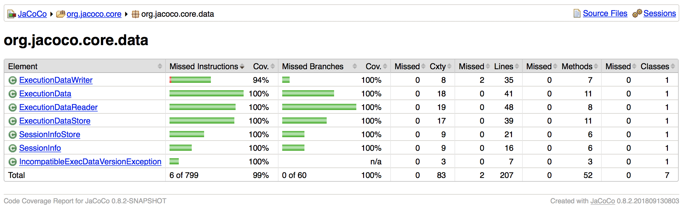
- left and right border for tables
- round corners for boxes (header, table, source)
- increased line distance for better horizontal readability
- Use unicode triangles as separators in bread crump header.
Idea of @Godin: Why not showing totals at the top? This is the primary information. If shown in headers no scrolling is required even for long lists of elements to see totals.
Yes I saw this as well when playing around with the CSS. This PR has been around for years. Any plans of bringing it into the mainline branch?