learning-note

learning-note copied to clipboard
 jackPanyj
css 实现蚂蚁行军的特效
先来一张效果图
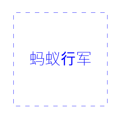
图是静态的,真正的效果应该是动态的。
先上代码:
html 部分:
<div class="ant">蚂蚁行军</div>
css 部分:
body {
  display: flex;
  justify-content: center;
  align-items: center;
  height: 100vh;
}
.ant {
  display: flex;
  justify-content: center;
  align-items: center;
  font-size: 50px;
  color: #00f;
  height: 300px;
  width: 300px;
  background-image: linear-gradient(#fff, #fff), repeating-linear-gradient(-45deg, currentColor 0, currentColor 10px, transparent 0, transparent 20px);
  background-clip: padding-box, border-box;
  border: 1px solid transparent;
  background-origin: border-box;
  animation: ant 12s infinite linear;
  background-size: 30px 30px;
}

@keyframes ant {
  to {
    background-position: 100% 100%;
  }
}
代码解释:
- 首先声明一点
background-image如果存在多个图片的话, 其表现是前面的覆盖后面的。 - 用
linear-gradient(#fff, #fff)做出白色的背景图作为第一个background-image - 用
repeating-linear-gradient(-45deg, currentColor 0, currentColor 10px, transparent 0, transparent 20px)做出一个字体色与透明色间隔图案,作为第二个背景图 - 利用
background-clip分别剪切俩个背景图, 第一个为padding-box, 第二个为border-box - 设置
border为1px, 背景色为透明色,这样就得到了一个静态的1px的边框 - 设置
background-size为合适的尺寸 - 制作动画帧, 然
background-position慢慢移动到100% - 应用动画,设置合适的时间间隔