FortyTwo
 FortyTwo copied to clipboard
 jack-bradshaw
FortyTwo is the answer to the Ultimate Question of Life, the Universe, and Everything. It's also a great library for displaying multiple choice answers in Android apps.
FortyTwo
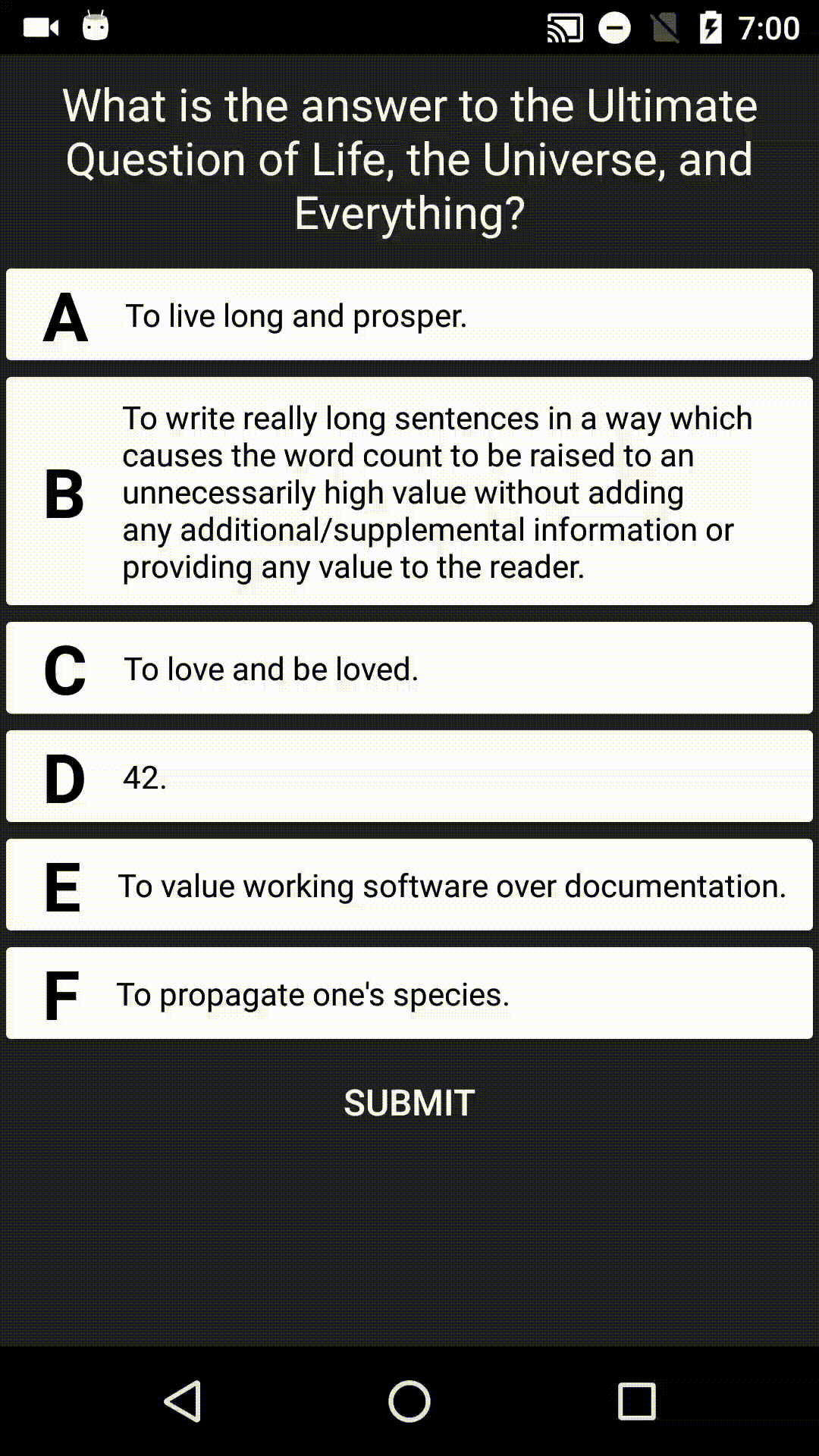
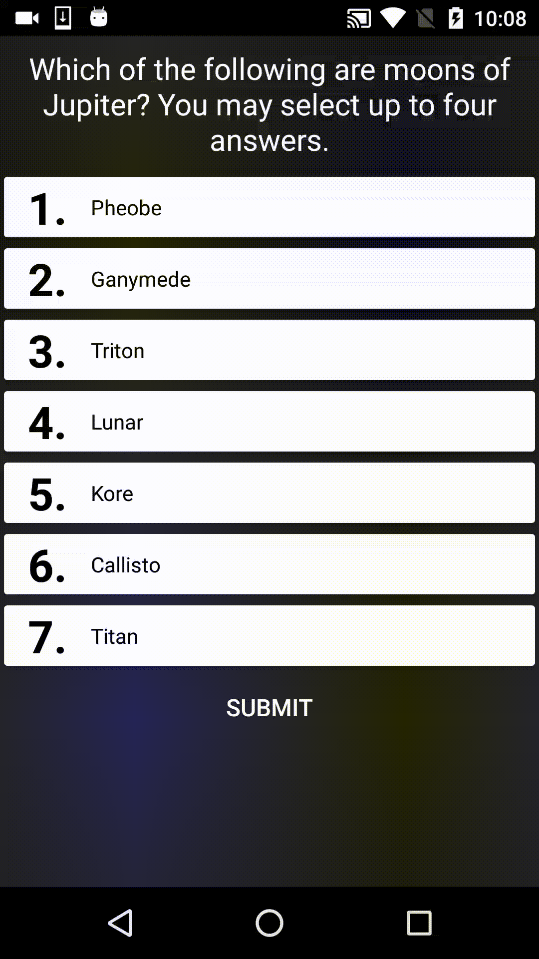
FortyTwo is the answer to the Ultimate Question of Life, the Universe, and Everything. It's also a UI library designed for displaying multiple choice answers in Android apps, for example:
SUPPORT NOTICE: This library is now STABLE. It is no longer under active development, however pull requests from others are still being accepted.
Dependency
To use the library, add the following to your gradle build file:
repositories {
  jcenter()
}

dependencies {
  implementation 'com.matthew-tamlin:forty-two:1.0.0'
}
Older versions are available in the Maven repo.
Usage
There are three key interfaces in this library:
- Answer: Contains the actual data to display.
- AnswerGroup: Displays multiple AnswerViews and coordinates the user’s interaction with them.
- AnswerView: Displays a single answer in the UI along with an identifier (e.g A, B, C, 1, 2, 3 etc.)
This section provides a quick overview of the components. For more in depth information, read the Javadoc and have a look at the example.
Answer
Define your answers by implementing the Answer interface or instantating one of the provided implementations.
// Directly implement the interface
Answer answer1 = new Answer() {
  public CharSequence getText() {
    return "incorrect answer";
  }

  public boolean isCorrect() {
    return false;
  };
}

// Use the PojoAnswer class
Answer answer2 = new PojoAnswer("this is the right answer", true);
answer2.setText("actually I changed my mind, this answer is wrong too");
answer2.setCorrectness(false);

// Use the ImmutableAnswer class
Answer answer3 = new ImmutableAnswer("this is definitely the right answer", true);
AnswerGroup
Display and coordinate multiple answers by adding an AnswerGroup to your layout. The SelectionLimitAnswerGroup is the only provided answer group and it should be flexible enough to meet most needs.
Using XML:
<LinearLayout
  xmlns:android="http://schemas.android.com/apk/res/android"
  android:layout_width="match_parent"
  android:layout_height="match_parent"
  android:orientation="vertical">

  <!-- Displays the question -->
  <TextView
    android:id="@+id/question"
    android:layout_width="match_parent"
    android:layout_height="wrap_content"
    android:gravity="center"
    android:padding="8dp"
  	android:textSize="20sp"/>

  <!-- Displays the answers -->
  <com.matthewtamlin.fortytwo.library.answer_group.SelectionLimitedAnswerGroup
    android:id="@+id/answers"
    android:layout_width="match_parent"
    android:layout_height="wrap_content"/>

  <!-- Button for submitting -->
  <Button
    android:id="@+id/submit_button"
    style="@style/Widget.AppCompat.Button.Borderless"
    android:layout_width="wrap_content"
    android:layout_height="wrap_content"
    android:layout_gravity="center_horizontal"
    android:text="Submit"
    android:textSize="16sp"/>
</LinearLayout>
Programatically:
// Like all views, a Context is needed to instantiate
AnswerGroup group = new SelectionLimitAnswerGroup(context);

// Ignore user input when the answers are showing as marked
group.allowSelectionChangesWhenMarked(false);

// Allow at most two answers to be selected at a time
group.setMultipleSelectionLimit(2);

// Enable animations when the user interacts with the view
group.enableSelectionAnimations(true);
AnswerView
Create an AnswerView for each Answer and add them to the AnswerGroup. The DecoratedAnswerCard is the recommended class due to its versatility and customisability.
List<Answers> answers = getAnswers();

for (int i = 0; i < answers.size(); i++) {
  // Like all views, a Context is needed to instantiate
  DecoratedAnswerCard answerCard = new DecoratedAnswerCard(context);

  // False = don't show animations
  answerCard.setAnswer(answers.get(i), false);

  // Identify each answer with a sequential number (e.g. 1. Some answer, 2. Another answer)
  answerCard.setIdentifier((i + 1) + ".", false);

  // Customise the answer card using decorators (see below for details)
  answerCard.addDecorator(createColorFadeDecorator(), false);
  answerCard.addDecorator(createAlphaDecorator(), false);

  // Show the card in the UI
  getAnswerGroup().addAnswer(decoratedAnswerCard);
}
Two concrete decorator classes are provided: ColorFadeDecorator and AlphaDecorator.
// Changes the background color of the card, using a blended color transition
public ColorFadeDecorator createColorFadeDecorator() {
  // Defines the colors to use for different answer properties
  final ColorSupplier colorSupplier = new ColorSupplier() {
    @Override
    public int getColor(boolean marked, boolean selected, boolean answerIsCorrect) {
      if (marked) {
        if (selected) {
          return answerIsCorrect ? Color.GREEN : Color.RED;
        } else {
          return answerIsCorrect ? Color.PURPLE : Color.WHITE;
        }
      } else {
        return selected ? Color.ORANGE : Color.WHITE;
      }
    }
  };

  return new ColorFadeDecorator(colorSupplier);
}

// Changes the alpha of the card
public AlphaDecorator createAlphaDecorator() {
  // Defines the alpha values to use for different answer properties
  final AlphaSupplier alphaSupplier = new AlphaSupplier() {
    @Override
    public float getAlpha(boolean marked, boolean selected, boolean answerIsCorrect) {
      if (marked && !selected && !answerIsCorrect) {
        return 0.3f; // 30% opacity
      } else {
        return 1f; // Full opacity
      }
    }
  };

  return new AlphaDecorator(alphaSupplier);
}
To create your own decorator, you can:
- Extend one of the existing decorators
- Extend the DecoratorAdapter class (eliminates boilerplate code)
- Implement the Decorator interface directly
Compatibility
This library is compatible with Android 12 and up.
Metadata
Owner
 jack-bradshaw
Metadata
FortyTwo is the answer to the Ultimate Question of Life, the Universe, and Everything. It's also a great library for displaying multiple choice answers in Android apps.